How to Choose Coffee Table Books for Any Style

Choose coffee table books by starting with the room, the reader, and the book’s purpose. Then check subject quality, dimensions, durability, and how the book will actually look and function on the table.
Knowing how to choose coffee table books starts with looking beyond the cover. The right book should suit the room, reflect the person who will actually pick it up, and feel intentional in both scale and subject matter.
A well-chosen coffee table book can work as decor, reading material, a conversation starter, or a gift that feels more personal than generic home accessories. The challenge is that beautiful covers alone do not guarantee a good fit. Size, page design, production quality, and where the book will live all affect whether it looks polished or out of place.
- Start with purpose: Decide if the book is for reading, styling, conversation, or gifting.
- Check scale: Match book size to the table so it looks balanced and leaves usable space.
- Buy beyond the cover: Review subject, publisher, binding, and image-to-text balance.
- Style thoughtfully: Use one or two edited stacks with trays or objects instead of cluttering the.
- Think long term: Timeless subjects and durable hardcovers usually offer better lasting value.
How to Choose Coffee Table Books for Any Style: Start With Room, Reader, and Visual Mood
Before comparing publishers, subjects, or cover finishes, decide what job the book needs to do. Coffee table books are part reading object and part styling object, so the best choice usually sits at the overlap between personal interest and visual harmony.
Define the book’s role: conversation piece, design accent, personal interest, or gift
Some books are meant to be opened often. Others are mainly there to anchor a table visually. That difference matters. A fashion retrospective with dramatic imagery may be ideal as a conversation piece in a living room, while a quieter interiors or botanical title may work better in a bedroom.
If you are buying for yourself, think about what you genuinely enjoy revisiting. If you are buying for someone else, choose a subject they already care about rather than a title that simply matches their sofa. Art, architecture, travel, gardens, fashion, food, photography, and design are all common categories, but the strongest picks usually connect to a real interest.
Match the book to the room’s scale, palette, and everyday use
A large, glossy volume can look impressive on a generous rectangular coffee table, but the same book may overwhelm a compact apartment setup. In smaller rooms, medium-format books are often easier to stack, move, and live with. If you are working with limited surface area, this guide to coffee table books for small spaces can help narrow the format.
Color matters too. In a neutral room, a vivid spine or saturated cover can introduce contrast. In a colorful interior, books can either echo the palette or provide a calmer visual break. Also think about wear: in a family room where people set down drinks, remotes, and trays, delicate jackets and pale cloth covers may need more care than darker, sturdier hardcovers.
If the table already holds a tray, candle, or decorative bowl, choose books that leave some breathing room around those objects rather than trying to fill every inch of the surface.
What to Look for in Coffee Table Books Before You Buy
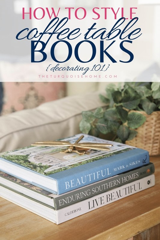
A curated stack of coffee table books sits next to a living room sofa.
Once you know the book’s purpose, evaluate it like both a reader and a stylist. A good coffee table book should have enough substance to justify its space.
Subject matter, author/editor credibility, and publisher quality
Start with content. Is the subject broad and visually rich enough to revisit, or is it so niche that it may lose appeal quickly? Then look at who made the book. Established museums, respected art publishers, university presses, and specialist design imprints often signal stronger editorial standards, better image licensing, and more thoughtful sequencing.
For artist monographs, exhibition books, and architecture volumes, the editor, contributing writers, and institution behind the title can matter as much as the cover. If details are unclear, check the publisher listing and table of contents before buying. That is especially useful when deciding between more image-led books and titles with deeper essays. If you are unsure how much reading material to expect, Hurrell Editions also has a guide on whether coffee table books have words.
Format, dimensions, page count, cover finish, and image-to-text balance
Format affects both display and usability. Oversized books create impact, but they are heavier and less flexible. Medium-format books are easier to stack and more practical for frequent browsing. Dimensions are worth checking carefully because retailer images can make books appear larger than they are.
Page count helps indicate depth, though more pages do not automatically mean better value. A shorter book with excellent image reproduction and strong pacing may feel more satisfying than a longer but repetitive one. Cover finish matters too: matte jackets tend to feel softer and more understated, while glossy finishes can read bolder and more commercial.
The image-to-text balance should suit the room and the reader. For display-first use, highly visual books with short captions may be enough. For collectors, students, or design enthusiasts, a more reference-led format can offer longer-term value.
Edition type, publication date, and whether the content will feel timeless or trend-led
Not every coffee table book needs to be timeless, but it helps to know whether you are buying a lasting reference or a trend-specific object. A survey of modern architecture, a museum collection, or a major photography archive often has longer shelf life than a book built around a short-lived aesthetic trend.
Edition type also matters. Hardcover editions usually feel more substantial for display than softcover versions, while special editions, boxed sets, or slipcased books may appeal more to collectors. Publication date is most important when the subject changes quickly, such as fashion, contemporary interiors, or pop culture. In those categories, newer editions may offer more relevant imagery and updated context.
Retailer photos do not always show scale, paper finish, or jacket texture accurately. When possible, confirm dimensions, binding type, and publication details on the official publisher or retailer listing before buying.
Choosing Coffee Table Books by Interior Style
The easiest way to make a book feel intentional is to relate it to the room’s design language. That does not mean matching everything exactly. It means choosing books that support the atmosphere already in place.
Minimalist and contemporary spaces
Minimalist rooms usually benefit from restraint. Look for books with clean typography, strong photography, monochrome or neutral covers, and uncluttered layouts. Subjects like architecture, black-and-white photography, modern art, and contemporary interiors often fit naturally.
One or two substantial books can be enough in these spaces. Too many stacks can interrupt the calm. If you want ideas that stay visually quiet, browse titles similar to the ones featured in Hurrell Editions’ guide to coffee table books for minimalist homes.
Classic, traditional, and collected interiors
Traditional rooms often suit books with depth, history, and richer visual texture. Think art history, antiques, gardens, decorative arts, old-world travel, museums, or biographies of major designers and artists. Linen covers, serif typography, and muted yet elegant jackets tend to sit well in these interiors.
Books in classic spaces can feel layered rather than stark. A pair of medium-to-large volumes stacked beside a tray or lidded box often looks more natural than a single ultra-glossy statement book.
Eclectic, artistic, and maximalist rooms
Maximalist and eclectic interiors can handle more color, bolder subjects, and stronger visual contrast. This is where expressive fashion titles, contemporary art books, graphic photography collections, and unusual niche subjects often shine.
In these rooms, contrast can be part of the point. A stack might mix an art monograph, a colorful travel book, and a graphic design title. The key is to make the mix feel curated rather than random by repeating a color, subject family, or era somewhere else in the room.
Natural, coastal, and relaxed modern homes
For lighter, more organic interiors, look for books with airy photography, tactile-looking covers, and subjects that support a relaxed mood. Botanical studies, landscapes, nature photography, coastal travel, ceramics, and understated interiors often work well.
Soft blues, sandy neutrals, greens, off-whites, and weathered textures tend to integrate easily. If you want a subject that feels decorative without being too flashy, botanical books are often one of the safest choices for this style.
Which Coffee Table Books Fit Best in Each Room?<
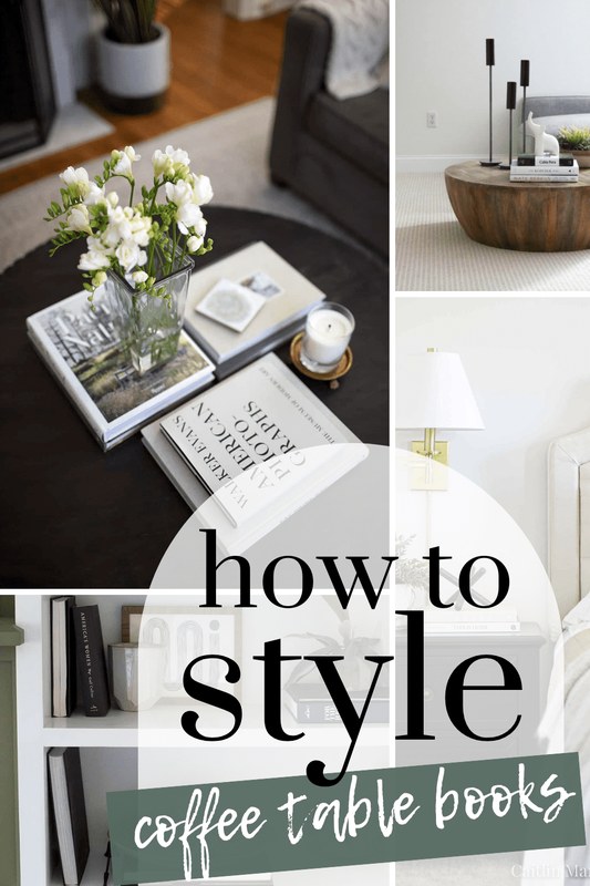
Coffee table books are arranged in different rooms to suit each interior style.
Coffee table books are arranged in different rooms to suit each interior style.
/h2>
Not every room asks for the same tone. A book that feels perfect in a living room may feel too loud for a bedroom or too personal for a guest area.
Living room: statement stacks and conversation starters
The living room is the most flexible place for coffee table books. Here, larger books and bolder subjects make sense because they are part of how the room welcomes guests. Art, fashion, photography, architecture, and travel are all strong categories for this setting.
Try building one main stack and one secondary accent rather than scattering books across the entire table. If you are debating quantity, Hurrell Editions’ article on how many coffee table books can help you judge what looks balanced.
Bedroom: calming subjects, softer palettes, and intimate scale
Bedrooms usually benefit from gentler choices. Medium-size books often feel more appropriate than oversized tomes, especially on smaller benches, ottomans, or bedside surfaces. Subjects like interiors, gardens, poetry-adjacent photography, wellness, or quiet travel imagery can support a restful atmosphere.
Choose covers that blend with bedding, upholstery, or wood tones rather than competing with them. A bedroom book should feel easy to live with, not like a showroom prop.
Office or studio: architecture, photography, fashion, and reference-led titles
Workspaces can handle books with more intellectual or professional weight. Architecture, design, photography, fashion history, artist monographs, and visual reference books all make sense here. In a studio or office, the book can be both inspiring and useful.
If the desk area is compact, keep larger books on a side table, low shelf, or credenza rather than crowding the main work surface. Books in this room should support focus, not consume functional space.
Entryway, guest room, and waiting areas: universally appealing choices
In shared or semi-public spaces, broadly appealing subjects are usually safest. Travel, landscapes, museum collections, city photography, and general design books tend to invite browsing without feeling too personal.
For giftable, accessible options, avoid books that require specialized background knowledge unless you know the audience well. In these rooms, the goal is welcoming interest rather than strong self-expression.
Size, Materials, and Display Specifications That Matter
Styling success often comes down to practical details. A book may be beautiful on its own and still be wrong for the table it is meant to sit on.
Oversized vs medium-format books and how many to stack
Oversized books create strong visual weight and usually work best on larger rectangular or square tables. Medium-format books are more versatile, especially for smaller homes, layered styling, or frequent handling. As a general rule, one to three books per stack is usually enough. More than that can start to look unstable or overly busy.
- Use one oversized book as a base if the table is generous and the room needs a focal point.
- Keep stacks low enough that people can still see across the table comfortably.
- Leave open surface area for practical use.
- Stacking so high that books wobble or block conversation.
- Using a huge art book on a very narrow or delicate table.
- Adding books just to fill space without considering proportion.
Hardcover bindings, slipcases, jackets, paper quality, and durability
Hardcovers are usually the best fit for coffee table display because they hold shape better and feel more substantial. Dust jackets can look elegant, but they also show wear more easily, especially on glossy finishes. Slipcases add protection and collector appeal, though they can make casual browsing less convenient.
Paper quality affects both appearance and longevity. Heavier coated paper often supports crisp image reproduction, while uncoated paper can feel more tactile and subdued. Neither is automatically superior; it depends on the subject and production style.
How book size relates to table shape, tray use, and surrounding objects
Round tables usually look best with fewer, softer groupings: perhaps one short stack paired with a bowl or candle. Rectangular tables can handle a longer composition with a stack at one end and an object or tray at the other. Square tables often benefit from quadrant-style styling, where books balance another object grouping diagonally or side by side.
If you use a tray, let the tray define the arrangement. Books can sit inside it if the tray is large enough, or beside it if the tray already contains smaller objects. The goal is to create order, not competition.
Styling Ideas: How to Display Coffee Table Books Without Clutter
Good styling is less about adding more and more about editing. Coffee table books should ground a surface, not bury it.
Layering with trays, candles, bowls, and sculptural objects
Books work well as risers for smaller decor. A candle, small vessel, or sculptural object placed on top of a stack can add height variation and make the arrangement feel finished. Keep the top object proportional and stable, and avoid anything likely to scratch or stain the cover.
- Use books to elevate one special object rather than scattering many small accessories.
- Repeat one material, such as glass, brass, ceramic, or wood, to make mixed items feel connected.
- Leave enough space to set down a drink or pick up the book comfortably.
Color-coordinated stacks vs theme-based groupings
Color-coordinated stacks can look polished, especially in minimalist or highly designed rooms. Theme-based groupings often feel more personal because they tell a clearer story: architecture with interiors, botanical with landscape photography, or fashion with portraiture.
Neither method is better in every room. If the space already has strong color structure, theme-based grouping may feel richer. If the room is visually busy, a more disciplined color approach can restore calm.
How to style books on round, rectangular, square, and nested coffee tables
On round tables, think in arcs and compact clusters. On rectangular tables, split the surface into two or three visual zones. On square tables, use symmetry or balanced asymmetry. On nested tables, avoid duplicating the same stack on every surface; let one table hold books and the other hold a contrasting object.
If your table sits near framed art or a console arrangement, it can help to echo one subject or color family so the room feels connected. Similar principles apply in other display areas, including console styling.
Benefits, Limitations, and Common Mistakes to Avoid
Coffee table books are easy to romanticize, but they work best when chosen with the same care you would give any other visible design element.
Why coffee table books add personality, depth, and easy seasonal refresh
They add cultural and visual texture without requiring a major decor change. Swapping one or two titles can subtly shift a room from summery and relaxed to moody and layered. They also reveal taste in a way that mass-market accessories often do not.
For renters or anyone hesitant to commit to larger decor purchases, books are one of the simplest ways to make a room feel more considered.
Potential drawbacks: dust, sun fading, trend fatigue, and purely decorative buying
Books do collect dust, and covers can fade if left in strong direct sunlight. Very trend-driven titles may also lose their appeal faster than expected. Another common issue is buying books only for spine color or online popularity, then realizing the content has little staying power.
Keep valuable or light-colored books away from prolonged direct sun, high humidity, and drink rings. Dust jackets and cloth covers can mark more easily than they appear to in product photos.
Mistakes such as choosing by spine alone, ignoring scale, or overcrowding surfaces
The most common mistake is treating books like filler. A beautiful spine is helpful, but it should not be the only reason to buy. Ignoring scale is another frequent problem: books that are too small can look flimsy, while books that are too large can dominate the table awkwardly.
Overcrowding is the final issue. If the table becomes harder to use, the styling has gone too far. A coffee table should still function like a table.
Caring for Coffee Table Books, Assessing Value, and Choosing Them as Gifts
Once you find books that fit your style, a little maintenance and thoughtful selection can help them stay relevant for years.
Care and maintenance: dusting, light exposure, humidity, and safe stacking
Dust books regularly with a soft, dry cloth and avoid spraying cleaners directly onto covers or jackets. Store especially valuable titles away from direct sunlight and damp rooms. Stacks should sit flat and stable, with the largest book usually at the bottom.
If you rotate books seasonally or move often, protective storage matters too. For longer-term organization beyond display, see Hurrell Editions’ guide on how to store coffee table books.
Value considerations: content quality, production standards, longevity, and price
Value is not just about price. A more expensive book may justify itself through better image reproduction, stronger editorial content, more durable binding, or long-term relevance. A lower-priced book can still be worthwhile if the subject is strong and the production is solid.
If current prices or edition details vary by retailer, confirm them before purchasing. For many buyers, the real test of value is simple: would you still want the book if it were not on display?
Who coffee table books suit, best gifting occasions, and presentation/display ideas
Coffee table books suit art lovers, design-minded hosts, recent movers, newlyweds, graduates, creative professionals, and anyone who enjoys visual culture. They work especially well for housewarmings, birthdays, holidays, and thank-you gifts where you want something personal but still broadly useful.
For gifting, match the title to the recipient’s interests first and their decor second. Presentation can be simple: a protective wrap, a handwritten note inside, or pairing the book with a small object like a bookmark, candle, or tray for display context.
Final recommendation: build a small, style-matched collection with lasting visual and personal relevance
The smartest approach is to build a small collection rather than buying in bulk. Choose books that fit the table, support the room’s mood, and offer subjects you or the recipient will genuinely revisit. A few well-made, well-scaled titles with lasting personal relevance will nearly always look better than a larger stack chosen only for color or trend.
Frequently Asked Questions