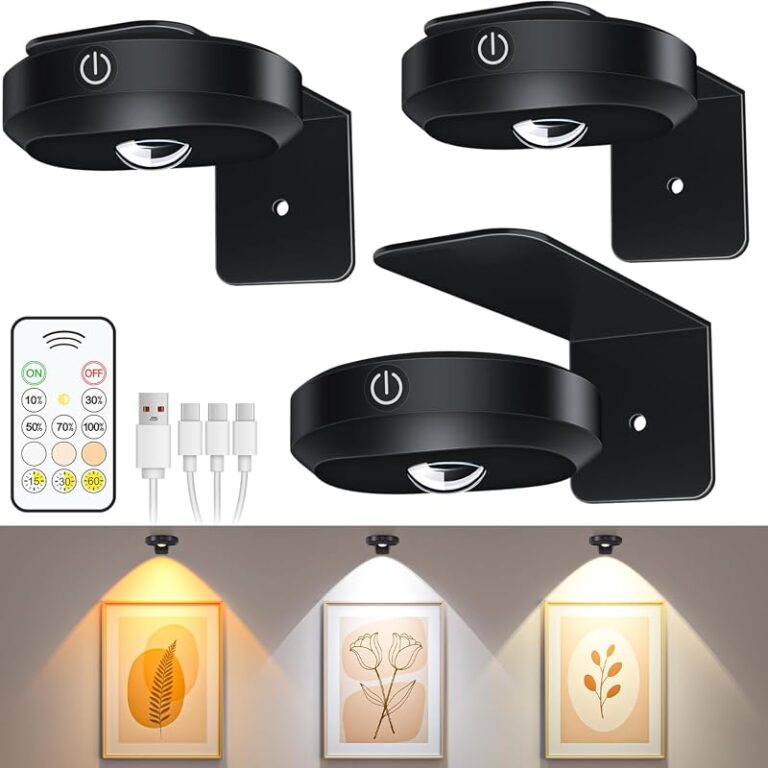
How to Position a Wireless Picture Light Above Artwork

Position a wireless picture light centered above the frame, close enough to feel integrated, and angled to wash the artwork evenly without glare. Choose the size, finish, and brightness based on the artwork scale, wall type, and room mood.
how to position a wireless picture light above artwork starts with one simple idea: place the light so it flatters the art without drawing attention to the fixture itself. The best position depends on frame size, ceiling height, wall color, and how much ambient light the room already has.
- Center first: Align the light with the artwork, not the empty wall around it.
- Control glare: Keep the fixture high enough to avoid hotspots and reflections.
- Match scale: Larger art usually needs a wider, more proportional light.
- Check the wall: Drywall, plaster, brick, and paneling may need different fixings.
How to Position a Wireless Picture Light Above Artwork: The Quick Answer
In most rooms, a wireless picture light should sit centered over the artwork and slightly above the top edge of the frame, with the arm angled so the beam washes the full piece evenly. The exact height varies by frame scale and light design, but the goal is usually balanced illumination, minimal glare, and a fixture that feels proportional to the artwork rather than oversized or cramped.
Because wireless models rely on batteries or rechargeable power, placement also needs to account for access, charging convenience, and safe mounting. If you want a broader buying framework before you place anything on the wall, see how to choose a picture light for artwork and why use a battery operated picture light.
What a Wireless Picture Light Needs to Do for Artwork
Why placement matters for proportion, visibility, and mood
A picture light does more than brighten a frame. It sets the visual hierarchy in the room, helps the artwork read clearly from across the space, and can make a hallway, dining room, or sitting area feel more finished. If the light is too high, the beam may skim the wall and miss the art; too low, and the fixture can crowd the frame or create harsh reflections.
Proportion matters just as much as brightness. A slim frame with a large, bulky light can feel top-heavy, while a wide painting with a tiny light can look underlit and incomplete. The most successful installations usually feel calm and intentional, which is why the fixture should be chosen and positioned as part of the artwork’s composition rather than as an afterthought.
Ideal brightness, color temperature, and beam spread for art
For artwork, softer and more controlled light usually works better than a very bright, narrow beam. Many shoppers prefer a warm-to-neutral tone that keeps colors looking natural, though the ideal color temperature depends on the artwork itself, the wall color, and the mood of the room. A cooler light can make some contemporary pieces feel crisp, while warmer light often suits traditional interiors and textured works.
Beam spread is equally important. A beam that is too narrow can create a spotlight effect with hot centers and dim edges. A broader, more even spread usually helps the entire frame feel illuminated. If the light is dimmable, that adds flexibility for evening use and for rooms that already receive daylight.
Manufacturer specifications for brightness, color temperature, and beam angle vary by model, so confirm those details before buying if your artwork is especially glossy, dark, or large.
Wireless power sources, battery life, and safety basics
Wireless picture lights typically use rechargeable batteries or replaceable batteries, and that affects both placement and maintenance. A model that needs frequent charging should be installed where you can remove it or access the power module without disturbing the artwork. If the fixture uses a remote or integrated dimmer, make sure the control method is convenient for the room.
Safety basics still matter even without a cord. The light must be mounted securely for the wall type, and any product instructions about clearance, charging, or indoor use should be followed closely. For battery timing and maintenance planning, it can help to review how long it takes to charge a picture light before you commit to a placement that is hard to reach.
How High to Mount a Wireless Picture Light Above a Frame
Standard placement rules for single artworks
For a single framed artwork, the most common approach is to center the fixture over the piece and place it just above the frame so the light can angle downward across the surface. In practice, that usually means enough clearance for the light to look separate from the frame, but not so much space that the fixture feels detached from the composition.
A useful way to think about height is visual relationship rather than a fixed number. The light should appear to belong to the artwork, and the beam should cover the image area without spilling excessively onto the wall. If the frame has a tall profile or ornate top rail, the light may need a little more breathing room than a thin modern frame.
- Keep the light centered on the artwork, not the wall space around it.
- Leave enough clearance so the fixture does not visually touch the frame.
- Adjust the angle to wash the artwork evenly rather than spotlighting one section.
Adjusting height for tall frames, small frames, and oversized pieces
Tall frames often need more vertical separation so the light does not crowd the top edge. Small frames, by contrast, can look overwhelmed if the fixture is too large or mounted too far above them. Oversized pieces may need a wider light or a slightly higher mount point to cover the full width without leaving the corners dark.
Scale is the deciding factor. A compact print in a narrow hallway can usually handle a petite light mounted close to the frame, while a large painting in a formal room may need a more substantial fixture and more deliberate spacing. When the artwork is unusually wide, check whether the light’s spread actually reaches the outer edges before deciding on final placement.
Artwork with glass or acrylic glazing is more likely to show reflections, so angle and height matter even more than they do for unglazed pieces.
How to avoid glare, hotspots, and shadowing
Glare usually happens when the light is aimed too directly at reflective glazing or when the fixture sits too low and sends a bright hotspot into the viewer’s line of sight. Shadowing can happen when the beam is too narrow, the light is mounted off-center, or the frame projects far enough from the wall to interrupt the spread.
The easiest fix is careful aiming. The light should graze the artwork evenly, not blast straight into the room. If the piece is behind glass, test the angle from the main viewing position, since what looks fine from the side may still reflect harshly at eye level.
Choosing the Right Size, Finish, and Style for the Room
Matching the light to frame width and artwork scale
Size should be chosen in relation to the artwork, not just the wall. A light that is too short can leave wide pieces dim at the edges, while one that is too long can dominate a modest frame. As a general styling principle, the fixture should feel in proportion with the frame and the room’s other hardware, such as door handles, sconces, or cabinet pulls.
For most homes, a medium-scale wireless picture light with adjustable angle and dimming offers the most flexible result. It suits living rooms, hallways, and bedrooms well, though very large art may still need a wider model or a different lighting approach.
Brass, black, antique finishes, and modern minimal looks
Finish affects how visible the fixture feels. Brass and antique finishes often read warmer and more traditional, which can be ideal for classic interiors, wood frames, and collected art walls. Black finishes tend to disappear more easily against darker walls or contemporary décor, while polished metallic finishes can feel more decorative and formal.
Minimal designs work best when you want the art to remain the focal point. More decorative styles can suit traditional rooms where the fixture is meant to contribute to the room’s character. The right choice depends less on trend and more on whether the light should blend in or stand out.
How to coordinate with existing decor and wall color
Wall color changes how the fixture reads. On pale walls, a picture light often becomes a visible architectural accent; on dark walls, it may recede and let the artwork take center stage. Frame finish matters too. A brass light can look intentional with warm wood or gilded frames, while a black light may feel cleaner with monochrome or contemporary art.
Try to coordinate the light with the room’s existing metal finishes if possible, but do not force an exact match. A well-chosen contrast can look richer than a perfectly matched but visually flat combination. The key is consistency in mood, not identical hardware everywhere.
Wall Type, Hanging Hardware, and Installation Considerations
Plaster, drywall, brick, and paneling: what changes
Wall type affects how securely the fixture can be mounted and what kind of fixings may be needed. Drywall often requires proper anchors or placement into studs where appropriate, while plaster can be more fragile and may need extra care to avoid cracking. Brick and masonry typically require different hardware altogether, and paneling may limit where fasteners can safely go.
If you are unsure about the wall structure, it is worth confirming before purchase or installation. A wireless light may reduce cable concerns, but it does not remove the need for secure mounting. For heavier pieces or difficult wall surfaces, a professional installer may be the safest choice.
Do not assume a wireless light is automatically damage-free. Always check the product’s mounting method, the wall’s condition, and the weight limits for the hardware supplied.
Fixings, brackets, and damage-free installation priorities
When damage is a concern, especially for renters, the best option is usually the light and mounting system that asks the least of the wall while still remaining secure. That may mean selecting a lighter fixture, confirming whether the bracket can be removed cleanly, or choosing a location where existing holes can be reused.
Damage-free priorities should never override safety. A light that is not properly supported can shift over time, and even a small fixture can mark the wall if it is loose. If the room setup allows, pick a mounting approach that balances reversibility with stability.
Where wireless lights simplify setup and where they still need care
Wireless designs simplify the visual finish because there is no cord to disguise or route. That is a major advantage over plug-in lights, especially above a centered artwork where a visible cable would interrupt the composition. They can also make it easier to place art where outlets are awkwardly positioned.
Still, wireless does not mean maintenance-free. Batteries need charging or replacement, controls need to be reachable, and the fixture still needs a secure, level installation. If you want a broader picture of why many shoppers choose this format, wireless LED picture light is a useful companion read.
Styling Wireless Picture Lights with Different Art and Rooms
Living rooms, hallways, bedrooms, and dining spaces
Living rooms often benefit from a picture light that feels warm and atmospheric rather than overly bright. Hallways usually call for a simpler, more directional approach because people pass the artwork quickly and need clear visibility without glare. Bedrooms tend to favor softer illumination, especially if the art sits near seating or the bed.
Dining rooms can be especially effective for picture lighting because the glow adds mood without competing with the main table light. In each room, the fixture should support the atmosphere already present, not fight it. If the room is small, a lower-profile design is often easier to live with day to day.
Single statement pieces versus gallery wall layouts
Single statement pieces are the easiest to light because the fixture can be centered directly above one frame. Gallery walls are more complicated, since one light may not cover every piece evenly. In those cases, a picture light usually works best when it is dedicated to the main focal artwork rather than trying to illuminate an entire cluster.
If you are styling multiple frames, it may help to think about hierarchy. Light the anchor piece and let the surrounding works remain ambient. For layout ideas that keep framed groups uncluttered, how to style picture ledges for layered art display and how to arrange frames on a picture ledge without clutter can be useful references.
How to pair lighting with frames, mats, and surrounding furniture
Mats and frames influence how light lands on the artwork. A wide mat can create a cleaner visual border and make the illuminated image area feel more refined, while a glossy frame finish may reflect more light than a matte one. Nearby furniture also matters, since a console, sofa, or sideboard can change the viewing angle and the sense of scale.
Try to step back and view the arrangement as a whole. The picture light should feel like part of a layered composition with the frame, wall, and furniture below it. When that relationship is right, the room feels composed rather than decorated in isolated pieces.
Common Mistakes When Positioning Picture Lights
Mounting too high or too low
Mounting too high often leaves the artwork underlit and makes the fixture feel disconnected. Mounting too low can create glare, crowd the frame, or make the light look awkwardly compressed. Both mistakes usually come from focusing on the wall rather than the artwork itself.
- Center the light over the artwork first, then fine-tune the height.
- Check the view from the room’s main seating or walking position.
- Installing the light based on ceiling height alone.
- Letting the fixture visually touch the frame unless the design specifically calls for it.
Using the wrong brightness or color temperature
Too much brightness can flatten the artwork and make the room feel harsh. Too little brightness makes the piece disappear, especially in evening light. Color temperature matters because it changes how paint, paper, and textiles appear; a light that looks good on one artwork may not suit another.
When in doubt, choose a model with dimming or adjustable settings if the manufacturer offers them. That gives you more control across seasons, daylight conditions, and different viewing moods. It is also one reason many shoppers compare the options in best gallery picture light dimmable before deciding.
Ignoring artwork size, wall texture, and reflective glazing
Artwork size determines how much spread you need, wall texture affects how shadows appear, and glazing changes how much reflection you will see. A textured plaster wall may create more visual interest but can also make light fall less evenly. A piece behind glass may need a more careful angle than an unglazed canvas or textile.
These details are easy to overlook because the fixture may look fine in isolation. The real test is how the light behaves with the specific art, wall, and room together. That is why placement should be adjusted on site rather than treated as a universal formula.
Care, Maintenance, and Long-Term Value
Battery charging, cleaning, and finish protection
Wireless picture lights need routine attention so they keep looking neat and performing well. Battery charging or replacement should be scheduled before the light fades noticeably, and the fixture should be dusted gently to preserve the finish. Avoid harsh cleaners unless the manufacturer specifically approves them, especially for brass or antique finishes.
Finish protection matters because picture lights sit in a visible spot and collect dust more than people expect. A soft, dry cloth is often enough for general care, but always follow the product’s care instructions if a particular finish is lacquered, brushed, or hand-finished.
When a wireless picture light is worth the investment
A wireless picture light is usually worth it when you want a cleaner wall, a more flexible layout, or a room where a cord would be distracting. It is also a strong choice for renters, gallery-style interiors, and rooms where art is a focal point but outlets are inconvenient.
The tradeoff is ongoing power management and, in some cases, a higher need to think carefully about access and mounting. If those limitations fit your routine, wireless lighting can be an elegant solution rather than a compromise.
Final recommendation for Hurrell Editions readers
For most homes, the best result comes from centering the light over the artwork, keeping it close enough to feel integrated, and choosing a beam and finish that suit the room’s mood. If you are still deciding between styles, start with the artwork’s scale, then confirm the wall type, power needs, and mounting method before you buy.
For readers who want a simple rule to remember: place the light to serve the art first, the frame second, and the wall last. That order usually produces the most balanced and timeless result.
Frequently Asked Questions