
How to Choose a Dimmable Picture Wall Light

Choose a dimmable picture wall light by matching its width to the artwork, then checking brightness, color temperature, and dimming compatibility. The best option also suits your wall type, power source needs, and room style.
Knowing how to choose a dimmable picture wall light comes down to five things: size, placement, dimming compatibility, light quality, and power source. Get those right, and your artwork looks intentional, evenly lit, and comfortable to live with at any time of day.
A good picture light should flatter the art rather than steal attention from it. That means matching the fixture to the piece itself, checking whether it will dim smoothly with your chosen setup, and making sure the finish works with the frame, wall, and surrounding furniture. If you are still deciding between formats, Hurrell Editions also has a guide to what a dimmable picture wall light is and where it fits best.
- Start with size: Match the fixture to the framed piece, not the full wall.
- Verify dimming: Confirm whether it uses a wall dimmer, touch control, remote, or built-in settings.
- Check light quality: Look for suitable lumens, warm or neutral white, and reliable low-level dimming.
- Pick the right power: Hardwired suits permanent rooms, while plug-in and rechargeable options offer flexibility.
- Avoid glare: Placement, projection, and beam spread matter as much as finish and style.
What to Look for First in a Dimmable Picture Wall Light
Start with the practical decisions before looking at styling details. A picture light can be beautifully made, but if it is the wrong width, too bright, or incompatible with your dimmer, it will be frustrating from the start.
Size the light to the artwork, not just the wall
The most common buying mistake is choosing a fixture based on the empty wall area instead of the framed piece. Picture lights are meant to visually belong to the artwork, so the width of the light should usually relate to the frame width, not the room width.
As a general rule, many decorators look for a light around one-half to two-thirds of the artwork width. A very narrow light can create a spotlight effect and leave the outer edges dim. An overly wide light can look clumsy above a small frame and may spill light onto the wall more than the art.
Also check the depth of the frame and whether the art sits behind glass. Reflective glazing changes how light behaves, so a model with a thoughtful projection and adjustable head is often easier to live with than a fixed bar.
Check dimming compatibility before you buy
Not every “dimmable” light behaves the same way. Some include integrated touch dimming on the fixture itself. Others are designed for wall dimmers, remote controls, or built-in stepped brightness settings. The right choice depends on how you want to use the light day to day.
Before buying, confirm whether the fixture needs a compatible LED dimmer, a specific driver, or its own proprietary control method. If the listing is vague, check the manufacturer specifications directly. Smooth dimming at low levels matters because picture lights often look best slightly below full brightness, especially in living rooms and bedrooms.
For a broader overview of selection basics, see our guide on how to choose a picture light for artwork.
Choose a finish and profile that suits the frame and room
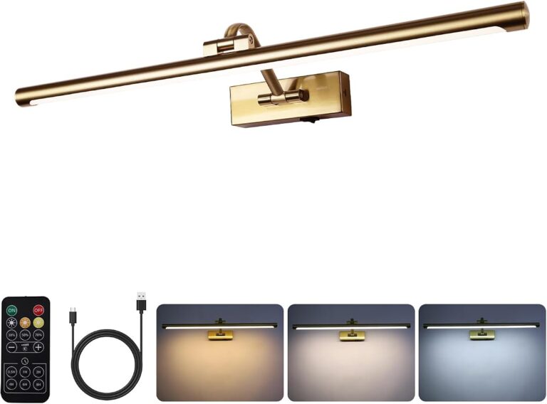
A picture light is both a lighting tool and a decorative object. The finish should connect with nearby elements such as the frame, mirror hardware, cabinet pulls, or other wall sconces. Brass and bronze usually feel warmer and more traditional. Nickel and black finishes often read cleaner and more contemporary.
Profile matters too. A slim, understated bar can disappear into a minimalist room, while a more sculptural arm and shade can add character in a formal hallway or library. If the frame is ornate, the light should support it rather than compete with it.
How to Match a Dimmable Picture Light to Your Artwork and Wall Layout
Once you know the style direction, focus on fit and coverage. This is where a good-looking fixture becomes a useful one.
Recommended light width for small, medium, and oversized pieces
Small framed works generally suit compact picture lights that do not extend too far beyond the frame edges. Medium pieces are the easiest to pair because there are more fixture widths available. Oversized art often needs a longer light bar or, in some layouts, a pair of fixtures for balanced coverage.
If you are working with a large canvas or poster, be careful not to undersize the light. A short fixture above a wide piece can make the center bright and the sides dull. On the other hand, with a delicate sketch or narrow portrait, a broad fixture can feel visually top-heavy.
| Artwork Size | Best For | Key Consideration |
|---|---|---|
| Small | Compact lights above single frames | Keep the fixture visually lighter than the frame |
| Medium | Most living room and hallway art | Look for balanced width and adjustable projection |
| Oversized | Statement art and wide pieces | Check beam spread carefully to avoid dark edges |
Placement height, projection, and beam spread for even coverage
Placement affects glare more than many buyers expect. The fixture is usually mounted above the frame, but the exact distance varies by design, artwork height, and whether the head is adjustable. Too high, and the light may wash the wall more than the art. Too low, and the fixture can crowd the frame or create a harsh hot spot across the top edge.
Projection is the distance the fixture extends from the wall. More projection can improve coverage on deeper frames and reduce concentrated bright bands near the top of the artwork. Beam spread matters as well: a wider spread gives gentler, more even illumination, while a narrow spread feels more dramatic but less forgiving.
If your artwork is glazed, prioritize an adjustable head or arm. Small angle changes can make a big difference in reducing reflections from glass or acrylic.
Spacing considerations for pairs, salon hangs, and gallery walls
Single centered fixtures are the easiest option, but they are not the only one. Pairs can work beautifully above extra-wide art, long shelves, or symmetrical wall compositions. The goal is even coverage without obvious overlap lines or distracting bright zones.
For salon hangs and gallery walls, decide whether you are lighting one hero piece or the whole arrangement. If the wall is dense with frames, a single picture light may not distribute light evenly enough across the grouping. In some cases, directional wall lighting or a different layered scheme will work better. If your display is more about arrangement than individual spotlighting, our article on how to create a record cover gallery wall may help with layout thinking before you choose the light.
Brightness, Colour Temperature, and Dimming: The Specifications That Matter Most
Specifications are where many attractive fixtures separate into good choices and poor ones. You do not need to memorize technical language, but you do need to know what affects the look of art on the wall.
How many lumens you need for subtle accent light versus display lighting
Lumens describe visible brightness. Lower-lumen picture lights tend to create a soft decorative glow, which works well in relaxed rooms and evening use. Higher-lumen models are better when you want the artwork to read clearly from across the room or when the wall is otherwise dim.
The right brightness depends on artwork size, wall color, ambient light, and how much contrast you want. Dark walls usually absorb more light, while pale walls reflect it. This is exactly why dimming matters: it lets you fine-tune the effect instead of being stuck with a single output that feels too strong at night.
Warm white or neutral white: choosing the right Kelvin range for art and interiors
Color temperature changes the mood of both the art and the room. Warm white usually feels softer, more residential, and more flattering with traditional interiors, wood frames, and layered ambient lighting. Neutral white can reveal detail more crisply and may suit contemporary spaces or black-and-white photography.
There is no single perfect Kelvin rating for every home. Warmer light can make whites look creamier and reduce starkness. Cooler or more neutral light can sharpen contrast but may feel clinical if pushed too far. For most everyday interiors, the safest route is a light that feels natural with your existing lamps and ceiling lighting rather than one that stands apart from them.
LED quality, colour rendering, and smooth low-level dimming
LED quality matters just as much as brightness. A better LED source typically gives more accurate color rendering, which means the tones in the artwork look truer and less muddy. Manufacturer specifications may mention CRI or color rendering information; if they do, that is worth checking.
Driver quality matters too. A poor driver can cause flicker, stepping, buzzing, or inconsistent dimming at low levels. Those issues are especially noticeable with picture lights because they are often used in quiet rooms and dimmed for atmosphere.
- Check whether the LED is integrated or replaceable
- Confirm the dimming method before ordering
- Look for clear color temperature and light output details
- Assuming every LED dimmer works with every fixture
- Choosing the brightest model by default
- Ignoring glare on glazed or glossy artwork
Wired, Plug-In, or Rechargeable: Choosing the Right Power Source for Your Room
The right power source depends less on style and more on how permanent the installation should be. Think about whether you want a long-term lighting plan or a flexible decorative upgrade.
Best uses for hardwired picture lights in permanent schemes
Hardwired picture lights usually look the most built-in and polished. They are a strong choice for formal rooms, custom millwork, renovated spaces, and anywhere you want the fixture to feel like part of the architecture.
The tradeoff is planning. Hardwired lighting typically requires more coordination with wall finish, switch placement, and electrical access. It is best suited to homeowners or larger decorating projects where permanence is a benefit rather than a limitation.
When plug-in designs make more sense for flexible styling
Plug-in picture lights are often the most practical middle ground. They offer a more substantial look than many battery options, but they are easier to install and change later than hardwired fixtures. This makes them useful for renters, evolving gallery walls, and rooms where furniture layouts may shift.
The main challenge is cable visibility. Some plug-in designs manage this elegantly with fabric cords or neat routing, while others look less refined if the outlet is awkwardly placed.
Battery and rechargeable options: convenience, compromises, and maintenance
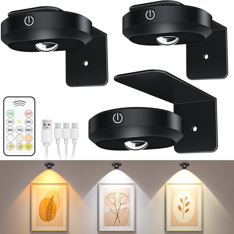
Battery-powered and rechargeable picture lights are appealing because they avoid rewiring and visible cords. They are especially useful where outlets are poorly placed or where you want to test the picture-light look before committing to a permanent fixture.
However, convenience comes with tradeoffs. Brightness, runtime, charging frequency, and dimming behavior can vary widely by model. If you are considering this route, it helps to understand the practical case for using a battery-operated picture light and to confirm expected charging details on the product page.
Safety basics for installation, cable routing, and wall type
Always check the wall type, the fixture weight, and the hardware included. Masonry, plaster, drywall, and paneling all behave differently, and not every fixing method suits every surface. If a fixture is heavy, valuable artwork sits below it, or electrical changes are involved, professional installation is the safer route.
Do not guess on anchors, wiring, or load limits. Confirm wall suitability, follow the manufacturer instructions, and use a qualified installer for hardwired work or uncertain wall conditions.
Which Rooms Suit a Dimmable Picture Wall Light Best
Picture lights are not only for formal art rooms. They can work in many everyday interiors when the scale and mood are right.
Living rooms, dining rooms, hallways, and bedrooms
Living rooms are the most natural fit because they benefit from layered evening lighting and often have a main art wall. Dining rooms also suit picture lights well, especially when you want a softer perimeter glow around a table setting. Hallways can feel more finished with lit artwork, particularly in darker passages where ceiling lighting alone feels flat.
Bedrooms can work too, but the light should stay gentle and warm rather than sharp or gallery-bright. In this setting, dimming is especially valuable because the fixture may be used more for mood than display clarity.
Period homes versus contemporary interiors
Period homes often suit classic metal finishes, curved arms, and slightly decorative silhouettes. These details can echo cornicing, antique frames, and traditional joinery. Contemporary interiors usually benefit from simpler bars, matte finishes, and cleaner geometry.
That said, contrast can work. A sleek black fixture above an antique oil painting can feel fresh, while a warm brass light can soften a minimalist room. The key is making the light feel intentional, not accidental.
When a picture light works better than ceiling or table lighting
Picture lights are especially useful when overhead lighting creates glare, shadows, or a generally flat effect. They also help when a console table or sideboard needs visual emphasis but table lamps would take up too much surface space.
They are less useful when the wall display changes constantly or when the room already has excellent directional lighting aimed exactly where you need it.
Materials, Finishes, and Styling Ideas for a Cohesive Look
Once the technical decisions are covered, styling is what makes the fixture feel integrated with the room.
Brass, bronze, nickel, and painted finishes
Brass tends to add warmth and a collected look. Bronze often feels deeper, moodier, and slightly more traditional. Nickel can read crisp and tailored, especially near cooler-toned frames or hardware. Painted finishes, including black or wall-matched colors, are useful when you want the fixture to recede.
Finish appearance can vary by brand and by whether the metal is lacquered, brushed, polished, or patinated, so it is worth checking finish descriptions and close-up images carefully.
Matching the light with frames, hardware, and existing decor
You do not need an exact metal match, but you do want a visual relationship. A warm brass fixture usually sits comfortably with walnut, oak, linen shades, and antique-style frames. Black works well with graphic prints, slim gallery frames, and modern hardware. Nickel suits cooler palettes, stone surfaces, and tailored interiors.
If the frame is already visually strong, choose a quieter light. If the frame is simple, the fixture can carry a little more decorative interest.
- Repeat the fixture finish elsewhere in the room through hardware, mirror frames, or lamp bases.
- Use a slimmer picture light above narrow frames so the artwork stays dominant.
- On dark walls, a warm metal finish can help the fixture read as intentional rather than disappearing entirely.
Layering picture lights with ambient and task lighting
A picture light works best as part of a layered lighting plan. It should complement floor lamps, sconces, table lamps, or ceiling fixtures rather than trying to light the whole room on its own. This layered approach gives the room depth and lets the artwork glow without becoming the only bright point in view.
In practical terms, that means dimming the picture light into balance with the surrounding light sources. If it is much brighter than everything else, the room can feel visually lopsided.
Common Mistakes, Limitations, and Ongoing Care
Even a well-chosen picture light has limits. Knowing them helps you buy more realistically and avoid disappointment.
Glare, hotspots, and choosing a light that is too bright or too cool
Glare is one of the biggest issues with picture lighting, especially on glossy paper, glass, or acrylic glazing. Hotspots happen when the beam is too concentrated or the fixture is too close to the artwork. A light that is too cool can flatten warm tones and make a cozy room feel harsher than intended.
These problems are often linked. Buyers sometimes overcorrect by choosing a brighter, cooler fixture, assuming it will look more “professional,” when in a home setting it can simply feel uncomfortable.
Ignoring driver quality, dimmer pairing, and artwork sensitivity
Low-quality drivers and poor dimmer pairing can lead to flicker, buzzing, or uneven dimming. That is not just annoying; it can make the light feel cheap even when the fixture body looks expensive. Confirm compatibility and installation notes before purchase, especially with integrated LED models.
Also think about the artwork itself. Delicate works on paper, textiles, and older pieces may be more sensitive to prolonged light exposure. If preservation matters, check framing and conservation guidance and avoid leaving any art light on unnecessarily for long periods.
Cleaning, bulb or LED maintenance, and long-term upkeep
Maintenance is usually simple, but it still matters. Dust the fixture regularly with a soft dry cloth and avoid harsh cleaners that can damage lacquered or painted finishes. For models with replaceable bulbs, confirm the correct bulb type before buying extras. For integrated LED fixtures, check the manufacturer information on lifespan, serviceability, and warranty terms.
Rechargeable models need a different kind of upkeep: keeping charging routines realistic. If that sounds convenient now, make sure it will still feel convenient in six months.
Are Dimmable Picture Wall Lights Worth It in 2026?
For many homes, yes. A dimmable picture wall light adds focused atmosphere, gives artwork a more intentional presence, and offers more flexibility than a fixed-output fixture. In 2026, the strongest value comes from models that combine good LED quality, reliable dimming, and a finish that genuinely suits the room rather than chasing novelty.
Where they offer the most value in everyday interiors
They offer the most value in rooms where artwork is part of the daily visual experience: above a mantel, over a console, along a hallway, or behind a dining table. They are also worthwhile when you want evening ambiance without relying only on ceiling lighting.
Who should invest, who can skip them, and the best final approach
Invest if you have framed art you want to highlight properly, a room that benefits from layered lighting, and a clear idea of placement and power source. Skip them if your wall layout changes constantly, your artwork is temporary, or you mainly need general room lighting rather than focused display lighting.
The best final approach is simple: choose the right width for the framed piece, verify the dimming system and LED specifications, and select the least visually intrusive power source that suits your room. If you confirm those details on the official product listing before buying, you are far more likely to end up with a picture light that looks refined and works well long term.
- Match the fixture width to the artwork, not the wall.
- Check dimming method, driver details, and LED quality before ordering.
- Use warm or neutral light that suits both the art and the room.
- Choose hardwired, plug-in, or rechargeable power based on permanence and practicality.
- Prioritize even coverage and low glare over maximum brightness.
Frequently Asked Questions


One Comment