Dimmable Picture Wall Light Installation

Install a dimmable picture wall light by centering it above the artwork, matching the fixture width and beam coverage to the frame, and choosing a power source that suits your wall. The best results come from balanced brightness, the right color temperature, and safe mounting for your wall type.
dimmable picture wall light installation starts with three decisions: where the light will sit, how much of the artwork it needs to cover, and which power source fits your wall and room. Get those right first, and the rest of the process becomes far more straightforward, whether you are lighting a single framed print or a larger gallery-style arrangement.
- Placement first: Center the light to the artwork, not the furniture or wall width.
- Size matters: Match fixture width and projection to the frame for even coverage.
- Buy by specs: Check lumens, color temperature, CRI, and dimming controls before ordering.
- Power choice: Hardwired looks cleanest, plug-in is flexible, and rechargeable is easiest to install.
- Safety counts: Use suitable fixings, verify wall type, and get electrical help when needed.
How to Install a Dimmable Picture Wall Light: The Essentials First
A picture light should make art easier to see, not turn it into a spotlight problem. Before buying or mounting anything, think about the artwork’s width, the frame depth, the wall material, and whether you want a permanent electrical solution or a simpler renter-friendly one. If you need a broader primer on features and terminology, this guide to what a dimmable picture wall light is can help clarify the basics.
Choosing the right position above artwork
The standard placement is centered above the frame, with the fixture aligned to the artwork rather than to nearby furniture. That sounds obvious, but in real rooms the eye often gets pulled by a mantel, console, or ceiling line. If the light is not centered to the frame, even a beautiful fixture can make the whole arrangement feel slightly off.
For a single piece, aim to place the light so its center point matches the horizontal center of the artwork. For a diptych or two-part set, you can either center one longer fixture over the full combined width or use two matching lights if the pieces are spaced widely apart. In gallery walls, the best result usually comes from lighting the visual grouping rather than trying to force a small light over every frame.
Mark the artwork center and the proposed light center with painter’s tape before drilling or fixing anything. It is a quick way to spot alignment issues from across the room.
Setting safe height, projection, and beam coverage
Height and projection determine whether the light washes the art evenly or creates glare on the glass. Most picture lights are installed a short distance above the top edge of the frame, but the ideal gap varies by fixture design, arm projection, and beam spread. A shallow fixture mounted too high can leave the lower half of the artwork dim, while a deep projecting fixture mounted too close can create a bright band at the top.
As a rule of thumb, smaller frames usually need a tighter relationship between frame and fixture, while larger artworks benefit from a little more breathing room. Always compare the manufacturer’s stated projection and recommended coverage to your frame size. If the product listing does not explain beam spread clearly, that is a sign to ask for more information before buying.
Also consider reflective surfaces. Glossy photography, glazed prints, and metallic finishes tend to show hotspots sooner than matte canvas or textured paper. In those cases, a softer beam and careful dimming matter as much as raw brightness.
Deciding between hardwired, plug-in, and rechargeable options
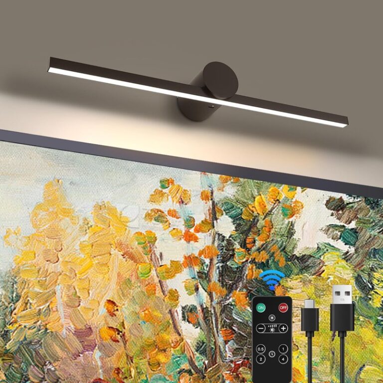
There are three main installation paths. Hardwired picture lights connect into the wall’s electrical system and offer the cleanest finished look, especially in formal rooms and long-term homes. Plug-in models are easier to install and easier to move, but they require visible cable planning. Rechargeable and battery-powered lights avoid wiring entirely, though output and runtime can vary a lot by model.
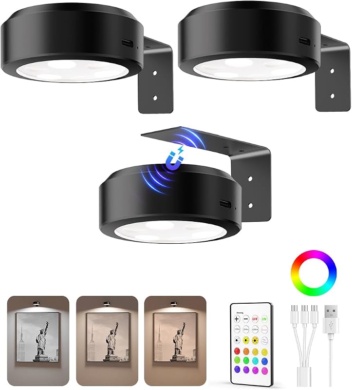
If you are comparing cordless options specifically, it is worth reviewing examples of rechargeable picture lights before you decide. They can be excellent for renters, seasonal styling, or walls where wiring is impractical, but they are not always the best fit for very large or heavily detailed artwork.
What to Look for Before Buying a Dimmable Picture Wall Light
Installation goes more smoothly when the fixture actually suits the art. A well-made light with the wrong brightness, color temperature, or dimming system can still disappoint once it is on the wall.
Brightness in lumens and how much light artwork really needs
Lumens tell you how much visible light the fixture produces. For picture lighting, more is not automatically better. A small framed sketch in a quiet hallway may need only modest illumination, while a large dark-toned oil painting in a living room with layered ambient lighting may need more output to stand out in the evening.
The right brightness depends on artwork size, surface reflectivity, wall color, and how much other light is in the room. Very bright picture lights can flatten subtle textures and make glass reflections more noticeable. A dimmable model gives you room to tune the effect rather than living with a single fixed intensity.
Colour temperature for oils, prints, photography, and mixed-media pieces
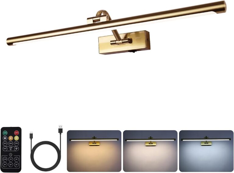
Color temperature affects how warm or cool the art appears. Warmer light often flatters traditional interiors, gilt frames, oil paintings, and earthy palettes. Cooler light can suit black-and-white photography, contemporary prints, and crisp minimalist rooms. Many buyers land in the middle because neutral light tends to feel balanced across different media.
There is no universal best setting for every piece. A sepia print, a bright abstract, and a textured textile work can all respond differently under the same lamp. If you collect mixed media or rotate art seasonally, a model with adjustable color temperature can offer more flexibility than a fixed-tone fixture.
Dimming range, controls, and memory settings
Dimmable does not always mean finely adjustable. Some fixtures offer a smooth range from very low glow to full brightness, while others step through a few preset levels. That difference matters if you want the light to feel subtle at night but still strong enough to highlight details when entertaining.
Control method matters too. Wall dimmers can feel seamless in hardwired setups, while remote controls and touch controls are common on plug-in and cordless models. Memory settings are especially useful if you do not want to reset the brightness every evening. If remote operation is a priority, browsing options with remote-based controls can help narrow the field; Hurrell Editions has a separate guide to picture lights with remote control.
CRI, glare control, and even light distribution
CRI, or color rendering index, indicates how accurately a light reveals colors compared with a natural reference source. For artwork, higher color accuracy is generally preferable because it helps preserve the intended look of pigments, inks, and tonal variation. If the product listing includes CRI, it is worth paying attention to.
Glare control is just as important. A fixture with poor shielding or an overly harsh beam can produce bright streaks near the top of the frame or reflections on glazing. Even light distribution is the goal: enough brightness to reveal detail, but soft enough that the art still feels natural.
- Check the fixture width against your frame width, not just the wall space.
- Confirm lumens, color temperature, CRI, and dimming method in the official specifications.
- Review whether wall fixings, remote controls, batteries, or chargers are included.
- Verify whether the model is hardwired, plug-in, battery-operated, or rechargeable.
Placement, Sizing, and Spacing for Different Artwork and Wall Layouts
Picture lights look best when they feel proportionate to the frame and intentional within the wider wall composition.
Matching light width to frame width
A common guideline is to choose a fixture narrower than the frame, often around half to two-thirds of the artwork width for many standard setups. That is not a hard rule, but it is a useful starting point. A fixture that is too short may create a narrow pool of light, while one that is too long can dominate the art visually.
Very wide artworks may need a larger fixture, dual fixtures, or a model specifically designed for broader beam coverage. Narrow portraits and small studies usually benefit from a more restrained fitting so the hardware does not overpower the piece.
Recommended distance from the top of the frame
The gap between the top of the frame and the light body often determines whether the setup looks elegant or awkward. Too close, and the fixture can feel cramped. Too far, and it can seem disconnected from the artwork while reducing effective coverage. Because frame depth and fixture arm design vary, the safest approach is to dry-position the light first and view it from standing and seated angles.
Rooms with high ceilings can tempt people to mount everything too high. Resist that. The light should relate to the art, not disappear into the wall space above it.
Single artworks, diptychs, and gallery wall arrangements
Single artworks are the simplest case: center the light and size it proportionally. Diptychs need a little more judgment. If the two frames read as one visual composition, one wider fixture often looks cleaner. If they are intentionally separate with generous spacing, two smaller fixtures can preserve that rhythm.
Gallery walls are trickier. Instead of trying to light every frame individually, think about focal hierarchy. One or two lights placed over the most important pieces can anchor the arrangement without making the wall feel crowded. If your wall is more of a collage layout, this article on picture frames collage wall decor is useful for thinking through spacing and visual balance before adding lighting.
Wall type, fixing points, and suitable hanging hardware
Wall construction matters as much as fixture style. Plaster, drywall, masonry, paneling, and older period walls all require different fixing approaches. Do not assume the supplied hardware suits every wall. Always confirm weight support, fixing compatibility, and whether the light should be mounted into a stud, a secure anchor, or another suitable support point.
If the artwork itself is also being rehung, coordinate the picture hook position and the light placement together. That avoids ending up with a correctly mounted light over a poorly placed frame.
Do not guess on wall anchors or electrical routing. If the wall type is unclear, the fixture is heavy, or wiring may be hidden behind the mounting area, check with a qualified installer or electrician before drilling.
Power Source and Safety Basics for a Reliable Installation
The right power source depends on how permanent you want the installation to be and how much light output you expect.
When hardwiring makes sense in period and contemporary homes
Hardwiring makes the most sense when you want a built-in look and are already renovating, redecorating, or adding wall lighting elsewhere. In period homes, it can complement traditional picture rails, classic frames, and library-style rooms. In contemporary interiors, it keeps the wall line clean and uncluttered.
The trade-off is complexity. Hardwired installation may require electrical planning, patching, and a professional electrician, especially if no existing wall feed is nearby. It is usually the least flexible option if you plan to move the artwork later.
Plug-in installations for renters and flexible room styling
Plug-in models are often the practical middle ground. They provide steady power without opening the wall, and they can be moved with the art if your layout changes. The main design challenge is cable management. A visible cord can look casual and contemporary in some settings, but it can also distract from a formal framed piece if it is left to hang loosely.
Look for ways to route the cable neatly along trim, shelving, or paint lines, and always follow the maker’s instructions for safe use. Avoid stretching cords across walkways or placing them where furniture can pinch them.
Battery or rechargeable models: convenience versus output
Battery and rechargeable picture lights are the easiest to install because they avoid wiring completely. That convenience makes them especially appealing for rental homes, narrow hallways, and walls where a hardwired fixture would be disproportionate. They are also useful for occasional evening ambience rather than long daily runtime.
The compromise is usually runtime, charging frequency, or maximum brightness. Some perform beautifully on smaller works and accent use, while others may struggle to illuminate a large dark painting evenly. Always confirm charging method, expected runtime, and whether replacement batteries are needed.
Load, cable routing, moisture zones, and electrician considerations
Safety comes down to respecting the wall, the electrical setup, and the room conditions. Heavy fixtures need secure support. Cables should not be trapped, sharply bent, or run in unsafe ways. Moisture-prone areas need extra caution, and not every picture light is suitable for bathrooms or similar zones.
If you are considering art lighting near a sink, bath, or humid room, verify the product’s location suitability and any local code requirements first. Manufacturer instructions and a licensed electrician should guide those decisions, not guesswork.
Which Rooms Suit a Dimmable Picture Wall Light Best
Picture lights are surprisingly versatile, but they are not equally useful in every room.
Living rooms, dining rooms, hallways, bedrooms, and studies
Living rooms are one of the strongest settings because picture lights add both focal emphasis and evening atmosphere. Dining rooms benefit in a similar way, especially where lower light levels make artwork disappear after sunset. Hallways often gain the most from compact fixtures because wall art in transitional spaces can otherwise feel underlit.
Bedrooms and studies can also work beautifully, though the mood should usually be softer. For room-specific inspiration, Hurrell Editions has separate guides to the best picture lights for bedrooms and options suited to hallways, smaller walls, and living spaces.
How to match finishes with existing decor, frames, and hardware
The finish should connect with something already in the room: the frame, cabinet hardware, curtain rods, mirror trim, or nearby sconces. Matching everything exactly is not required, but the fixture should feel intentional. A warm brass light can enrich traditional oils and antique-style frames, while matte black often suits modern prints and graphic photography.
Nickel and chrome tend to feel cooler and cleaner, which works well in contemporary interiors or rooms with mixed metals. Bronze can bridge classic and rustic spaces without feeling overly ornate.
When a picture light works better than ceiling or accent lighting
Ceiling lighting often floods a room, but it does not always reveal art well. Recessed lights can miss the frame entirely or create directional glare, especially on glazed pieces. Accent lamps and floor lamps may add atmosphere without truly lighting the artwork.
A picture light works better when the goal is targeted, controllable illumination tied directly to the art. If you are still deciding whether this category is worth adding at all, a broader discussion of whether picture lights are worth it can help frame the trade-offs.
Styling Ideas: Making Artwork, Frames, and Walls Feel Cohesive
Good picture lighting should feel like part of the room’s composition, not an afterthought clipped on above it.
Classic, modern, and gallery-inspired looks
Classic interiors usually suit symmetrical placement, warmer finishes, and framed art with a clear focal role above a mantel, sideboard, or writing desk. Modern spaces often look best with slimmer profiles, simpler lines, and a restrained glow that highlights the art without adding visual clutter.
Gallery-inspired rooms can take a more curated approach. One statement light over a hero piece can give the wall a collected feel, while the surrounding art remains unlit but visually connected.
Pairing brass, bronze, black, or nickel finishes with art and interiors
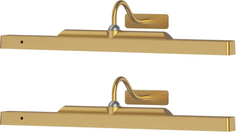
Brass tends to flatter warm palettes, traditional portraiture, and layered vintage decor. Bronze feels softer and slightly moodier, making it a good fit for textured walls, darker paint colors, and old-world frames. Black works well when you want the fixture to recede visually while still giving graphic definition. Nickel can feel crisp and tailored, especially with monochrome photography or pale wall colors.
Using dimming to shift from daytime display to evening ambience
This is where dimmable models justify themselves. In daylight, you may want just enough output to keep the artwork legible against ambient room brightness. In the evening, that same fixture can become part of the room’s mood lighting, especially in living rooms, dining spaces, and bedrooms.
The best effect is usually subtle. Instead of pushing the light to full output every night, lower it until the art feels present and inviting without becoming the brightest thing in the room.
Common Installation Mistakes, Limitations, and Long-Term Care
Even a good fixture can disappoint if it is mounted carelessly or maintained poorly over time.
Overlighting, hotspots, and choosing the wrong colour temperature
The most common mistake is using too much light. Overlighting can wash out delicate tones, exaggerate glare, and make art feel theatrical in the wrong way. Hotspots usually come from a fixture that is too narrow, too bright, or mounted at the wrong distance from the frame.
Color temperature mistakes are subtler but just as common. A cool white light can make warm-toned art feel flat, while an overly warm lamp can muddy crisp photographic detail. If the fixture offers adjustability, test different settings before settling on one permanent look.
Misaligned mounting, poor spacing, and ignoring wall construction
Small alignment errors are easy to notice once the light is switched on. A fixture that is even slightly off-center will draw the eye immediately. Poor spacing above the frame can also make the installation look improvised rather than designed.
Ignoring wall construction is the bigger practical problem. Unsuitable fixings, weak anchors, or rushed drilling can lead to loose mounts and damaged walls. Always work from the actual wall type and the official installation instructions.
Cleaning finishes, checking fixings, and maintaining dimmers and batteries
Routine care is simple but worth doing. Dust the fixture gently, avoid abrasive cleaners, and follow any finish-specific care guidance from the manufacturer. Periodically check that screws, brackets, and mounting points remain secure, especially on frequently used doors or vibration-prone walls nearby.
For cordless models, keep an eye on charging cycles, battery condition, and remote responsiveness. If dimming becomes inconsistent or flickering appears, confirm whether the issue relates to the power source, the dimmer compatibility, or the lamp’s own electronics before replacing the whole fixture.
- Center the fixture to the artwork, not the furniture below it.
- Confirm beam coverage, projection, and dimming type before buying.
- Use wall-appropriate fixings and professional help when wiring is involved.
- Choosing the brightest model just to be safe.
- Mounting too high above the frame.
- Assuming all battery or rechargeable lights suit large artworks equally well.
Are Dimmable Picture Wall Lights Worth It? Value, Trade-Offs, and Final Recommendation
Dimmable picture lights are usually worth it for anyone who wants artwork to stay visible and atmospheric after dark, especially in rooms where ceiling lighting does not flatter framed pieces. The biggest benefits go to art lovers with reflective glazing, mixed media collections, or spaces that shift from practical daytime use to softer evening mood.
Who benefits most from adjustable picture lighting
Homeowners styling permanent art walls, renters who want a polished but removable lighting solution, and anyone displaying meaningful pieces in low-light rooms will get the most value. Dimming is particularly helpful where one artwork needs to perform differently across the day rather than stay at a single fixed brightness.
When a non-dimmable or alternative art-lighting solution may be better
If the artwork is small, lightly viewed, or already well lit by dedicated accent lighting, a non-dimmable fixture may be enough. In some rooms, a nearby wall sconce, track light, or carefully aimed ceiling light can provide simpler coverage with fewer installation decisions. Very temporary displays may also be better served by lightweight cordless options or even shelf-based lighting rather than a formal wall-mounted picture light.
A balanced verdict for 2026 interiors
For 2026 interiors, the strongest case for a dimmable picture wall light is flexibility. Choose one only after checking width, beam coverage, color quality, and power source against your actual frame and wall. If you want the cleanest look and use the artwork daily, hardwired or well-planned plug-in models are the most dependable choices; if you need convenience and minimal disruption, rechargeable designs are often the better fit, provided you accept the limits on runtime and sometimes output.
Frequently Asked Questions