Gallery Wall with Black Frames: Layout, Art Pairings & Styling Tips
A gallery wall with black frames feels fresh because it adds structure, contrast, and cohesion without overpowering the room. The best results come from thoughtful art choices, balanced spacing, and finishes that suit the light and mood of your space.
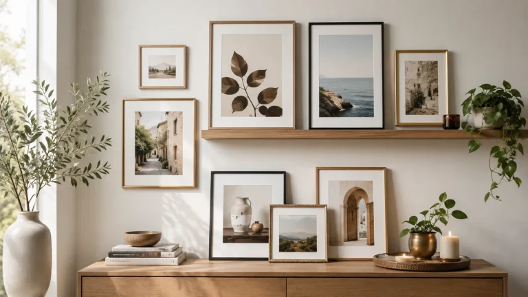
A gallery wall with black frames has a way of feeling both timeless and current. In 2026, it remains one of the easiest ways to make a room look considered, personal, and quietly polished without losing warmth.
What makes this look endure is its flexibility. Black frames can sharpen photography, ground color-rich prints, and bring order to a mix of art, books, and collected objects. When chosen with care, they create structure without turning a home into a showroom.
- Best use: Black frames unify mixed art styles and keep walls looking intentional.
- Layout matters: Spacing and scale are as important as the frames themselves.
- Finish choice: Matte is easiest for glare; glossy is bolder and more reflective.
- Room fit: Black frames suit modern, Scandinavian, industrial, and eclectic interiors.
- Care counts: Protect prints from sun, humidity, and dust for long-term display.
Why a Gallery Wall with Black Frames Still Feels Fresh in 2026
Reader intent: what people want from this look now
Most people searching for this style want more than a basic arrangement of frames. They want a wall that feels elevated, easy to live with, and adaptable to changing art, rooms, and budgets.
That usually means a look that can handle real-life interiors: a sofa wall that needs balance, a hallway that needs rhythm, or a reading nook that needs personality. Black frames answer that brief well because they are visually clear without being flashy.
How black frames shift a room from casual to curated
Black frames act like a visual outline. They define each artwork, helping a wall read as a composition rather than a random collection of prints.
That outline is especially useful in rooms with mixed decor. A stack of family photos, a botanical print, and an abstract can feel intentional when the frame language is consistent.
If you are building from scratch, a coordinated set can save time and reduce guesswork. Our guide to gallery wall frame sets is a useful starting point for understanding how frame size, finish, and layout work together.
Choosing the Right Art for Black Frames
Photography, line art, abstracts, and book-inspired prints
Black frames are especially flattering to photography, particularly black-and-white images, architectural scenes, and portraits with strong tonal contrast. They also suit line art because the frame reinforces the clean edges of the drawing.
Abstracts can work beautifully too, especially when the palette includes one or two recurring colors. Book-inspired prints, literary quotes, or vintage cover art can add character for readers who want their walls to reflect their shelves.
A small set of monochrome photography prints paired with one typographic artwork can create a wall that feels collected over time, not assembled in one afternoon. The key is to let one piece lead and let the others support it.
Curator recommendations for mixing subjects without visual clutter
The safest way to mix subjects is to keep one unifying thread. That might be a shared color palette, a repeated paper tone, similar matting, or a consistent frame width.
If you love variety, limit the number of competing focal points. Three strong styles are usually easier to balance than six. For example, photography, line art, and one abstract can feel layered without becoming noisy.
- Black-and-white photography
- Minimal line drawings
- Editorial prints and typography
- You want a very soft, rustic mood
- Your artwork already has heavy black borders
- You prefer a highly textural, handmade feel
If your wall includes canvas art, frame style matters even more. See our guides to frames for canvas art and best floating frames for canvas for more context on when a frame should disappear and when it should define the piece.
Scale, matting, and print finish considerations
Black frames are most elegant when scale is handled carefully. Small prints often benefit from generous matting, which gives the eye room to rest and keeps the wall from feeling cramped.
Matte paper usually looks softer and more refined under black frames, while glossy finishes can feel sharper and more contemporary. Neither is universally better; the right choice depends on the room’s light and the mood you want.
If your room gets strong afternoon sun, matte paper and anti-glare glazing can reduce reflections. In darker rooms, a slightly richer finish may help artwork feel more luminous.
Designing the Layout: Balance, Rhythm, and Negative Space
Classic grid, salon wall, and asymmetrical arrangements
A grid is the most disciplined option. It works well with black frames because the repeated outline creates a clean architectural effect, especially in modern homes.
A salon wall feels more expressive and collected. It suits a mix of art sizes and subjects, but it needs a clear logic so the arrangement reads as curated rather than crowded. An asymmetrical layout sits between the two, offering flexibility with a more relaxed mood.
| Option | Best For | Note |
|---|---|---|
| Grid | Minimal, modern interiors | Best when frame sizes are consistent |
| Salon wall | Collected, eclectic rooms | Needs careful spacing and a unifying thread |
| Asymmetrical | Casual but intentional spaces | Works well around furniture and corners |
How to plan around sofas, staircases, consoles, and reading nooks
Over a sofa, the wall should usually feel anchored by the furniture below it. A wide arrangement with balanced outer edges tends to look calmer than a cluster that floats too high.
On staircases, follow the rise of the architecture rather than forcing a strict grid. Consoles and reading nooks are ideal places for smaller compositions, where black frames can add definition without dominating the room.
Choose the artwork or frame that will set the scale, then build outward from it.
Lay the arrangement on the floor or use paper templates to check the overall shape.
Allow enough negative space so the wall feels composed, not packed.
Spacing rules that keep black frames looking intentional
Spacing is where many gallery walls lose their polish. Too little space makes black frames feel heavy; too much makes them feel disconnected.
A consistent gap between frames usually looks best, even if the art sizes vary. The eye reads repetition as intention, and black frames reward that discipline.
When in doubt, choose slightly more negative space than you think you need. Black frames already provide strong edges, so the wall often feels more elegant when the composition can breathe.
Black Frames and Interior Style: Matching the Mood of the Room
Minimalist, modern, Scandinavian, industrial, and eclectic interiors
Black frames are almost effortless in minimalist and modern rooms because they echo the clean lines already present. In Scandinavian interiors, they add contrast without disturbing the light, airy mood.
Industrial spaces often welcome black frames naturally, especially with exposed brick, steel, or raw timber. In eclectic rooms, they can act as the unifying element that keeps the mix of art and objects from drifting apart.
When black frames add contrast versus when they feel too stark
Black frames add contrast beautifully when a room has soft walls, pale furniture, or lots of natural texture. They can be especially effective in spaces that need a little structure.
They may feel too stark if the room already relies on high contrast, glossy finishes, or very dark furniture. In that case, a slimmer frame profile, softer matting, or a slightly warmer art palette can ease the effect.
Black is often used in display design because it creates a visual boundary without competing with the image itself. That is one reason black frames remain so dependable in gallery walls.
Lighting effects: natural light, warm lamps, and spotlighting artwork
Lighting changes everything. In daylight, black frames can look crisp and architectural. Under warm lamps, they often feel softer and more intimate.
Spotlighting can be useful for a focal work, but it should be subtle. Harsh lighting can flatten the art and make glare more noticeable, especially with glass-fronted frames.
Materials, Finishes, and Price Context for Gallery Wall Sets
Matte black, satin black, and glossy frame finishes
Matte black is the most forgiving and often the easiest to live with. It minimizes reflection and tends to read as modern and refined.
Satin black offers a little more depth and can feel slightly warmer. Glossy black is more dramatic and can work well in contemporary interiors, though it is less discreet and shows fingerprints more readily.
- Matte finishes reduce glare
- Satin finishes balance softness and depth
- Glossy finishes create a bolder statement
Wood, metal, and composite frame trade-offs
Wood frames often bring a gentler presence, even when painted black. They can feel a little warmer and more organic than metal, which tends to look sharper and more contemporary.
Composite frames are common in entry-level sets and can be a practical choice for larger walls or first-time decorators. Metal frames may cost more, but they often feel slimmer and more architectural.
- Weight and wall support
- Finish durability
- How much glare the glass creates
- Whether the room needs warmth or precision
What to expect at entry, mid, and premium price points in 2026
At entry level, you can usually expect simpler materials, lighter construction, and fewer finish options. These sets can still look good, especially in smaller arrangements or renter-friendly spaces.
Mid-range options typically offer better frame depth, more consistent finishes, and improved glazing or matting choices. Premium pieces may use higher-quality wood, refined metalwork, archival materials, or custom sizing.
For gift buyers and decorators comparing art-led presents with decorative objects, our article on art book gift vs wall decor gift offers a helpful way to think about value, longevity, and personal taste.
Creative Styling Ideas for Art-Loving Homes
Pairing black frames with books, objects, and collected ephemera
Black frames work especially well in homes where art and books share the same visual conversation. A wall near shelving can echo the dark spines of books, while a framed print can give structure to a softer, layered corner.
Collected ephemera such as postcards, exhibition flyers, letters, or vintage paper goods can look wonderful when framed consistently. The black outline keeps these smaller items from feeling lost.
Using monochrome, color-pop, or mixed-media artwork for impact
Monochrome artwork creates a calm, editorial mood. It is the easiest route if you want the wall to feel cohesive and restrained.
Color-pop art introduces energy and personality. Mixed-media pieces can be especially compelling in black frames, but they need enough breathing room so texture and detail remain visible rather than crowded.
Think of the wall as a visual conversation: one quiet voice, one bright remark, and one or two supporting details. Black frames help each piece speak clearly without raising the volume.
If you like a more playful, music-led approach, you may also enjoy our guide on how to create a record cover gallery wall, which shows how a strong frame language can unify bold cover art.
Giftable gallery wall concepts for new homes, weddings, and milestones
A black-framed gallery wall set makes an especially thoughtful gift when it is flexible enough to grow with the recipient. It suits new homes, weddings, anniversaries, and milestone birthdays because it feels useful and personal at once.
The best gift versions are often the simplest: a small set of frames with room for the recipient’s own art, photography, or meaningful prints. That leaves space for the story to unfold over time.
Care, Hanging, and Long-Term Display Tips
Protecting prints from glare, dust, and fading
Artwork lasts longer when it is protected from direct sun, moisture, and unnecessary handling. Even the most beautiful frame can’t fully compensate for a poor location.
Dust the frame regularly with a soft, dry cloth and avoid household cleaners on the glazing unless the frame maker specifically recommends them. If you are framing delicate paper or photography, archival materials are worth considering.
Paper art, vintage prints, and photographs can fade or warp in strong light, humid rooms, or near heat sources. If the wall is in a kitchen, bathroom, or bright sunlit space, choose materials accordingly.
Safe hanging methods for renters and permanent installations
Renters often benefit from lighter frames, removable hanging hardware, or picture ledge displays. Permanent installations allow for more ambitious layouts, but they still need proper anchors and level planning.
For anyone deciding between ledges and direct hanging, our article on picture ledge shelves vs hanging individual frames is a practical companion piece.
Updating a gallery wall seasonally without losing cohesion
One of the best things about black frames is how easily they adapt to seasonal updates. You can swap in brighter art for spring, deeper tones for autumn, or a more minimal mix when you want the room to feel calmer.
Keep one or two constants in place, such as frame size, mat color, or a repeated subject matter. That way the wall evolves without losing its identity.
When rotating artwork, photograph your original layout before removing anything. It makes it much easier to restore the arrangement if you want to return to the original balance later.
Final Creative Recap: Building a Gallery Wall with Black Frames That Feels Collected, Not Cluttered
Key takeaways for a polished, personal, and artful result
A gallery wall with black frames works best when the frame color is treated as a design tool, not just a default choice. It can sharpen a room, unify different artworks, and bring calm to a busy wall.
The most successful versions balance contrast with restraint. Choose art with intention, leave enough negative space, and let the wall reflect your taste rather than a trend alone.
- Black frames add structure and clarity to gallery walls.
- Mixed art looks best when one visual thread connects the pieces.
- Spacing, scale, and matting matter as much as the frames themselves.
- Finish and material should suit the room’s light and mood.
Recommended Products
SHOP THIS SETUP
Arttoframes Black Gallery Wall Frame Set, 12 Piece Assorted Sizes
This set stands out because it gives you a more polished, curated gallery wall look with multiple frame sizes in a coordinated black finish. It’s a strong choice for an art-led interior because the mix of dimensions helps create visual rhythm while keeping the overall palette clean and modern.
Frequently Asked Questions
Photography, line art, abstracts, and book-inspired prints all work well. Black frames are especially strong when the artwork has clear contrast or a cohesive palette.
A consistent gap usually looks the most intentional. Leave enough space so each frame reads clearly, but not so much that the wall feels disconnected.
Yes, especially if the layout is kept tight and the art is scaled appropriately. Slim frames and a little negative space can make a small room feel polished rather than crowded.
Matte black is usually easier to live with because it reduces glare and feels softer. Glossy black can be striking, but it shows reflections and fingerprints more readily.
Yes, but it helps to keep one unifying element, such as mat color, art style, or frame profile. Too many competing finishes can make the wall feel less cohesive.
Use warm artwork, natural textures, or softer matting to balance the contrast. Lighting also helps; warm lamps and gentle daylight can make black frames feel more inviting.