How to Choose Mat Colors for a Gallery Wall Like a Pro

The quickest way to choose mat colors for a gallery wall is to pull from the artwork’s mid-tones and repeat that color across the wall. Keep undertones consistent, test in natural light, and let the art lead the decision.
Knowing how to choose mat colors for a gallery wall is the difference between a display that feels intentional and one that reads as a random collection of frames. Mat color quietly controls contrast, rhythm, and visual weight across the entire arrangement, so it deserves attention before you settle on frames, spacing, or hanging order.
- Mid-tone rule: Pull mat color from the artwork’s mid-tones, not the highlights or the wall paint.
- Undertone consistency: Keep warm and cool undertones consistent across all mats on the wall.
- Contrast level: Decide on low or high contrast before choosing individual mats.
- Room context: Match mat color to the room’s lighting and furniture, not just trends.
- Conservation: Use acid-free or rag matting for valuable or sentimental pieces.
The 60-Second Rule: Why Mat Color Matters More Than Frame Choice
When you walk into a room and glance at a gallery wall, your eye registers the overall shape and tonal balance before it lands on any single frame profile. That first impression is driven largely by the mats, because on most framed prints they occupy more visible surface area than the frame moulding itself.
Frames get plenty of attention in planning conversations, but they play a supporting role. A mat bridges the artwork and the frame, and it controls how much light, wall color, and neighboring art influences each piece. When mats clash, no frame can rescue the wall. When they harmonize, even mismatched frames look deliberate.
How a Single Hue Can Make or Break Your Gallery Wall’s Cohesion
Repeating one mat color across several frames creates a visual thread that ties the wall together. One off-tone mat, by contrast, can pull the eye away from the artwork and make the whole arrangement feel unbalanced. The goal is not uniformity; it is a shared tonal language that lets each piece speak without shouting over its neighbors.
Think of mat color as the background music of the wall. It should support, not compete, and it should stay consistent enough that the eye moves smoothly from one frame to the next.
Start with the Art, Not the Wall: Reading Your Piece’s Dominant Tones
Mat board samples are laid over artwork to match its dominant tones.
The most common mistake is choosing a mat to match the sofa, the rug, or the paint color. The artwork should always come first. A mat exists to serve the piece it surrounds, and the wall is simply the environment where that relationship plays out.
Identifying the True Neutrals and Undertones in Your Existing Collection
Look at each piece and identify its dominant tone: the color that appears most often, not the brightest or the boldest. Then look for the undertone, the subtle shift beneath the obvious color. A cream paper with a pink undertone needs a different mat than one with a yellow undertone, even if they look similar at a glance.
For a collection of mixed prints and photographs, find the common denominator. It might be a warm gray that appears in every piece, or a consistent off-white background. That shared tone is your starting point for mat selection.
The Three-Step Method for Choosing a Mat Color That Always Works
This method works for a single framed print or an entire wall of mixed media. It takes about ten minutes with your art in front of you and a few mat swatches in hand.
Step 1: Pull from the Artwork’s Mid-Tones, Not the Highlights
Highlights are the lightest areas of the piece; mid-tones are the colors that dominate the middle range. A mat pulled from a highlight can look washed out and make the art feel faded. A mid-tone mat grounds the piece and gives the eye a resting place, especially when the artwork contains strong contrast.
Lay the mat swatch directly on the artwork, not beside it. You want to see how the mat reads against the image, not against the table or the wall behind it.
Step 2: Let the Wall Act as a Silent Partner in the Conversation
After the art has spoken, consider the wall. On a white or off-white wall, almost any mat works, which is why neutral walls are so popular for gallery displays. On a colored or heavily textured wall, choose a mat that contrasts with the surface just enough to keep the art from blending into it.
A deep green wall, for example, can make a warm white mat look glowing, while the same mat might look flat against a stark white wall. The wall’s undertone matters as much as its hue.
Step 3: Decide on Contrast Level Before You Commit to a Swatch
Low contrast creates a soft, serene, museum-like feel. High contrast makes the artwork pop and adds energy. Decide which mood you want for the whole wall before choosing individual mats, because mixing high- and low-contrast mats across one wall can feel chaotic unless it is done deliberately.
If you are unsure, start with a low-contrast mat in a warm neutral and test it in the room at different times of day. Natural light changes how mat colors read more than almost any other factor.
Beyond White: The Best Mat Colors for Every Room in Your Home<
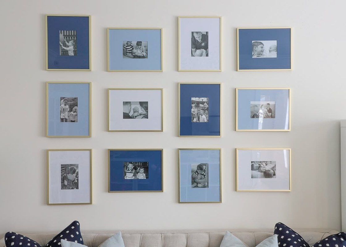
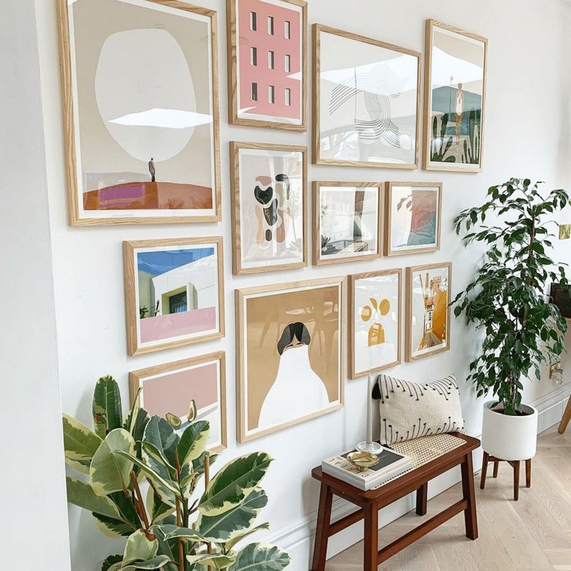
Framed prints with beige, gray, and blue mats hang on a living room gallery wall.
Framed prints with beige, gray, and blue mats hang on a living room gallery wall.
/h2>
White is the default for good reason: it is safe, available everywhere, and works with most art. But it is not always the best choice. The room’s purpose, light levels, and existing furniture all play a role in which mat color will feel right.
Living Rooms and Libraries: Rich Earth Tones and Deep Charcoals
Living rooms and libraries tend to have warmer lighting and darker furniture, so mats in deep charcoal, taupe, or muted olive can feel more grounded than stark white. These colors create a cozy, collected-over-time look, especially with wood frames and leather or linen upholstery nearby.
Bedrooms and Hallways: Soft Warm Whites and Muted Pastels
Bedrooms and hallways benefit from calm, restful tones. Soft warm whites, pale greige, and muted pastels like dusty blue or sage keep the wall feeling light without the clinical edge of pure white. These shades also forgive evening lighting, which tends to yellow stark white mats.
Modern and Minimalist Spaces: The Case for a Single Bold Accent
In a modern or minimalist room, repeating one bold mat color across the entire wall can be a striking design move. A deep navy, forest green, or even black mat gives the wall a graphic, editorial quality. The key is consistency: one bold color repeated, not several competing hues.
| Mat Color Family | Best For | Key Consideration |
|---|---|---|
| Warm white / ivory | Bedrooms, hallways, traditional art | Avoid pairing with cool white mats |
| Soft gray / greige | Modern spaces, photography | Reads neutral in most lighting |
| Deep charcoal / black | Minimalist walls, bold art | Can overpower small pieces |
| Earth tones (taupe, olive) | Libraries, living rooms | Check undertone against wood frames |
| Muted pastels | Children’s rooms, cottage style | Keep pastels consistent across the wall |
| Bold accent (navy, forest) | Statement gallery walls | Repeat the same color for cohesion |
Sizing, Spacing, and Layout: The Technical Side of a Professional Gallery Wall
Mat color does its job only when the proportions and layout support it. A beautiful mat color can look wrong if the mat is too narrow, or if the wall is arranged without a clear visual path.
Standard Mat Widths and Proportions for Different Frame Sizes
For most frames between 8 and 16 inches, a mat width of 2 to 3 inches feels balanced. Larger pieces, say 20 inches or more, can carry a 4-inch mat without looking heavy. A good rule of thumb: the mat should be wider than the frame moulding, and it should feel proportional to the artwork, not like an afterthought.
If you are mixing frame sizes across a wall, keeping the mat width consistent from piece to piece creates more cohesion than varying it. For guidance on combining different frame dimensions, see our guide to mixing frame sizes on a gallery wall.
Grid vs. Salon-Style Hanging: Spacing Rules That Keep the Eye Moving
A grid layout with equal spacing reads as clean and modern; salon-style hanging with varied spacing feels collected and organic. In both cases, consistent gaps matter. Two to three inches between frames is a comfortable default for most walls. If you want a more structured approach, our gallery wall layout templates walk through the math of planning before you pick up a hammer.
Wall Type and Hanging Hardware: What Works for Plaster, Drywall, and Brick
Drywall takes standard picture hooks and anchors; plaster and brick require different hardware and often a masonry bit. Before hanging, confirm your wall type and the weight of each framed piece. For heavy frames or fragile walls, a professional installer is worth the cost. If your frames tend to tilt forward on the wall, you may need to adjust the hanging hardware rather than the mat.
Common Mat Color Mistakes and How to Avoid Them
Even experienced decorators make mat color mistakes. The good news is that most are easy to fix once you know what to look for.
The Perils of Over-Matching, Clashing Undertones, and the “Floating Island” Effect
Over-matching happens when the mat color is so close to the wall color that the art seems to float without a boundary. Clashing undertones occur when one mat is cool white and another is warm cream; side by side, they look unintentional. The “floating island” effect happens when a single piece has a dramatically different mat treatment from the rest of the wall, making it look disconnected.
- Hold mat swatches against the artwork first, then against the wall.
- Keep undertones consistent across all mats on the wall.
- Test mats in natural and evening light before committing.
- Matching the mat to the sofa or rug instead of the art.
- Mixing cool white and warm ivory mats on the same wall.
- Choosing a mat so close to the wall color that the frame disappears.
Materials and Specifications: Conservation Matting vs. Decorative Paper
Mat color is only half the story; the material matters just as much for the long-term health of your art. Decorative paper mats are inexpensive and fine for temporary displays, but they are not suitable for valuable or sentimental pieces.
Acid-Free, Linen-Covered, and Rag Mats: What Your Art Actually Needs
Acid-free mats are treated to resist yellowing and acid migration, which can stain artwork over time. Rag mats, made from cotton or linen fibers, are the most stable and are the standard for archival framing. Linen-covered mats add texture and depth, but they cost more and can be harder to find in a wide range of colors.
For a gallery wall of everyday prints, acid-free mats are a reasonable baseline. For original art, signed prints, or photographs you plan to keep for decades, conservation-grade matting is worth the upgrade. If you are buying a pre-assembled frame set, check whether the mat is described as acid-free or archival before you assume it is.
The term “mat burn” refers to the brownish staining that occurs when acidic mat board touches artwork over many years. Conservation-grade matting is designed to prevent exactly this kind of damage.
- Check whether the mat is described as acid-free or conservation grade.
- Confirm the mat width suits your frame size and artwork proportion.
- Test the mat color against the artwork in both natural and evening light.
The Verdict: Trust the Process, Not the Trends
Trend-driven mat colors come and go; a well-considered mat selection based on the artwork itself will look right for as long as the piece hangs on your wall. Start with the art, pull from its mid-tones, keep undertones consistent, and let the room’s lighting guide your final call.
A cohesive gallery wall outperforms a trendy one every time, because it reflects the collection rather than the season. Once your mats are right, the rest of the display work gets easier. For broader guidance on pulling a room together, our approach to displaying art at home like a designer covers the full picture, from layout to lighting.
- Pull mat color from the artwork’s mid-tones, not its highlights or the wall paint.
- Keep undertones consistent across the whole wall, even when mixing colors.
- Match mat width to frame size, and keep spacing even for a professional finish.
- Choose acid-free or conservation matting for anything you plan to keep long-term.
Frequently Asked Questions