How to Arrange Black and White Frames on One Wall Like a Pro

Plan your layout on paper before you pick up a hammer. Keep spacing even at 2–3 inches and match frame tones to the room’s existing hardware and decor.
Learning how to arrange black and white frames on one wall is one of the fastest ways to give any room a curated, gallery-like feel. The good news is that the process is more about planning than artistic talent: choose a layout, measure carefully, and keep spacing consistent.
- Plan first: Measure the wall and preview the layout with paper templates before hanging.
- Spacing: Keep 2–3 inches between frames for a cohesive, professional look.
- Frame tones: Limit yourself to two frame colors and match them to room hardware.
- Height: Center the arrangement at eye level, about 57–60 inches from the floor.
- Layouts: Grid, salon-style, and linear rows are the three reliable approaches.
The Pro Formula: How to Arrange Black and White Frames on One Wall
Every successful gallery wall starts with a simple formula: pick a layout, set a spacing rule, and match the frames to the room. Black and white frames work particularly well because they read as a single material family even when sizes and shapes vary. The monochrome palette lets the artwork — rather than the frame — carry the visual weight.
A practical order of operations:
- Decide on the wall and measure its usable width and height.
- Choose a layout style: grid, salon-style, or linear.
- Lay the frames on the floor in front of the wall to preview the arrangement.
- Mark the wall with painter’s tape or paper templates.
- Hang the center frame first, then work outward.
This approach prevents the most common problem: a finished arrangement that drifts upward, downward, or to one side because each frame was hung in isolation.
What to Look For: Frames, Mats, and Artwork That Work Together
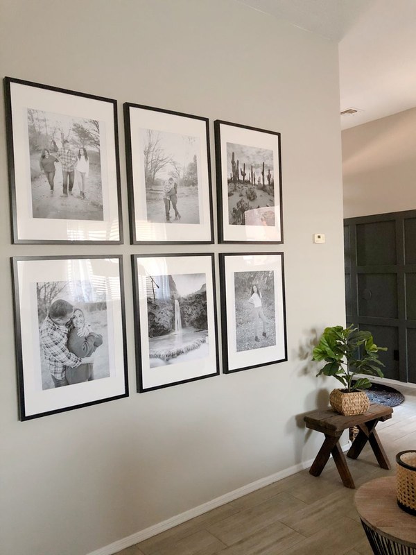
Black and white framed prints with coordinating mats arranged on a wall.
Frame Materials and Matting: The Essentials
Black and white frames come in a wide range of profiles, from slim metal to chunky wood. The key is consistency in tone rather than identical style. A matte black metal frame, a whitewashed wood frame, and a natural oak frame can coexist beautifully if they share a similar visual weight and finish sheen. The same applies to white frames: mix bright white with off-white only if the difference reads as intentional rather than accidental.
Matting matters more than most people expect. A white mat inside a black frame creates a clean, gallery-like separation between the artwork and the frame. It also gives the eye a resting place, which is especially valuable when you are hanging multiple pieces close together. If you are working with prints in standard sizes, consider having mats cut to a uniform outer dimension so that mismatched art sizes still align visually.
When mixing frame styles on one wall, limit yourself to two frame colors — usually one black and one white — and let the artwork bring in any gray tones. A third color, such as gold or natural wood, can work, but it will read as an accent rather than part of the system.
Choosing Artwork: Prints, Photography, and Negative Space
Black and white artwork is the natural companion to these frames, but the wall does not have to be exclusively monochrome. A single piece with a muted color palette can act as a deliberate contrast point. That said, the most reliable approach is to keep the artwork tonal: black-and-white photography, ink drawings, engravings, and minimalist line work all sit comfortably together.
Negative space is your friend. Frames with generous white mats make small prints feel substantial, and they help a busy arrangement breathe. If you are hanging a mix of portrait and landscape orientations, group them so that the eye can follow a loose visual path rather than jumping between competing directions.
Choosing the Right Wall and Matching Your Existing Decor
Best Rooms for a Black-and-White Gallery Wall
A black-and-white frame arrangement works in almost any room, but it performs best where the wall is relatively uncluttered. Living rooms, hallways, staircases, and home offices are the most common choices. A long hallway benefits from a linear arrangement that draws the eye forward, while a living room wall above a sofa suits a grid or salon layout.
Dining rooms and bedrooms also work, provided the arrangement is scaled to the furniture. A large grid above a bed can feel imposing; a smaller, tighter cluster is often more restful. In a home office, a black-and-white gallery wall can double as a mood board if you swap prints seasonally.
Matching Frames to Furniture and Wall Colour
The wall color sets the contrast level. Black frames pop on white or light gray walls; white frames disappear slightly, which can be an advantage if you want the artwork to feel like it is floating. On darker walls, white frames become the dominant element, and black frames recede.
Match the frame finish to the room’s existing hardware. If your furniture has matte black legs or your light fixtures are brushed nickel, echo that finish in the frames. This is a subtle detail, but it is what makes a gallery wall feel intentional rather than assembled from leftovers. For more guidance on combining materials, see our guide on how to mix wood and metal picture frames.
Wall color, furniture finish, and room lighting all affect how a frame reads. A frame that looks warm in the store can look cool or washed out in a room with strong daylight, so evaluate your frames in the actual room before committing to a layout.
Sizing, Spacing, and Layout: The Technical Side<
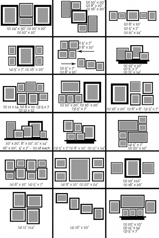
Black and white frames with equal spacing arranged in a grid on a white wall.
Black and white frames with equal spacing arranged in a grid on a white wall.
/h2>
Measuring Your Wall and Planning the Arrangement
Before you hang anything, measure the usable area of the wall — the space between furniture, moldings, and light switches. Write down the width and height. Then, on paper or using a layout app, sketch the arrangement to scale. This step saves time and prevents holes in the wrong places.
A simple method: cut paper templates the exact size of each frame, tape them to the wall, and adjust until the arrangement feels balanced. This is easier than measuring and marking each hanger position from scratch.
Spacing Rules: The 2–3 Inch Sweet Spot
Consistent spacing is what separates a professional-looking gallery wall from a random collection of frames. The standard rule is 2 to 3 inches between frames, measured edge to edge. This gap is close enough to read as one cohesive unit but wide enough to let each piece breathe.
For a grid layout, keep the gap identical in both directions. For a salon-style hang, the gap can vary slightly, but try to stay within the 2-to-3-inch range so the arrangement does not feel scattered. If you are working with oversized frames, you can push the gap to 4 inches; for very small frames, 2 inches is usually right.
The 2-to-3-inch spacing rule is a common guideline in gallery practice, where consistent gaps help the eye group disparate works into a single composition. It is one of the few rules in interior design that applies almost universally.
Wall Types and Hanging Hardware: Plaster, Drywall, and Brick
The right hardware depends on the wall. Drywall can usually support a single frame with a simple picture hook or nail rated for the frame’s weight. Plaster is harder and more brittle; it often requires a masonry bit and appropriate anchors. Brick and concrete also need masonry anchors, and drilling into them is more involved.
Always check the weight of your frame and the rating of the hardware. For heavy pieces, or if you are unsure about the wall construction, consult a professional installer. If you are hanging a group of frames, it is often easier to use a picture rail or a picture ledge system, which avoids multiple holes altogether. For practical guidance on keeping frames level, see how to stop picture frames from tilting on the wall.
Heavy frames and large mirrors require anchors rated for their weight. If your wall is plaster, brick, or concrete, use the correct masonry anchor and bit. When in doubt, ask a professional installer rather than risking a fall.
Three Styling Approaches That Always Work
The Symmetrical Grid: Clean and Contemporary
The grid is the easiest layout to execute and the most reliably polished. Choose frames of the same size — or the same outer dimension with different internal mats — and arrange them in a rectangle. A 2×2 or 3×3 grid works well above a sofa, console table, or bed.
The grid demands precision: measure the gaps carefully and use a level. Because the layout is repetitive, any inconsistency is immediately visible. The payoff is a clean, contemporary look that suits minimal interiors.
The Salon-Style Hang: Curated and Eclectic
The salon-style hang is the opposite of the grid: frames of varying sizes and orientations arranged in a loose cluster. This approach is forgiving and personal, and it is ideal for hallways, staircases, and walls where you want to display many pieces.
To pull it off, start with the largest frame in the center and work outward, keeping the 2-to-3-inch gaps. Keep the outer edges of the cluster roughly aligned so the arrangement has a shape rather than trailing off randomly. If you need help with layout, our gallery wall layout templates for frames offer a practical starting point.
The Linear Shelf Line: Simple and Modern
The linear approach places frames in a single horizontal row, evenly spaced. It is the simplest layout and works best for narrow walls, above long furniture, or in hallways. Choose frames of similar size for a clean line, or vary sizes while keeping the bottom edges aligned.
A picture ledge is a practical alternative to hanging: you can arrange and rearrange frames without adding new holes. This approach is especially useful in rentals where you want to minimize wall damage.
Common Mistakes and How to Avoid Them
Hanging Too High or Too Low
The most common mistake is hanging artwork too high. The center of a gallery wall should sit at roughly eye level — about 57 to 60 inches from the floor — though this varies with the room and furniture height. Above a sofa, the bottom of the arrangement should typically sit 6 to 10 inches above the back of the sofa.
If the wall is a staircase, follow the angle of the stairs rather than hanging everything at the same height. The rule of thumb is to align the center of each frame with the staircase line.
- Measure the center of your arrangement and align it with eye level.
- Use paper templates to preview the layout before hammering.
- Keep spacing consistent at 2–3 inches between frames.
- Hanging frames at different heights without a deliberate pattern.
- Mixing more than two or three frame colors on one wall.
- Filling the entire wall edge to edge with no breathing room.
Mixing Incompatible Frame Styles and Tones
Black and white frames are forgiving, but not infinitely so. A glossy black frame next to a matte black frame can look like a mistake rather than a choice. Similarly, a bright white frame next to an antique cream frame will clash unless the difference is clearly intentional.
The safest approach is to choose one dominant frame style and use the other as a supporting accent. Varying frame sizes within a single color family adds interest without breaking the visual system.
Overcrowding the Wall
More frames do not always mean a better gallery wall. When frames are packed too tightly, the eye cannot rest, and the individual pieces lose their impact. Leave some empty wall space around the arrangement, and resist the urge to fill every gap.
A good test: stand back and squint. If the wall reads as a solid block of frames, you have overcrowded it. If you can see the wall between and around the frames, the arrangement is likely well balanced.
Care, Value, and Final Recommendation
Cleaning and Protecting Your Frames and Prints
Black and white frames show dust quickly, so regular dusting with a soft, dry cloth is the best maintenance. Avoid spray cleaners directly on the glass or frame; instead, apply the cleaner to the cloth first. For prints, direct sunlight is the main enemy: UV rays cause fading and yellowing over time. Hang artwork away from strong windows or use UV-protective glass. For more detail on this, see our guide on how to protect framed art from sunlight at home.
The Value of a Well-Arranged Gallery Wall
A well-arranged gallery wall transforms a blank wall into a personal statement. It is one of the few decor projects that works in rentals and owned homes alike, and it can be updated over time by swapping prints without changing the layout. The value is not just aesthetic: a thoughtful arrangement shows that the space was considered, which is the difference between decoration and design.
- Choose a layout first — grid, salon, or linear — and measure the wall before hanging.
- Keep spacing between frames at 2 to 3 inches for a cohesive look.
- Match frame tones to the room’s hardware and limit yourself to two frame colors.
- Hang the center of the arrangement at eye level, about 57 to 60 inches from the floor.
- Protect prints from direct sunlight and use hardware rated for the frame’s weight.
Frequently Asked Questions