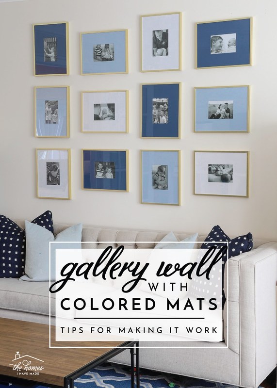
How to Plan a Minimalist Gallery Wall with Mixed Frames

Plan a minimalist gallery wall with mixed frames by limiting yourself to two or three frame finishes, using consistent spacing, and mapping the layout on paper before hanging. Start with one anchor piece and build the arrangement around it at eye level.
How to plan a minimalist gallery wall with mixed frames is what this guide covers, step by step.
Planning a minimalist gallery wall with mixed frames is less about matching everything and more about building a quiet, balanced composition that feels intentional rather than busy. The goal is to combine different sizes, materials, and finishes into a single arrangement that still reads as calm, uncluttered, and cohesive — an approach that works in almost any room when you follow a few simple rules.
- Limit the palette: Stick to two or three frame finishes so mixed sizes still read as calm.
- Plan on paper: Use kraft paper templates taped to the wall to test layout, spacing, and alignment.
- Keep spacing uniform: A consistent 2-to-3-inch gap between frames is what makes a mixed arrangement feel cohesive.
- Match the room: Echo furniture tones and wall color, and scale the arrangement to the wall and.
- Check hardware: Choose anchors rated for each frame’s weight and verify wall type before installation.
What Is a Minimalist Gallery Wall with Mixed Frames?
A minimalist gallery wall is a curated arrangement of framed artwork, prints, or photographs displayed together as one unified composition. The “mixed frames” part means you deliberately combine different frame styles, sizes, or finishes instead of hanging identical frames in a perfect grid. The result is a wall that feels personal and layered while staying visually quiet.
The Core Principle: Restraint with Variety
The word “minimalist” does the heavy lifting here. A mixed-frame gallery wall only stays minimalist when you impose limits. That usually means restricting yourself to two or three frame finishes, keeping matting and artwork tones neutral, and leaving generous negative space between pieces. Variety gives the wall character; restraint keeps it from turning into visual noise.
Think of it as a color palette: you can work with warm wood, matte black, and a single off-white, but adding a fourth or fifth finish starts to dilute the calm effect. The same logic applies to artwork — a mix of photography, line drawings, and small abstract prints can feel cohesive when the color story stays consistent.
Why Mixed Frames Work in a Minimalist Setting
Identical frames create order, but they can also feel flat. Mixed frames introduce texture, depth, and a sense of history — a slim black metal frame next to a chunky natural oak frame gives the eye something to move between. In a minimalist room, that subtle contrast prevents the wall from feeling sterile.
Mixed frames also make the arrangement easier to update. Swapping one frame or print changes the whole composition without requiring a full redesign. If you are new to this, start by understanding how to mix frame sizes for a gallery wall, since proportion matters more than finish when you are first laying things out.
Choosing Frames: Materials, Finishes, and Sizing
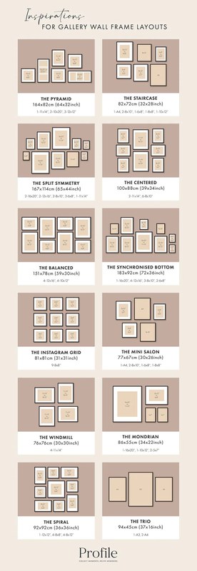
A selection of frames in various materials, finishes, and sizes for comparison.
Before you buy anything, decide on a small set of materials and finishes that will anchor the wall. This is the step that separates a considered minimalist arrangement from a random collection of leftovers.
Frame Materials and Finishes That Keep It Minimalist
Natural wood frames — oak, walnut, maple, or ash — are the most forgiving choice because their grain adds warmth without shouting. Metal frames in matte black, brushed brass, or raw aluminum bring a sharper, more architectural line. A third option is a simple white or off-white painted frame, which recedes into the wall and lets the artwork lead.
Finish matters as much as material. Matte finishes absorb light and feel quieter, while high-gloss finishes reflect and can compete with the artwork. For a minimalist wall, matte or satin is almost always the safer direction.
Finish consistency is what ties mixed frames together. If you choose two wood frames, keep their undertones close — warm oak with walnut reads as intentional, while orange-toned pine next to gray-washed ash can look accidental. When in doubt, stick to one wood tone and one metal tone.
Sizing and Proportion Across Mixed Frames
Proportion is the backbone of any mixed-frame arrangement. A common approach is to build around one large anchor piece, support it with two or three medium frames, and finish with a few small ones. Avoid placing two frames of nearly identical size side by side — the repetition reads as a failed grid rather than a deliberate mix.
Matting is a useful tool here. A small print with a wide mat can hold its own next to a larger frame, while a frame with no mat can feel lighter and more modern. If you prefer a ready-made starting point, a minimalist gallery wall frame set takes the guesswork out of proportion by pairing complementary sizes and finishes that are designed to work together.
Planning the Layout: Sizing, Spacing, and Arrangement
Planning on paper — or on the wall itself — is the single most effective way to avoid a lopsided result. This stage costs you an hour of patience and saves you a dozen extra nail holes.
Measuring the Wall and Mapping the Arrangement
Start by measuring the width and height of the wall space you want to fill. A good rule of thumb is that the total arrangement should cover roughly two-thirds to three-quarters of the width of the furniture below it — so a six-foot sofa calls for a gallery wall roughly four to four-and-a-half feet wide.
Next, cut pieces of kraft paper or wrapping paper to the exact size of each frame, including the mat. Tape these templates to the wall and rearrange them until the composition feels balanced. Step back, take a photo, and adjust. This method lets you test spacing and alignment without committing to holes.
Use painter’s tape to mark the center point of your wall and the eye-level line before you place any templates. Then arrange your paper cutouts symmetrically around that center. A balanced center is what makes a mixed arrangement feel calm rather than chaotic.
Spacing Guidelines for a Cohesive Composition
Consistent spacing is the hidden glue of a minimalist gallery wall. A common starting point is 2 to 3 inches between frames, measured edge to edge. Whatever gap you choose, keep it uniform across the whole arrangement — uneven gaps are the fastest way to make a mixed-frame wall feel messy.
Hanging height matters just as much. The center of the overall arrangement should sit at roughly eye level, which for most adults is around 57 to 60 inches from the floor. In a room where people mostly stand, aim for the lower end; above a sofa or console, the bottom of the frames can sit 6 to 10 inches above the furniture top.
Matching the Gallery Wall to Your Room and Decor<
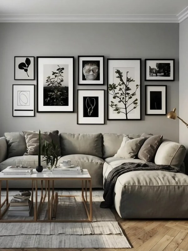
A mixed-frame gallery wall arranged to complement the room's neutral decor and furniture.
A mixed-frame gallery wall arranged to complement the room's neutral decor and furniture.
/h2>
A minimalist mixed-frame wall should feel like it belongs to the room, not like it was installed in isolation. That means considering the room’s function, its furniture, and the way light hits the wall.
Which Rooms Suit a Minimalist Mixed-Frame Wall
Living rooms are the classic setting — a mixed-frame arrangement above a sofa or console adds personality without competing with conversation areas. Hallways and stairwells are excellent for narrow, vertical arrangements because they guide the eye along the path of travel. Bedrooms benefit from a smaller, calmer arrangement above the headboard, while a home office can use a mixed-frame wall to break up the visual weight of a desk and monitor setup.
Scale the arrangement to the room. A large wall in an open-plan living area can carry five to seven frames; a compact hallway or bedroom wall usually reads better with three to four. When in doubt, fewer frames with more space between them will always look more minimalist.
Coordinating with Furniture, Wall Color, and Lighting
Let the room’s existing palette guide your frame choices. If your sofa is charcoal and your shelving is black metal, a matte black frame finish will feel at home. If the room leans on light oak and linen textures, warm wood frames will harmonize better. The goal is continuity, not matching — the frames should echo tones already present in the room.
Lighting is the finishing layer. A picture light or track lighting can make a mixed-frame wall feel like a deliberate exhibit, but the fixtures themselves should stay visually quiet. If you are working without hardwired lighting, there are practical options for lighting a gallery wall without hardwiring that preserve the minimalist look.
Wall Types, Hanging Hardware, and Installation
Different walls demand different hardware, and the right choice depends on both the wall construction and the weight of your frames. Skipping this step is how frames end up tilted, cracked, or on the floor.
Hardware for Drywall, Plaster, and Brick
For drywall, a standard picture hook with a nail can handle lightweight frames, but anything over a few pounds should use a wall anchor or a rated picture-hanging system. Plaster walls are harder and more brittle — they need fine-thread screws or specialized plaster anchors, and you should drill slowly to avoid cracking. Brick and concrete require masonry anchors or adhesive hooks rated for the weight.
Check the weight rating on your hardware and compare it to the total weight of each framed piece. If you are hanging a heavy mirror, a large framed piece, or anything you are unsure about, consult a professional installer. The same applies to mounted lighting or shelving above the gallery wall.
Step-by-Step Installation Technique
With your paper templates still taped to the wall, mark the top center of each frame position with a pencil dot. Remove the templates and confirm the dots match your planned spacing.
For each frame, measure the distance from the hanging wire or hook to the top of the frame. Transfer that measurement to your wall dot so the hardware goes in at the correct height.
Start with the largest frame, then the mediums, and finish with the smalls. This lets you adjust spacing around the pieces that define the composition.
Use a spirit level on every frame, and check the gaps between neighbors with a ruler. Small adjustments at this stage make the whole wall look professional.
If frames keep shifting or tilting after installation, the issue is often the hanging hardware itself. Learning how to stop picture frames from tilting on the wall can save you from constantly straightening your arrangement.
Common Mistakes to Avoid When Mixing Frames
Most failed gallery walls come down to a handful of repeatable mistakes. Knowing them in advance is cheaper than fixing them later.
Too many finishes. Four or five different frame materials will always read as clutter, no matter how carefully you space them. Limit yourself to two, or three at the absolute most.
Inconsistent spacing. A gap of 2 inches on one side and 4 inches on the other breaks the visual rhythm. Measure every gap, not just the ones you can see easily.
Hanging too high. Frames that float near the ceiling feel disconnected from the room. Remember that the center of the arrangement should sit around eye level.
Ignoring the wall’s scale. Tiny frames lost on a huge wall look accidental; oversized frames crammed into a narrow hallway feel overwhelming. Match the arrangement’s footprint to the wall and the furniture below it.
Matching everything. If every frame is a different size but the same finish, the wall can look like a mistake. A true mix needs variety in both size and finish — that contrast is what makes it intentional.
For a more uniform alternative, a gallery wall with black frames offers a monochrome route that still allows size variation while keeping the palette strictly controlled.
Caring for Your Frames and Artwork
Once your gallery wall is up, a little routine care keeps it looking crisp. Dust frames weekly with a soft, dry microfiber cloth, and clean glass only when needed using a gentle glass cleaner sprayed onto the cloth — never directly onto the frame, where moisture can seep into the joinery.
Direct sunlight is the biggest long-term threat to both frames and artwork. UV rays fade prints, yellow mats, and dry out wood finishes over time. Avoid hanging your gallery wall on a wall that receives strong afternoon sun, or use UV-protective glazing if you have no other option. Humid rooms like bathrooms can also cause wood frames to warp and paper to buckle.
Check the hanging hardware every few months, especially after seasonal humidity changes. A quick tug on each frame tells you whether the anchors are still holding firmly. If a frame starts to sit crooked, fix the hardware rather than just nudging the frame back into place.
Value, Benefits, and Final Recommendation
A minimalist mixed-frame gallery wall is one of the most flexible decorating projects you can take on. It works with almost any budget, adapts to any room, and changes easily as your taste evolves.
Benefits of a Minimalist Mixed-Frame Gallery Wall
The biggest benefit is personality. A mixed arrangement looks collected over time rather than bought in one box, which gives a home a lived-in, curated feel. It is also forgiving — you can add, remove, or swap frames without redoing the whole wall, and the variety hides minor imperfections in individual pieces.
Limitations to Consider
The main limitation is that it takes planning. Unlike a matching grid, a mixed-frame wall requires careful attention to spacing, proportion, and finish coordination. It also demands more wall space than a single large piece, so it is not ideal for very narrow or heavily furnished rooms. And because the arrangement is composed of many pieces, there are more opportunities for hardware failure — which makes quality hanging materials non-negotiable.
- Adds depth and texture while staying visually calm
- Easy to update by swapping individual frames
- Works across living rooms, hallways, bedrooms, and offices
- Adaptable to almost any budget
- Requires careful planning of spacing and proportion
- Needs more wall space than a single large piece
- More frames mean more hardware to maintain
- Too many finishes can quickly turn cluttered
Final Recommendation
If you want a wall that feels personal, flexible, and quietly sophisticated, a minimalist gallery wall with mixed frames is worth the extra planning. Start with a limited palette of two or three finishes, choose one anchor piece, map the layout on paper before you pick up a hammer, and keep your spacing consistent. Done well, it will look like the room grew around it — and it will still feel fresh years later when you swap in new prints and photographs.
Frequently Asked Questions