How to Style Shelves With Art for a Designer Look

Style shelves with art by using one larger anchor piece, layering smaller items in front, and leaving enough open space for the arrangement to breathe. Match frame finishes and colors to the room, and hang heavier pieces when leaning is not stable or practical.
Knowing how to style shelves with art comes down to a few design basics: use varied scale, layer pieces instead of lining everything up flat, leave breathing room, and repeat colors or materials so the arrangement feels intentional. Whether you are styling a narrow picture ledge, a bookcase, or built-ins, the goal is to make art feel integrated with the room rather than added as an afterthought.
Shelf styling works best when you treat art as part of a composition, not just decoration to fill gaps. A framed print can anchor a stack of books, a small canvas can soften the hard lines of shelving, and a sculptural object can keep the display from feeling too one-note. If you want a broader foundation for building a collected interior, Hurrell Editions also has a useful guide on how to create an artful home with style and soul.
- Start with scale: One larger piece gives each shelf section a focal point.
- Layer for depth: Lean or overlap art with books and objects instead of lining everything up flat.
- Protect negative space: Open areas make shelves look edited, not empty.
- Match the room mood: Choose art and frames that support the palette and overall style.
- Think practically: Check shelf depth, wall type, glare, and safety before leaning or lighting art.
What Makes Shelves Look Designer-Led With Art
The core formula: scale, layering, negative space, and repetition
Designer-looking shelves rarely depend on expensive art alone. They usually succeed because the arrangement respects proportion. That means combining a few larger visual anchors with smaller supporting pieces, then giving everything enough space to register clearly.
Scale is the first decision. If every frame is small, shelves can look fussy. If every piece is oversized, the display can feel top-heavy. A better approach is to choose one dominant artwork or object for each shelf zone, then build around it with smaller forms.
Layering is what makes shelves feel relaxed rather than rigid. Instead of placing every frame side by side, overlap one or two pieces slightly, set a smaller frame in front of a taller one, or lean art behind a ceramic vessel or stack of books. This creates depth and keeps the eye moving.
Negative space matters just as much as the objects themselves. Empty wall, visible shelf surface, and open gaps between objects give the composition structure. Without that breathing room, even beautiful art can disappear into visual noise.
Repetition ties the whole display together. Repeat a frame finish, a color from the artwork, a shape, or a material. For example, black frames repeated at different sizes feel cohesive, while oak frames echoed by wooden boxes or book spines create warmth.
When to lean, stack, or hang art above shelving
Leaning art works especially well on picture ledges, mantels, deep shelves, and built-ins where you want an informal, layered look. It also suits renters or anyone who likes to rotate pieces often. Leaning is best for lighter frames and shelves deep enough to support them securely.
Stacking is useful when you want art to feel integrated with books and objects. A small frame on top of two or three horizontal books can lift it into view and break up a row of vertical spines. This technique works best with compact pieces that do not become unstable when elevated.
Hanging art above shelving is often the right move when the shelf itself is shallow, the frame is heavy, or you need a stronger focal point. A hung piece can visually ground the shelf below it and prevent the display from feeling like a row of disconnected accessories.
If you are styling a dedicated ledge setup, this pairs well with Hurrell Editions’ guide on how to style picture ledges for layered art display, which goes deeper into overlapping compositions.
Leaning looks effortless, but it is not always the safest option for heavy frames, very slick shelf surfaces, or high-traffic homes with children or pets. In those cases, hanging or securing the piece is often the better choice.
Choose the Right Art for Shelf Styling
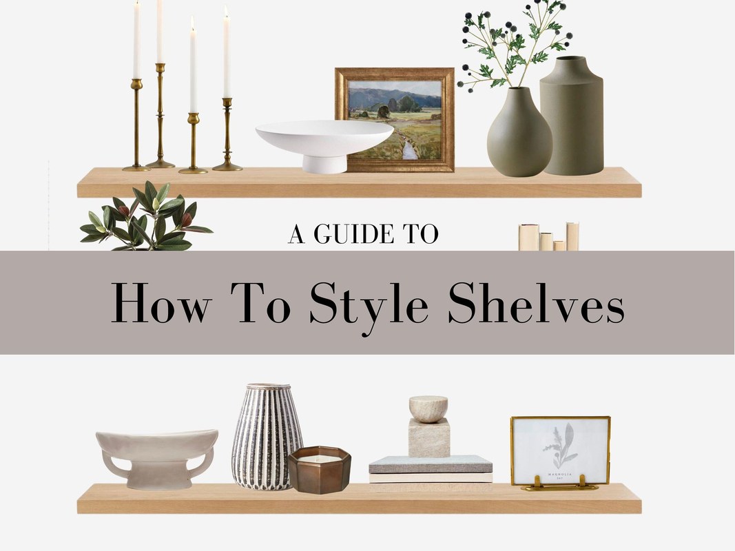
Framed artwork rests on a shelf among books and decorative objects.
Best art types for shelves: framed prints, photography, small canvases, and sculptural pieces
Framed prints are usually the easiest starting point because they add structure and read clearly from a distance. They work across most interiors, from minimalist to traditional, and are easy to mix in sets or as standalone accents.
Photography tends to sharpen the look of shelves because it introduces contrast and narrative without too much visual bulk. Black-and-white photography is especially useful when the room already has a lot of color and texture.
Small canvases bring softness because they often have less reflective surface than glazed frames. That can be helpful in rooms with strong daylight or many lamps, where glass glare might distract from the composition.
Sculptural pieces count as art too. A small bust, carved object, folded metal form, or handmade ceramic can bridge the gap between two-dimensional art and practical shelf decor. These pieces add shadow, texture, and variation in silhouette.
How to match artwork to your existing decor, palette, and room mood
Start with the room’s mood before you start matching colors literally. A calm bedroom may suit tonal landscapes, soft abstracts, or muted photography. A lively living room can handle bolder contrast, graphic prints, or mixed media with stronger shapes.
If your room already has a defined palette, pull one or two colors from existing textiles, rugs, upholstery, or adjacent art. The artwork does not need to match exactly, but it should feel related. Repeating one accent color across shelves is often enough to make the display feel coherent.
Also pay attention to style language. In a classic room, thin black frames, brass accents, and traditional landscapes may feel natural. In a contemporary room, larger mats, clean-lined frames, and abstract forms may fit better. Eclectic spaces can mix periods and mediums, but they still need a unifying thread such as color, frame finish, or subject matter.
Try building a shelf story around one mood word, such as quiet, earthy, graphic, or collected. That single word can guide your art choices more effectively than chasing a perfect color match.
What to look for in frames, glazing, finishes, and overall quality
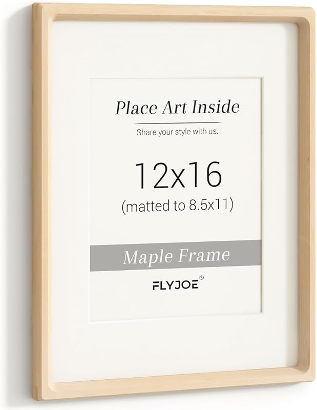
Frames influence the final look almost as much as the artwork itself. Thin metal frames feel crisp and modern. Natural wood adds warmth. Painted wood can feel either classic or playful depending on the finish and profile.
Glazing affects both appearance and practicality. Glass often looks clearer and more premium, but it is heavier and breakable. Acrylic is lighter and can be a smart choice for shelves, especially in family spaces, though it may scratch more easily and can sometimes show static or reflections differently.
Look for clean corners, secure backing, and a finish that does not fight with your shelving. If product details are important to your purchase, confirm materials, glazing type, included hardware, and care guidance on the official listing before buying.
- Check the frame material and whether the front is glass or acrylic.
- Confirm the outer dimensions, not just the artwork size.
- Make sure the frame depth suits your shelf.
- Review care instructions if the shelf gets strong sun, kitchen moisture, or frequent dust.
Sizing, Placement, and Spacing Rules That Actually Work
How to size art for narrow shelves, bookcases, mantels, and built-ins
Narrow shelves and picture ledges usually look best with art that stays comfortably within the shelf depth and does not project too far forward. Slim to medium-depth frames are easiest to layer here. For bookcases, you have more freedom to mix upright frames, small canvases, and objects, but the art should still relate to the height of each shelf opening.
On mantels, art often needs more presence because the shelf sits at a strong architectural focal point. One medium or large piece can work better than several tiny ones. Built-ins usually benefit from a rhythm of alternating larger and smaller art so every cubby does not feel styled the same way.
If a frame looks lost on a shelf, the problem is usually scale rather than style. Try a larger piece, a thicker mat, or elevate the art on stacked books before replacing it entirely.
Ideal spacing between frames, objects, and stacked books
There is no single perfect measurement for shelf spacing because shelf width and object size vary, but the visual rule is simple: items should feel related, not crowded. Frames placed too far apart lose their connection. Objects pushed tightly together blur into one mass.
A good arrangement usually alternates denser zones with open space. For example, one side of the shelf might hold a leaned frame, a small vase, and a short book stack, while the other side remains mostly open. That contrast is what makes the shelf feel edited.
Books can help create spacing by acting as visual pedestals or dividers. If you need guidance on selecting decorative volumes that work with art displays, see Hurrell Editions’ article on how to choose coffee table books for any style.
Layering heights and depth so shelves feel balanced rather than crowded
Balance comes from variation. If every item reaches the same height, the shelf feels flat. If every piece is pushed to the back edge, it can feel static. Mix tall and short forms, and bring some pieces forward while letting others sit farther back.
One reliable formula is to place the tallest item slightly off-center, add a medium-height frame or object overlapping it, then include one lower element such as a bowl, box, or horizontal books. This creates a stepped silhouette that reads as intentional.
- Vary heights, widths, and depths within each shelf grouping.
- Use books or boxes to raise smaller art.
- Leave visible shelf surface around focal pieces.
- Lining every frame up at the same height.
- Using only tiny objects with no visual anchor.
- Pushing every item flush against the wall.
Layout Ideas for Different Rooms and Shelf Types<
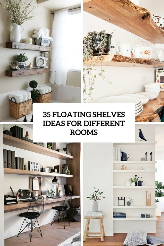
Framed art is layered with books and objects on living room shelves.
Framed art is layered with books and objects on living room shelves.
/h2>
Living room shelves: statement styling without visual clutter
Living rooms can handle more contrast and stronger focal pieces because they are social spaces. Use one or two standout artworks, then soften them with books, ceramics, and a few organic shapes. The key is to resist filling every inch. Shelves that sit near a television or fireplace especially benefit from restraint.
If the room already contains a lot of pattern, choose simpler art with stronger framing. If the space is neutral, shelves are a good place to introduce richer color or more expressive subject matter.
Bedroom and hallway shelves: softer compositions and calmer palettes
Bedrooms generally feel better with quieter arrangements. Try fewer objects, lighter frame finishes, and art with softer edges or muted tones. Hallways can work similarly, especially if shelves are narrow and viewed in passing rather than from a seated position.
Because these spaces are often transitional or restful, symmetry can be useful here. A pair of related frames or a centered composition may feel calmer than a highly layered, eclectic arrangement.
Home office, kitchen, and dining shelves: practical styling with personality
In a home office, shelves often need to balance storage with visual interest. Art can break up rows of books or files and make the room feel less utilitarian. Choose pieces that fit the scale of the shelving and do not interfere with access to everyday items.
In kitchens and dining areas, moisture, grease, and heat matter more. Framed prints behind glazing are usually easier to wipe down than unprotected paper or textured canvas. Smaller pieces with simple finishes often make more sense than delicate or highly valuable works in these rooms.
Dining shelves can be a great place for art that feels conversational: still lifes, abstract prints, or photography with a bit of mood. The styling should still leave room for serving pieces or practical storage if the shelving is functional.
Materials, Hardware, and Wall Considerations Before You Style
Frame materials, shelf materials, and how texture changes the look
Texture is one of the easiest ways to make shelves feel layered. Smooth metal frames against rough wood shelves create contrast. Matte painted frames on lacquered shelving feel cleaner and more contemporary. Natural oak, linen mats, and ceramics can warm up a stark built-in.
Try not to match every finish exactly. A little contrast keeps the arrangement from feeling flat. What matters more is that the materials relate to the room’s larger palette and style.
Wall type, shelf depth, and when hanging hardware is safer than leaning
Shelf depth determines whether leaning art is practical. Shallow shelves may not support larger frames securely, especially if the frame has a thick profile or slick backing. In that case, hanging art above the shelf or using purpose-made display ledges may be safer and visually cleaner.
Wall type also matters if you plan to hang anything above shelving. Weight limits, anchors, and hardware vary by wall construction and by the frame itself. For heavier pieces, check the manufacturer’s instructions and consider professional installation if there is any doubt.
Picture lights and shelf lighting: placement, brightness, color temperature, and power options
Lighting can make shelf art look dramatically better, but it needs restraint. A picture light or shelf light should illuminate the art without creating harsh glare on glass or hot spots on the wall. Warm to neutral color temperatures usually feel more flattering in living spaces than very cool light.
Brightness should suit the room. A gentle accent is often enough for bedrooms and living rooms, while offices may tolerate slightly brighter task-adjacent lighting. Power options vary, including hardwired, plug-in, and battery-operated designs. Confirm the product specifications before buying, especially if cord visibility or charging frequency matters to you.
Mounted lights, electrical connections, and heavy frames all require extra caution. Check wall type, product weight limits, and installation guidance, and use a qualified installer when the setup is complex or load-bearing.
Safety basics for cords, anchors, heavy frames, and family-friendly styling
If children, pets, or frequent movement are part of the household, style lower shelves more carefully. Place heavier objects lower down, avoid unstable stacks, and keep breakable glazing away from the easiest reach zones when possible.
Cords from plug-in lighting should be routed neatly and kept clear of walkways or areas where they can snag. Heavy frames should not simply perch on slick surfaces without considering stability. Family-friendly styling is still stylish; it just prioritizes secure placement and durable materials.
Common Shelf Styling Mistakes and How to Avoid Them
Using art that is too small, too similar, or disconnected from the room
The most common mistake is choosing art that is too timid for the shelf. Tiny frames can work, but usually only when grouped thoughtfully or elevated. Another issue is using pieces that are all the same size, same orientation, or same subject, which can make the display feel flat.
Art should also relate to the room around it. A shelf arrangement can be eclectic, but it should not feel visually unrelated to the furniture, textiles, or architecture nearby.
Overfilling shelves and losing negative space
Many shelves look better after removing one-third of the objects. If every surface is occupied, the eye has nowhere to rest and the art loses impact. Negative space is not emptiness; it is part of the design.
Ignoring proportion, sightlines, and practical function
A beautiful shelf still needs to function. In a working office, you should be able to reach the books you use. In a dining room, serving pieces should not feel trapped behind decor. In a hallway, nothing should jut out so far that it feels precarious.
Sightlines matter too. Step back and view the shelves from the doorway, from seated positions, and from the side if the shelving is exposed. A composition that looks balanced head-on may feel awkward from the angles you actually use most.
Care, Maintenance, and Long-Term Value
How to protect framed art from dust, sunlight, moisture, and shelf vibration
Shelves collect dust quickly, especially open bookcases and built-ins near vents. Framed art generally fares better than unprotected paper in these settings, but all pieces benefit from regular light dusting and sensible placement.
Direct sunlight can fade paper, textiles, and some inks over time. Moisture from kitchens, bathrooms, or humid rooms can also affect paper, mats, and certain frame materials. If shelves vibrate from slamming doors, speakers, or nearby traffic, check leaned pieces regularly so they stay stable.
Cleaning frames, glass, acrylic, and shelf surfaces without damage
Dust first with a soft, dry cloth. For glass, use a cleaner appropriate for framed surfaces and avoid spraying directly onto the art, since liquid can seep under the frame edge. Acrylic should be cleaned with extra care because it scratches more easily than glass.
Shelf materials matter too. Painted shelves, raw wood, stone, and laminate all have different care needs, so follow the manufacturer’s guidance when available.
When investing in better framing or limited-edition prints adds value
Better framing often adds more visible value than buying more art. A well-proportioned frame, quality mat, and suitable glazing can make a modest print look far more refined on a shelf. Limited-edition prints may matter if you are collecting for provenance or long-term enjoyment, but for many homes, the right scale and presentation matter more than exclusivity alone.
If value is part of your decision, verify edition details, materials, and care guidance directly from the seller or publisher rather than relying on marketplace summaries.
Best Styling Approach by Aesthetic, Budget, and Confidence Level
Minimalist, eclectic, classic, and contemporary shelf styling approaches
Minimalist shelves benefit from fewer pieces, stronger scale, and tight color control. Eclectic shelves can mix media and eras, but they still need repeated elements to feel curated. Classic shelves often suit balanced layouts, traditional subjects, and warmer materials. Contemporary shelves usually look best with cleaner silhouettes, bolder negative space, and simpler framing.
High-low mixing: combining investment art with books, ceramics, and found objects
A polished shelf rarely consists of art alone. Books, ceramics, boxes, and found objects give context and stop the display from feeling staged. Mixing high and low is often what makes a shelf feel personal rather than showroom-perfect.
You might pair one better-framed print with secondhand pottery, travel finds, or a few well-chosen books. The contrast can actually elevate the whole composition, as long as the palette and proportions stay under control.
A final recommendation for creating a polished, collected look at home
The strongest approach is usually the simplest one: choose one anchor artwork per shelf zone, add one or two supporting objects with different heights and textures, then stop before the shelf feels full. If you want shelves that look designer-led rather than overstyled, prioritize scale, breathing room, and cohesion over quantity.
- Start with art that has enough scale to anchor the shelf.
- Layer frames and objects instead of lining everything up evenly.
- Use repetition in color, frame finish, or material to create cohesion.
- Leave negative space so the arrangement feels edited and calm.
- Choose safer hanging or lighting solutions when weight, cords, or wall type are concerns.
Frequently Asked Questions