How to Style Picture Ledges for Layered Art Display
To style picture ledges for layered art display, start with one large anchor piece at the back, add medium and small frames in front, mix frame finishes carefully, leave some breathing space, and use a few personal accents like small books, ceramics, or greenery. The goal is to create depth without making the ledge look crowded.
Picture ledges are one of the easiest ways to create a layered art display without committing to a fixed gallery wall. They let you move frames, change seasonal art, and build a collected look that feels personal, relaxed, and stylish.
I like picture ledges because they solve a common decorating problem. Many people love art, prints, photographs, and small framed pieces, but they feel nervous about making too many holes in the wall. A ledge gives you freedom. You can test combinations, swap pieces, and keep the wall feeling fresh.
In this guide, I will show you how to style picture ledges for layered art display in a simple and practical way. I will focus on frame sizes, spacing, color, balance, safety, and the small details that make a ledge look intentional instead of messy.
What Is a Picture Ledge?
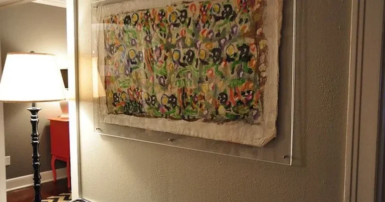
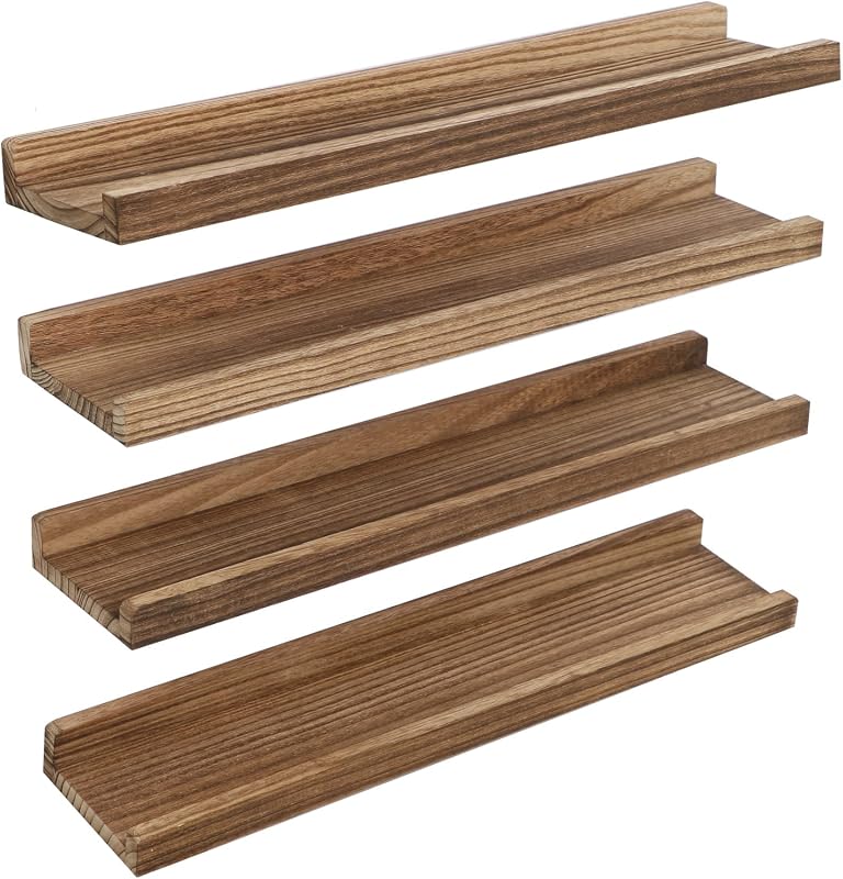
A picture ledge is a narrow wall shelf designed to hold frames, prints, photos, small art objects, and display pieces. Unlike a normal shelf, it usually has a small front lip. That lip helps keep frames from sliding forward.
Picture ledges are popular because they let you create a gallery-style wall without hanging every frame separately. They work well in living rooms, bedrooms, hallways, dining areas, home offices, and reading corners.
For more framing ideas, you can explore our Art & Frames guide. If you want to pair ledges with soft room lighting, our Lighting & Ambience guide can also help.
Museums often use careful spacing, height, and light to guide the eye. Even at home, small display choices can make ordinary prints feel more considered. The Met Museum offers helpful context on how art presentation affects how viewers experience a work.
Why Picture Ledges Work So Well for Layered Art
A picture ledge gives you depth. A flat gallery wall places each frame on one plane. A ledge lets frames sit in front of one another. This creates a soft, layered effect that feels warm and lived-in.
Layering also helps when your art collection is mixed. You might have a framed print, a family photo, a small sketch, a postcard from a museum shop, and a favorite art book. A ledge can bring these pieces together without forcing them to match perfectly.
How to Style Picture Ledges for Layered Art Display
The best way to style a ledge is to build it in layers. Start with the largest piece, then add medium frames, then finish with smaller accents. Do not begin with the small pieces. That usually makes the arrangement feel busy before it has structure.
Pick a wall where the ledge can be seen clearly. Good spots include above a sofa, above a console table, over a desk, or along a hallway wall.
Place the largest frame toward the back. This gives the display a clear center or starting point.
Add one or two medium frames that overlap the anchor piece slightly. Keep the overlap natural, not forced.
Small frames, postcards, or mini prints help move the eye across the ledge. Place them near the front or at the sides.
Add a small vase, candle, ceramic object, or book stack. Keep accents simple so they support the art instead of stealing attention.
Take a photo of your ledge after styling it. A phone photo makes it easier to see if one side feels too heavy or if the frames are too evenly spaced.
Best Frame Sizes for a Layered Picture Ledge
Frame size matters more than many people think. If all frames are the same size, the ledge can look flat. If the sizes vary too much, it can feel chaotic. I usually like a simple mix: one large frame, two medium frames, and one to three small pieces.
| Art Type | Recommended Display | Best Use |
|---|---|---|
| Large framed print | Back layer, slightly off-center | Creates the visual anchor |
| Medium photo frame | Middle layer with light overlap | Adds depth and balance |
| Small sketch or postcard | Front layer or side accent | Adds personality |
| Art book | Flat stack or upright feature | Creates a creative lifestyle feel |
| Small object | One piece only, near an open space | Softens the display |
How Much Should Frames Overlap?
A little overlap is good. Too much overlap hides the art. I suggest letting frames overlap by about two to four inches, depending on frame size.
Keep faces, main subjects, and important details visible. If the artwork has strong lines or a central figure, do not cover the main focus with another frame.
Layering should not make the art hard to see. If a frame blocks too much of another piece, move it to the side or choose a smaller front piece.
Choosing a Color Palette for Your Picture Ledge
A picture ledge works best when the colors feel connected. The pieces do not need to match, but they should speak to each other. You can use frame color, wall color, art tone, or material as the connecting thread.
For example, black frames give a crisp gallery look. Natural oak frames feel warm and Scandinavian. Brass or gold frames add softness and a more classic mood. White frames feel light and clean.
Picture Ledge Styling Ideas by Room
Each room needs a slightly different approach. A bedroom ledge should feel calm. A living room ledge can be more expressive. A home office ledge can include books, prints, and objects that inspire your work.
| Room | Best Ledge Style | What to Avoid |
|---|---|---|
| Living room | Large art print, family photo, small sculptural object | Too many tiny frames above a large sofa |
| Bedroom | Soft colors, calm prints, warm wood frames | Loud colors directly above the bed |
| Hallway | Photo series, travel prints, black frames | Deep objects that can be knocked off |
| Home office | Sketches, art books, inspirational prints | Cluttered objects near a work zone |
| Dining room | Botanical art, vintage prints, elegant frames | Frames that sit too low behind chairs |
For a calm creative home, try one landscape print, one simple line drawing, one small personal photo, and a slim ceramic vase. The mix feels personal without looking busy.
Do’s and Don’ts of Styling Picture Ledges
Small choices make a big difference. A ledge can look expensive and thoughtful even with affordable frames if the balance is right.
- Use one large frame as the anchor.
- Mix at least two frame sizes.
- Keep some empty space on the ledge.
- Repeat one color or material for unity.
- Secure the ledge properly into studs or with strong wall anchors.
- Do not overcrowd the whole shelf.
- Do not use only tiny frames.
- Do not place fragile items where children or pets can reach them.
- Do not mix too many frame finishes at once.
- Do not ignore the weight limit of the ledge.
Budget Estimate for a Picture Ledge Display
You can create a good-looking picture ledge display on a modest budget. The key is to spend wisely on the ledge and anchor frame, then use affordable small prints or personal photos to fill the display.
Best Product Types for This Look
For an Amazon-friendly picture ledge setup, I would focus on practical display pieces. Look for ledges with a front lip, frames with clean mats, and simple accents that suit your room.
Pro Tips for a Better Layered Art Display
- Use odd numbers when the ledge feels too stiff. Three or five main pieces often feel more natural than four.
- Keep one repeated element, such as black frames or warm wood, to avoid visual clutter.
- Lean larger frames at the back and smaller frames at the front.
- Add one object with texture, such as ceramic, woven material, or a small plant.
- Use warm lighting to make the wall feel softer in the evening.
- Change one or two pieces seasonally instead of restyling the whole ledge.
If you love changing your home by season, picture ledges pair beautifully with creative living ideas. You can also add art books from our coffee table book collection to make the display feel more layered and personal.
Common Picture Ledge Mistakes
The most common mistake is trying to fill the entire ledge. Empty space is not wasted space. It gives your eye a place to rest.
Another mistake is using frames that are too similar. If every frame is the same size and color, the ledge may look more like storage than styling. Mix size, height, and shape while keeping the color palette controlled.
| Problem | Likely Cause | Simple Fix |
|---|---|---|
| The ledge looks messy | Too many small pieces | Remove two items and add one larger frame |
| The display feels flat | No overlap or size variation | Layer medium frames in front of a larger piece |
| One side feels heavy | All large frames are on one end | Move one medium piece to the lighter side |
| The art feels disconnected | No shared color or theme | Repeat one frame color or art tone |
| The ledge feels unsafe | Poor mounting or too much weight | Reinstall with proper anchors and reduce weight |
Always install picture ledges according to the maker’s instructions. Use proper wall anchors, avoid overloading the shelf, and do not place heavy glass frames above beds, cribs, or seating areas unless the ledge is securely mounted.
Should You Use One Ledge or Two?
One ledge is best for a simple display. Two stacked ledges create a stronger gallery-wall effect. If you use two ledges, leave enough vertical space between them so the frames do not fight for attention.
A good starting point is to place the lower ledge at eye level, then set the second ledge above it with enough room for taller frames. Test the layout on the floor first before drilling.
- Cleaner and easier to style
- Good for small rooms
- Works well above a console or desk
- Needs more planning
- Can look crowded if spacing is tight
- Requires stronger visual balance
Where to Learn More About Art Display
For display inspiration, I like looking at museum and interior design sources. The Museum of Modern Art is useful for seeing how modern works are presented with space and focus. Architectural Digest often shows how art fits into real interiors. For practical home styling ideas, Apartment Therapy is also helpful. If you want art history and display context, the Met Museum is a strong reference point.
For most homes, I would start with one 24-inch to 36-inch ledge, one large matted print, two medium frames, and one small accent. This gives you enough depth without making the wall feel overdesigned.
- Measure the wall width before buying the ledge.
- Check the ledge weight limit.
- Choose one anchor frame first.
- Pick two or three frame finishes at most.
- Use a level during installation.
- Keep fragile items away from edges.
- Leave open space so the display can breathe.
- Start with one large anchor piece at the back.
- Layer medium and small frames in front.
- Repeat one color, material, or art mood for unity.
- Use accents sparingly.
- Install the ledge securely and respect the weight limit.
The best way to style picture ledges for layered art display is to create depth, not clutter. Use one anchor frame, vary your sizes, overlap gently, repeat one visual theme, and leave space around the arrangement. A ledge should feel flexible, personal, and easy to refresh.
FAQ: Styling Picture Ledges for Layered Art Display
Start with a large frame at the back, add medium frames in front, then finish with small art, books, or simple decor. Keep some empty space so the ledge does not look crowded.
For a standard ledge, three to six frames usually work well. Use fewer pieces for a clean look and more pieces only if the ledge is long enough.
They do not have to match exactly. A wood ledge can work with black, white, brass, or wood frames if the overall color palette feels balanced.
You can place heavier frames on some ledges, but only if the ledge is installed securely and the weight stays within the manufacturer’s limit.
A 24-inch to 48-inch ledge works for many living rooms. Choose the size based on the wall width, sofa size, and number of frames you want to display.
Use a ledge with a front lip, lean frames at a safe angle, and avoid placing frames too close to the edge. Small adhesive pads can also help reduce movement.
Picture ledges are better if you like changing your art often. Gallery walls are better if you want a fixed, polished layout that stays the same for a long time.
Final Thoughts
Picture ledges are a beautiful choice if you want a flexible, layered art display. They let you enjoy art without making every decision permanent. You can move a frame, add a small photo, change a print, or restyle the whole wall in a few minutes.
My practical recommendation is simple: start small. Use one strong anchor frame, two supporting pieces, and one small accent. Once that feels right, add more slowly. And always install the ledge safely before placing glass frames or heavier pieces on it.
When styled with care, a picture ledge can make a plain wall feel personal, creative, and quietly elegant.


3 Comments