How to Arrange Frames on a Picture Ledge Without Clutter?
To arrange frames on a picture ledge without clutter, use fewer pieces, vary frame heights, overlap frames lightly, keep one clear focal point, and leave small gaps of breathing space. A clean picture ledge should feel layered, not crowded.
A picture ledge looks best when the frames feel balanced, layered, and easy to read. The trick is not filling every inch. Use a few strong pieces, repeat colors, mix sizes carefully, and give the eye a clear place to rest.
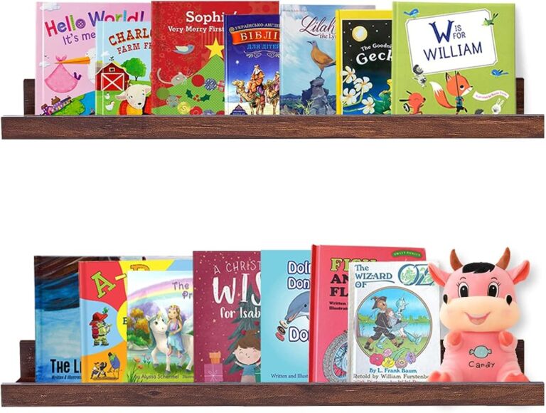
I love picture ledges because they make art feel relaxed. You can change prints, family photos, postcards, and small artwork without making new holes in the wall.
But I also know how fast a picture ledge can look messy. One extra frame, one busy print, or one mismatched color can make the whole shelf feel crowded. In this guide, I’ll show you how I arrange frames on a picture ledge without clutter, using simple steps that work in real homes.
What Makes a Picture Ledge Look Cluttered?
A picture ledge looks cluttered when too many items compete for attention. The problem is not always the number of frames. It is often the lack of order.
Clutter happens when every frame is the same size, every print is busy, or every color fights with the room. It can also happen when small objects are squeezed between frames with no clear reason.
If you are styling a full gallery wall or ledge system, start with the basics in our Art & Frames guide. It helps you think about frame size, spacing, and display style before you buy more pieces.
Museums often use visual spacing and clear sight lines to help viewers focus on the art. You can use the same idea at home by leaving small gaps between frames and avoiding too many tiny details in one place.
The Simple Rule I Use: Layer, Limit, and Repeat
When I style a picture ledge, I use three words: layer, limit, and repeat.
Layer means placing frames in front of each other with light overlap. Limit means choosing fewer pieces than the shelf can hold. Repeat means using the same colors, frame finishes, or art tones more than once.
How to Arrange Frames on a Picture Ledge Without Clutter
Choose the largest or strongest frame first. Place it slightly off-center, not exactly in the middle. This gives the ledge a natural, relaxed look.
Place one or two medium frames near the anchor. Let them overlap the main frame a little. This creates depth without adding clutter.
Add one or two small frames at the ends or in front of larger frames. Small frames should support the display, not dominate it.
Do not cover every part of the ledge. Leave some visible wall and shelf space. This is what makes the arrangement feel clean.
Stand across the room and look at the ledge. Remove one item if the display feels busy. Most ledges improve after one small edit.
Take a quick phone photo of your ledge. Clutter is easier to spot in a photo than when you are standing right in front of the shelf.
Why Picture Ledge Styling Matters
A picture ledge is small, but it can change the mood of a room. It can make a living room feel curated, a bedroom feel personal, or a hallway feel finished.
Good ledge styling also protects the value of your art. When frames are packed too tightly, they can rub, tilt, or fall. A cleaner layout is easier to dust and safer to update.
For lighting around art displays, I like to keep the light soft and warm. You can find related ideas in our Lighting & Ambience guide.
For more professional display ideas, I often look at how major art institutions present work. The Met Museum and MoMA are helpful sources for seeing how spacing, framing, and visual rhythm affect the way art is viewed.
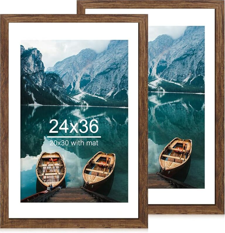
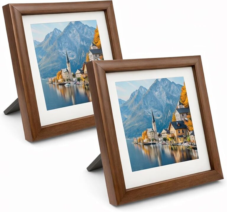
Best Frame Sizes for a Clean Picture Ledge
Mixing frame sizes is the easiest way to make a ledge feel styled instead of stuffed. I usually avoid using five frames of the same size in a straight line. That can look flat and heavy.
| Frame Size | Best Use | Clutter Risk |
|---|---|---|
| 5×7 inches | Small accent photos or postcards | High if used too many times |
| 8×10 inches | Medium prints and portraits | Low when mixed with larger frames |
| 11×14 inches | Main supporting frame | Low |
| 16×20 inches | Anchor artwork | Low if used as the main focus |
| Poster frame | Large statement piece | Medium if the ledge is shallow |
Frame size depends on ledge depth. A shallow ledge needs lighter, thinner frames. A deeper ledge can hold larger frames more safely.
Real-World Picture Ledge Examples
For a calm living room, I like one large abstract print, one medium black-and-white photo, one small sketch, and a low ceramic object. This gives the ledge shape, story, and space without making it feel crowded.
In a bedroom, I would use softer colors. Think warm beige, muted green, cream mats, and natural wood frames. In a home office, I would use cleaner lines, black frames, and one art book below the ledge to connect the wall to the desk.
For more room styling ideas beyond frames, our Creative Living section can help you connect wall art with furniture, books, lighting, and everyday objects.
Do’s and Don’ts for a Clean Picture Ledge
- Use one large anchor frame.
- Repeat one or two frame colors.
- Overlap frames lightly.
- Leave empty space at one end.
- Use simple prints beside busy art.
- Do not line every frame in the same height.
- Do not use too many small frames.
- Do not mix every frame finish at once.
- Do not place heavy frames on a shallow ledge.
- Do not add decor just to fill space.
Picture Ledge Style Guide
Best Layout Ideas by Room
| Room | Best Ledge Layout | Frame Mood |
|---|---|---|
| Living Room | Large anchor frame with two medium frames | Warm, balanced, welcoming |
| Bedroom | Soft prints with fewer frames | Calm, personal, restful |
| Hallway | Long ledge with repeated frame style | Clean, simple, easy to scan |
| Home Office | Graphic art with one quote or sketch | Focused, creative, neat |
| Dining Room | Art prints with one sculptural accent | Polished, social, curated |
Budget Estimate for a Simple Picture Ledge Display
You do not need to spend a lot. I would rather use three good frames than ten cheap frames that make the ledge feel crowded.
Pro Tips for Styling a Picture Ledge
- Use odd numbers, such as 3 or 5 frames, for a natural look.
- Place the tallest frame slightly off-center.
- Repeat one color from the art in the room decor.
- Keep mats simple if the prints are colorful.
- Use one small object only if it adds shape or texture.
- Leave at least one small section of the ledge empty.
My favorite clean ledge formula is one 16×20 frame, two 8×10 frames, and one small 5×7 frame. It gives height, balance, and depth without feeling overdone.
Common Mistakes That Make a Picture Ledge Look Messy
The most common mistake is using too many tiny frames. Small frames are charming, but they create visual noise when grouped too closely.
Another mistake is mixing too many frame finishes. Black, gold, oak, white, silver, and walnut can all look nice. But not all together on one small ledge.
Busy art can also cause clutter. If every piece has strong color, bold text, or lots of detail, the eye has nowhere to rest. Try pairing one bold piece with quieter artwork.
- Is there one clear focal frame?
- Are there no more than two or three frame finishes?
- Can you see some wall space between pieces?
- Are the heaviest frames stable?
- Does the ledge match the mood of the room?
Do not place heavy glass frames on a narrow or weak picture ledge. Check the weight limit, wall anchors, and shelf depth before styling. This is extra important above beds, sofas, desks, or children’s spaces.
Shop This Look
How to Choose Art That Will Not Feel Busy
If the ledge already has several frames, choose quieter art. Line drawings, simple landscapes, black-and-white photos, and soft abstract prints work well.
If you love art books, you can also use one book cover as color inspiration. Our coffee table book collection can help you find art styles that pair well with framed displays.
For more decor inspiration, publications like Architectural Digest and Apartment Therapy often show how simple art groupings can make a room feel finished without looking overdecorated.
- Feels calm and clean
- Easy to dust
- Works well in small rooms
- Highlights each artwork better
- Feels busy quickly
- Can hide smaller pieces
- Looks harder to maintain
- May feel visually heavy
Quick Recap
- Use one large anchor frame to guide the whole display.
- Layer frames lightly instead of lining them up flat.
- Limit the number of frame finishes.
- Leave empty space so the ledge can breathe.
- Remove one item if the display feels crowded.
The best way to arrange frames on a picture ledge without clutter is to edit carefully. Choose fewer frames, vary the height, repeat colors, and keep one clear focal point. A clean ledge should feel personal, but not packed.
FAQ: How to Arrange Frames on a Picture Ledge Without Clutter
Most picture ledges look best with 3 to 7 frames, depending on the shelf length. Use fewer frames if the artwork is large or colorful.
Yes, light overlap helps a picture ledge look layered and natural. Avoid covering too much of the artwork behind it.
Use one focal frame, limit small frames, repeat frame colors, and leave some empty space. Remove one piece if the ledge feels too full.
A mix of 16×20, 11×14, 8×10, and one small 5×7 frame works well. The largest frame should act as the anchor.
Yes. Black and wood frames work well together if you repeat each finish at least once and keep the art colors simple.
You can add one small decor item, but do not add too many. A small vase, candle, or ceramic piece is enough for most ledges.
They can be safe if installed correctly with proper anchors and lightweight frames. Avoid heavy glass frames above sleeping or seating areas.
Final Thoughts
Arranging frames on a picture ledge without clutter is mostly about restraint. Start with one strong frame, add support pieces slowly, and stop before the ledge feels full.
My practical recommendation is simple: style the ledge, take one step back, then remove one item. That small edit often makes the display look cleaner, calmer, and more intentional.
Also, check safety before you finish. Use secure hardware, avoid too much weight, and make sure every frame sits firmly on the ledge. A beautiful display should also feel safe and easy to live with.