What Is the Difference Between Gouache and Watercolor
Watercolor is usually transparent, luminous, and best for soft washes, while gouache is more opaque, matte, and suited to bold coverage. The right choice depends on whether you want airy atmosphere or crisp, graphic impact.
If you’re comparing gouache and watercolor, the simplest answer is this: watercolor is usually transparent and glowy, while gouache is more opaque, matte, and coverage-driven. Both are water-based paints, but they create very different moods on paper, which is why artists, illustrators, and gift-givers tend to reach for them for different reasons.
For Hurrell Editions readers, the distinction matters not only for technique, but also for how a finished piece will live in a home. A soft watercolor study can feel airy and luminous in a sunlit room, while a gouache illustration often reads more graphic, crisp, and contemporary in a frame or sketchbook.
- Transparency vs opacity: Watercolor lets paper glow through; gouache covers more fully.
- Finish: Watercolor looks luminous; gouache dries matte and flat.
- Best uses: Watercolor suits botanicals and travel sketches; gouache suits illustration and poster-style art.
- Paper matters: Heavier watercolor paper helps both mediums perform better.
- Care: Gouache can reactivate; watercolor benefits from light protection and flat storage.
What Is the Difference Between Gouache and Watercolor?
Gouache and watercolor are both made with pigment suspended in a water-soluble binder, which means they share a family resemblance at first glance. The key difference is how the pigment sits on the paper: watercolor tends to let the paper shine through, while gouache is formulated to cover more fully and appear flatter when dry.
That difference changes everything from blending to layering to the emotional feel of the finished work. Watercolor often rewards restraint and planning, while gouache is more forgiving for revisions, corrections, and bold shapes.
Some paints sit between the two categories. Designers’ and illustrators’ palettes may include “opaque watercolor” or “designer gouache,” so the label alone does not always tell the full story.
In practical terms, watercolor is usually chosen for translucency, atmosphere, and delicate color transitions. Gouache is often chosen for solid blocks of color, matte surfaces, and a more poster-like finish that reads clearly from across a room.
How Each Paint Behaves on Paper: Transparency, Opacity, and Layering
Behavior on paper is where the gouache vs watercolor conversation becomes most useful. If you understand transparency and opacity, you can predict how each medium will handle light, edges, and layering before you even open the tube.
Watercolor’s luminous washes and soft edges
Watercolor is prized for its transparency. Thin washes allow the white of the paper to reflect through the pigment, creating a natural glow that feels especially beautiful in botanical studies, skies, architecture sketches, and loose interiors scenes.
Because watercolor is so fluid, edges can soften naturally as water spreads across the sheet. That softness is part of its charm, but it also means the medium can be less forgiving if you prefer sharp shapes or frequent corrections.
Layering in watercolor is usually built in stages, from lightest to darkest. Artists often preserve highlights by leaving paper untouched, which gives watercolor its signature sense of light.
Gouache’s matte finish and solid coverage
Gouache is more opaque, so it can cover underlying marks more decisively. This makes it especially appealing for illustration, editorial work, and compositions that depend on strong silhouettes or clean color fields.
Its matte finish absorbs light rather than reflecting it, which gives gouache a velvety, modern look. The result can feel more graphic and immediate than watercolor, even when the palette is restrained.
Gouache can also be layered, but because it is more opaque, later layers can sit on top of earlier ones without needing the same level of paper preservation. That gives artists more room to revise shapes and adjust composition.
Traditional gouache has long been favored for poster art and design work because its flat finish reproduces cleanly and reads clearly in print, even under changing light.
Best Uses in Art, Illustration, and Creative Living Projects
Neither medium is “better” in general; each simply serves different visual goals. The right choice depends on whether you want atmosphere, precision, softness, boldness, or a mix of all four.
When to choose watercolor for botanical studies, travel sketches, and airy interiors art
Watercolor is a natural fit for botanical studies because translucent layers can mimic petals, leaves, glass vases, and shifting daylight. It also works beautifully for travel sketches, where quick washes can capture a place without overworking the page.
For interiors-inspired art, watercolor is especially appealing when you want a sense of breathing room: pale walls, sunlit windows, linen textures, and quiet still life arrangements. It suits rooms that lean calm, layered, and softly lit.
If you are building a beginner kit, watercolor is often the medium people reach for first. For related guidance, see what to buy a beginner watercolor artist and what paper is best for watercolor at home.
When to choose gouache for editorial illustration, poster-style work, and giftable originals
Gouache is a strong choice for editorial illustration because it supports clear shapes, clean contrast, and a more polished graphic look. It also lends itself to poster-style artwork, where bold color blocks and crisp edges help the piece stand out from a distance.
For giftable originals, gouache can feel especially satisfying because it often looks finished, intentional, and contemporary even in a modest frame. That makes it a thoughtful medium for a desk, gallery wall, or bookshelf vignette.
For gift-givers, a compact gouache set paired with a small sketchbook can feel more complete than paint alone. If you’re curating a present, the right paper matters as much as the medium.
Style Trade-Offs: Mood, Texture, and Visual Impact
One of the most useful ways to compare these paints is by mood. Gouache and watercolor can both be beautiful, but they shape the emotional temperature of a piece in very different ways.
Delicate, atmospheric, and light-filled effects
Watercolor excels when you want softness, translucency, and a sense of air. It can make a small painting feel expansive, especially when used for washes, gradients, and quiet tonal shifts.
This is why watercolor often feels at home in rooms with natural light, pale wood, or linen textures. It echoes the same visual language as open windows, pale walls, and gentle shadows.
Think of watercolor as the medium of daylight: it is especially lovely when you want a piece that feels like a breath rather than a statement.
Bolder, graphic, and contemporary finishes
Gouache brings a more assertive visual rhythm. Its matte surface and opaque coverage create a crispness that can feel modern, stylish, and a little more editorial.
It is particularly effective when your composition depends on shape design, negative space, or a strong focal point. In a framed work, gouache often reads as neat and intentional, which many collectors and decorators appreciate.
- Graphic illustration
- Flat color fields
- Bold, frame-ready artwork
- You want maximum transparency
- You prefer soft, accidental blends
- You enjoy the look of glowing paper
Materials, Tools, and Paper Considerations for Better Results
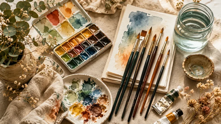
Good paper and the right brush can matter as much as the paint itself. Both gouache and watercolor reward thoughtful materials, but the ideal setup differs depending on the effect you want.
Paper weight, surface texture, and brush selection
Watercolor paper is usually the safest choice for either medium, especially if you plan to use a lot of water. Heavier sheets help reduce buckling, while the surface texture affects how pigment settles and how edges appear.
Hot press paper tends to be smoother, which can suit detailed work and fine lines. Cold press paper has a bit more tooth, which many artists like for watercolor washes and a more tactile finish. If you want a deeper comparison, our guide to cold press vs hot press watercolor paper is a useful companion read.
Brush choice matters too. Softer brushes tend to carry water more gracefully for watercolor, while firmer control can help with gouache when you want cleaner edges and less pooling.
Mixing palettes, rewetting, and layering techniques
Watercolor usually behaves best when mixed with enough water to remain luminous. Because it dries lighter, it can help to test swatches before committing to a final palette.
Gouache can often be rewetted after drying, which is convenient for mixing and touch-ups. That said, rewetting can also reactivate previous layers, so it helps to work with a light touch if you want crisp, uninterrupted surfaces.
If you are deciding between the two for sketchbook work, start with a small set of neutral tones and one accent color. This keeps the page cohesive and helps you learn how each medium handles layering before investing in a larger palette.
- Paper weight that can handle moisture
- Smoother paper for details, textured paper for atmosphere
- Brushes that suit either fluid washes or controlled edges
- A mixing surface that stays clean and easy to read
Care Tips for Finished Artwork, Sketchbooks, and Framed Pieces
Finished watercolor and gouache pieces can be deeply satisfying to live with, but they do ask for a little care. Humidity, friction, and direct handling all affect the longevity of both mediums in different ways.
Protecting gouache from scuffing and reactivation
Gouache can remain more vulnerable to smudging or reactivation than many people expect, especially if it is applied in thicker layers. For sketchbooks, that means allowing enough drying time before closing the page.
For framed work, a mount or spacer can help keep the surface from touching the glazing. If you plan to store loose sheets, interleaving with acid-free paper is a simple way to reduce rubbing.
Because gouache can lift when re-wet, avoid stacking finished pages too quickly. In humid rooms or busy sketchbooks, a little extra drying time goes a long way.
Preserving watercolor vibrancy and preventing paper warping
Watercolor is generally stable once dry, but the paper itself can warp if too much water is used without proper support. Heavier sheets help, and some artists prefer stretching paper in advance for smoother results; our guide on how to stretch watercolor paper at home is useful if you want a cleaner finish.
For framed pieces, keep watercolor away from prolonged direct sunlight when possible. Even beautiful pigments can fade over time, and paper can be sensitive to both light and humidity.
Whether you choose gouache or watercolor, framing with acid-free materials and keeping artwork out of damp spaces helps preserve color and paper quality.
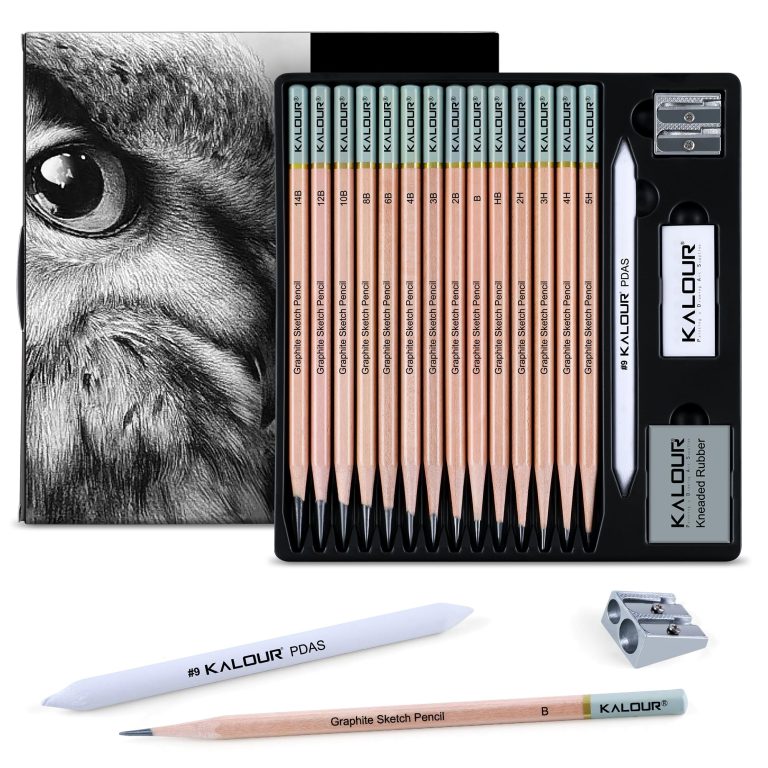
Price Context in 2025: Student vs Artist-Grade Paints and Starter Sets
In 2025, the biggest price difference usually comes down to pigment quality, lightfastness, and how much paint you get in a set. Student-grade options are often perfectly good for practice, while artist-grade paints tend to offer richer color, better handling, and more reliable results.
What buyers can expect at different price points
Entry-level sets are usually the easiest way to begin if you want to test whether the medium fits your style. Mid-range sets often strike the best balance for hobbyists, while investment pieces make the most sense for artists who paint regularly or want archival-quality results.
Because brand, tube size, and set composition vary widely, it is best to compare by use rather than by number alone. A smaller, better-curated set can be more useful than a larger one with colors you rarely mix.
Curator recommendations for thoughtful gifts and beginner kits
If you are buying for an art lover, think about the whole experience: paint, paper, brush, and a place to work. A coordinated starter kit often feels more generous and more usable than one expensive item alone.
For gift ideas beyond paint, Hurrell Editions readers may also enjoy best gifts for watercolor artists and what makes a good gift for an art lover. Those guides can help you choose something beautiful without guessing too much about the recipient’s style.
A beginner-friendly gift pairing that always feels considered: a compact watercolor or gouache set, a quality sketchbook, and a soft brush. It is practical, elegant, and easy to enjoy immediately.
Final Creative Recap: Choosing the Right Paint for Your Practice
If you want glowing washes, soft edges, and a sense of light passing through the page, watercolor is the medium to reach for. If you want matte coverage, clear shapes, and a more graphic finish, gouache is likely the better fit.
Many artists eventually keep both on hand, using watercolor for atmosphere and gouache for definition. That combination can be especially satisfying in sketchbooks, mixed-media studies, and interiors-inspired artwork where mood and structure both matter.
For home decorators, book lovers, and gift-givers, the best medium is the one that matches the feeling you want to live with. Watercolor softens a space; gouache sharpens it. Both can be beautiful, and both can become deeply personal when chosen with care.
Recommended Products
SHOP THIS SETUP
Holbein Artists’ Gouache Set, 12 Colors
Holbein Artists’ Gouache is a standout choice for anyone comparing gouache and watercolor because it shows exactly what makes gouache unique: rich opacity, smooth coverage, and strong pigment load. It’s a professional-grade set that helps readers understand how gouache behaves differently from transparent watercolor while still being versatile enough for illustration, design, and layered painting.
Frequently Asked Questions
They are closely related, but not identical in effect. Gouache is usually more opaque and matte, while watercolor stays more transparent and luminous.
It depends on your style. Watercolor can feel easier for loose washes, while gouache can feel more forgiving because it covers mistakes more readily.
Yes, both work well on watercolor paper. Heavier sheets are especially helpful if you plan to use a lot of water.
Yes, gouache often dries lighter and flatter than it appears wet. Watercolor also dries lighter, but it keeps more transparency.
Often, yes. That makes it convenient for blending and touch-ups, but it also means finished pieces can be more vulnerable to smudging.
Both can be beautiful framed. Watercolor is often chosen for delicate, glowing pieces, while gouache is loved for bold, graphic work.