How to Choose Oil Pastels for Mixed Media Work
Choose oil pastels by how they behave on your surfaces, how well they layer with other media, and whether the finish suits your style. For mixed media, a balanced set with good opacity, usable neutrals, and dependable lightfastness is usually the smartest buy.
If you are learning how to choose oil pastels for mixed media work, the best place to start is with your process, not the brand name. Mixed media asks more of a pastel than a single-surface drawing does: it needs to layer, resist, blend, travel, and sometimes sit comfortably beside watercolor, collage, or acrylic without turning muddy or brittle.
This guide from the Hurrell Editions Editorial Team focuses on the practical choices that matter most in 2026: softness, opacity, finish, surface compatibility, color range, and value. The goal is to help you choose sticks that support expressive work and look beautiful whether they live in a sketchbook, on board, or in a framed piece.
- Process first: Match softness and control to your actual mixed media workflow.
- Surface matters: Heavier paper, board, and gesso usually perform best.
- Color strategy: Curated palettes often beat oversized sets for daily use.
- Display readiness: Lightfast pigments matter for gifts and framed work.
What Mixed Media Artists Need from Oil Pastels in 2026
Why mixed media use is different from pure pastel drawing
Oil pastels behave differently when they are part of a layered composition. In pure drawing, you may want rich color and immediate mark-making. In mixed media, you also need the pastel to cooperate with wet media, collage papers, graphite, ink, and textured grounds.
That means a good mixed media pastel should not only look vivid on first application. It should also stay usable after multiple layers, sit well over dried paint or gesso, and feel predictable when you return to the page after a few days.
Reader intent: choosing tools that layer well, travel well, and last
Most artists shopping for oil pastels are balancing a few needs at once: a set that is easy to carry, a palette that feels inspiring, and enough permanence to justify the purchase. For art journalers and sketchbook users, portability matters. For collectors or gift buyers, presentation and lightfastness matter more.
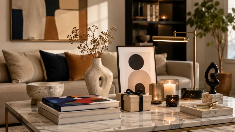
If you also enjoy keeping your supplies organized in a calm studio corner, it can help to think of oil pastels as part of a wider system. The same way you might choose the right sketchbook for quality paper or the right brushes for acrylic painting, the pastel set should fit the way you actually make work.
Oil Pastel Basics: Bindings, Texture, and Finish
Soft vs hard oil pastels for collage, ink, watercolor, and acrylic
Soft oil pastels deposit color quickly and feel lush on the page. They are often the best choice when you want bold, painterly marks, fast coverage, and easy blending over collage or dry acrylic passages.
Harder oil pastels give more control. They are useful for sharper edges, linear details, and sketchbook work where you want to draw over dry watercolor or ink without overwhelming the page. If your style leans toward structure and layering, a firmer stick can be very satisfying.
- Soft pastels: expressive layering and rich blending
- Harder pastels: line work, detail, and travel sketching
- You need crisp precision on small-format work
- You want a pastel that behaves more like a pencil
Opacity, blendability, and mark-making for expressive surfaces
Opacity matters because mixed media often includes busy surfaces. A pastel that covers well can unify collage edges, soften a printed image, or bring warmth back into a composition after watercolor washes. Blendability matters too, but not every artist wants a smooth finish.
Some of the most interesting mixed media work comes from visible marks: broken color, directional strokes, and layered scumbling. Look for a set that offers both coverage and control, rather than one that only excels at blending into a single velvety blur.
Test each pastel on top of dried watercolor, matte acrylic, and a scrap of collage paper before buying a full set. A stick that feels beautiful on bare paper may behave very differently over sealed or textured surfaces.
Matte, satin, and glossy finishes: how they affect the final artwork
Finish changes the mood of the piece. Matte oil pastels tend to feel quieter and more contemporary, especially in interior-inspired palettes. Satin finishes can give depth without becoming overly reflective. Glossy sticks can make color feel jewel-like, but they may also catch light in a way that shifts the viewing experience.
If you are making work for a home setting, finish matters more than many beginners expect. A highly glossy pastel can look striking near a window, but it may also create glare under a picture light or bright room lighting. For help planning display conditions, our guide on choosing a picture light for artwork is a useful companion read.
How to Match Oil Pastels to Your Mixed Media Process
Best choices for sketchbook studies and creative journaling
For sketchbooks and journals, choose a set that is compact, forgiving, and not too expensive to use freely. A smaller palette with strong neutrals, a few warm accents, and a reliable dark can be more useful than a huge box of rarely used colors.
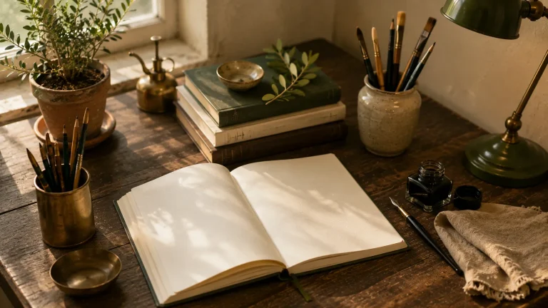
Journaling also benefits from sticks that do not crumble easily in transit. If you carry your kit in a tote or keep it beside your reading chair, sturdier packaging and less messy handling can make a real difference.
Some oil pastels remain soft in warm rooms or travel bags, so storage conditions matter. If your studio gets hot or humid, look for sets that are less tacky and easier to keep clean between uses.
Best choices for layered canvas, paper, and board experiments
For larger experiments, prioritize pigment strength and layering ability. Canvas and board can take more pressure and more buildup, so the pastel should continue to sit on top of previous layers without disappearing into the tooth too quickly.
Paper-based experiments are a little different. Heavier papers and lightly primed boards often give the best balance of grip and flexibility. If you enjoy working with acrylic underpaintings or collage, choose sticks that can handle irregular surfaces without dragging or skipping.
Best choices for combining with watercolor, gouache, charcoal, and printmaking
Oil pastels and watercolor are a classic mixed media pairing, but they require patience. Water-based layers generally go down first, then the pastel is added on top once the surface is dry. Gouache behaves similarly, though its matte finish can create a very elegant contrast with pastel sheen.
Charcoal and printmaking elements introduce another layer of texture. Oil pastels can soften hard graphic marks or emphasize edges, but they may also resist some surfaces in ways that are either beautiful or frustrating. If you like that tension, choose a set with a wide value range and strong darks.
Think of oil pastel as the “final voice” in a composition: the layer that can tie together paper scraps, washes, and drawn marks into something intimate and finished, without losing the hand-made feel.
Choosing by Surface: Paper, Canvas, Wood, and Found Materials
Surface compatibility and tooth: what grabs pigment best
Surface tooth is one of the most important factors in mixed media work. A surface with enough texture helps the pastel hold on, while a very smooth surface may make it slip or sit too heavily on top. That does not mean smooth is bad; it just means you need to know what effect you want.
Heavier paper, pastel paper, board, and primed wood usually provide more dependable grip than lightweight sketch paper. If you prefer a layered home-studio setup, it can be worth keeping a few sample surfaces on hand and testing the same color across each one.
Working on toned paper, gessoed boards, and recycled materials
Toned paper is especially useful for interior-inspired work because it gives you a middle value to build from. Gessoed boards are excellent when you want durability and a more finished presentation. Recycled cardboard, packaging, and found paper can create beautiful texture, though they are less predictable and may absorb or resist color unevenly.
That unpredictability is part of the charm. If you enjoy a lived-in look, oil pastels can make humble surfaces feel deliberate and artful. For artists who like display-ready results, however, a more stable ground usually gives cleaner edges and better longevity.
Mixed media pieces made on found materials can be more vulnerable to warping, acid damage, and uneven aging. If the work is meant for gifting or display, consider sealing or mounting the surface before finishing the pastel layer.
Practical examples for interior-inspired palettes and still-life studies
For a quiet still life, a muted palette of ochre, clay, olive, charcoal, and cream can feel timeless and sophisticated. These colors work especially well on toned paper, where the paper color becomes part of the composition rather than something to hide.
For decorative interiors, a softer, more restrained set often reads better than a neon-bright one. If your home leans toward natural textures, books, ceramics, and warm light, oil pastels in earthy colors tend to harmonize beautifully with the room rather than overpower it.
Style Trade-Offs: Color Range, Lightfastness, and Control
When to prioritize a wide palette over premium single sticks
A wide palette is helpful when you are still discovering your style or building a mixed media habit. It lets you test color relationships quickly and keeps the process playful. Larger sets are also useful if you work in series and want subtle shifts across multiple pieces.
Premium single sticks or smaller curated sets make more sense when you already know your preferred palette. Many artists do best with a focused range of colors they will actually use, rather than a large box that looks impressive but stays mostly closed.
Lightfast pigments for work you want to display or gift
Lightfastness matters if the work will hang in a bright room, be gifted, or live in a portfolio for years. Not every mixed media sketch needs archival-grade materials, but display pieces deserve more careful pigment choices, especially if they include strong colors that may fade over time.
For gifts, presentation-ready sets with clear labeling and better pigment stability usually feel more thoughtful. They are especially appropriate for collectors, new graduates, or anyone building a more serious studio practice.
Even lightfast materials can shift if displayed in direct sunlight or very bright interiors. Keep finished work away from strong UV exposure and consider glazing or protective storage when appropriate.
Choosing between muted, earthy, and high-chroma color stories
Muted palettes are often the easiest to integrate into mixed media because they sit comfortably with paper texture, collage, and room decor. Earthy colors feel grounded and editorial, while high-chroma colors bring energy and visual drama.
The best choice depends on the mood you want. If you are drawn to interiors with linen, wood, and soft shadows, earthy sets will likely feel more natural. If your work is graphic, playful, or bold, a higher-chroma set may be the better match.
Curator Recommendations: Best Oil Pastel Qualities for Different Creators
For beginners building a first mixed media kit
Beginners should look for a small-to-medium set with a balanced range of warm and cool colors, plus at least one solid black and one pale neutral. The aim is not to own everything at once, but to learn how the medium behaves across different surfaces.
A good starter set should feel approachable rather than precious. If you are also assembling a first creative workspace, our guide to setting up a home art studio space can help you think through storage, light, and table setup at the same time.
For illustrators, art journalers, and experimental makers
Illustrators often benefit from control and clean layering, while journalers may prefer softness and speed. Experimental makers usually want both. In practice, that means choosing a set with enough variety to handle line, wash, rubbing, and collage without forcing one style of mark.
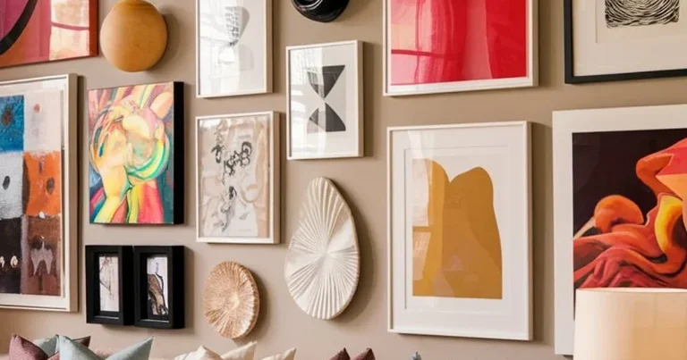
If you love recording moods, interiors, and bookish scenes, a curated palette can be especially satisfying. It keeps the page cohesive and helps the finished spread feel like part of a larger visual story rather than a random collection of colors.
A thoughtfully chosen mid-range mixed media set is often the sweet spot for most artists: enough color range to stay inspired, but not so many sticks that the palette becomes overwhelming. Look for sets that include a few neutrals, several earth tones, and reliable darks for structure.
For collectors and gift buyers seeking presentation-ready sets
Gift buyers should think about both aesthetics and usability. A beautiful box matters, but so does the feel of the sticks, the clarity of the palette, and whether the set looks generous without being impractical. If the recipient enjoys display-worthy supplies, presentation can be part of the charm.
For gifting inspiration beyond pastels themselves, our guide on choosing a gift for an artist friend is a helpful companion, especially if you are trying to match the gift to a specific creative personality.
Price Context, Set Sizes, and Value in 2026
What entry-level, mid-range, and artist-grade sets typically offer
Entry-level sets usually focus on accessibility. They are useful for learning, testing color families, or keeping a casual kit on hand. Mid-range sets often offer a more satisfying balance of handling, pigment strength, and color selection for regular use.
Artist-grade sets are where you are more likely to find refined texture, stronger pigment performance, and better lightfast options. They are not automatically the right choice for everyone, but they can feel worthwhile if you already know you will use them often.
When to buy a small curated set versus a larger studio collection
Buy small when you are exploring. Buy larger when you already know the colors you reach for repeatedly. A compact set can travel well and reduce decision fatigue, while a larger collection can support more nuanced color mixing and series work.
There is also a practical storage consideration. Larger collections need a dry, organized place where the sticks will not smudge, melt, or pick up dust. If your studio is compact, a smaller curated set may actually be the more luxurious choice.
- How often you will use the set
- Whether the work is for practice, display, or gifting
- How much color variety you truly need
- Whether your workspace is hot, humid, or highly portable
- How the packaging will hold up in storage or travel
How to judge value beyond packaging and brand reputation
Value is not just about how polished the box looks. A good set should feel coherent in color, comfortable in the hand, and suited to your process. If a set includes colors you never use, or if the sticks are too soft for your surfaces, the value drops quickly.
Look for usefulness over novelty. A smaller set with thoughtful color relationships can be more rewarding than a huge assortment that does not support the kind of work you actually want to make.
Care Tips and a Creative Recap for Better Results
Storage, wrapping, and handling tips to keep sticks clean and usable
Oil pastels should be stored in a way that protects them from dust, heat, and accidental pressure. Wrapping sticks or keeping them in a fitted tray can help prevent color transfer and keep edges usable for longer.
It also helps to separate light and dark colors if you use them often. That small habit keeps your palette cleaner and makes it easier to return to a work-in-progress without wasting time reorganizing.
How to test a set before committing to a full palette
The most reliable test is simple: try the pastel on your preferred surfaces, over your preferred underlayers, and in the kind of light where you actually work. Pay attention to coverage, drag, blending, and whether the colors feel harmonious together.
If possible, test at least one warm neutral, one bright color, one dark, and one pale highlight. That small sampling will tell you much more than a polished product image ever can.
Final recap: choosing oil pastels that support layered, expressive mixed media work
When deciding how to choose oil pastels for mixed media work, start with how you make art: sketchbook or canvas, travel kit or studio tray, muted interiors or high-energy color. Then choose the texture, palette, and finish that support that habit rather than fighting it.
The most satisfying set is usually the one that feels versatile, durable, and emotionally right for your process. In a mixed media practice, that balance matters more than chasing the biggest box or the most dramatic packaging.
- Choose softness, control, and finish based on your mixed media process.
- Match the pastel to your surfaces, not just to the color chart.
- Prioritize lightfastness for display pieces and gifts.
- Buy the set size that fits your actual workflow and storage.
Recommended Products
SHOP THIS SETUP
Sennelier Oil Pastels Set of 24
Sennelier is a benchmark brand for artists who want rich pigment, a creamy feel, and strong blendability in mixed media work. These pastels layer beautifully over acrylic, watercolor, and textured surfaces, making them a smart choice for artists who need color that stays bold without feeling overly waxy.
Frequently Asked Questions
Soft oil pastels are better for rich layering and blending, while harder sticks give more control for detail and line work. Many mixed media artists keep both types in a small kit.
Yes, oil pastels pair well with watercolor when the watercolor is applied first and fully dried. The pastel then acts as a resistant, expressive top layer.
Heavier paper, pastel paper, gessoed board, and primed wood usually give the best grip. Smooth or lightweight surfaces can work, but they may need testing first.
Not always, especially if the pages are for practice or private use. If you plan to display, gift, or archive the work, lightfast pigments are a much better choice.
A small to medium set is often enough for a first mixed media kit. Look for a balanced range of neutrals, warm and cool colors, plus a reliable dark and a light highlight.
Good value comes from usable colors, comfortable handling, and compatibility with your surfaces. A smaller set you use often is usually better value than a large set with colors that sit untouched.