How to Frame a Large Poster: Beginner’s Guide to Framing, Mounting & Display
Frame a large poster with a style that supports the artwork, not one that overwhelms it. Measure carefully, choose the right mounting and glazing, and place it where light and scale let it feel intentional.
Framing a large poster is less about hiding the paper and more about giving it the right stage. A thoughtful frame can protect the print, sharpen its presence, and help it feel intentional in a room rather than temporary or improvised.
- Scale first: Keep the frame proportionate so the poster has visual breathing room.
- Style matters: Black, wood, and metallic finishes each create a different mood.
- Measure precisely: Confirm trim size, visible area, and frame opening before buying.
- Protect the paper: Use UV-aware glazing and avoid direct sun or humidity.
- Room placement counts: Large posters work best as clear focal points.
How to Frame a Large Poster Without Losing Its Impact
Large posters work best when the framing feels supportive, not overpowering. The goal is to preserve the scale, keep the composition breathable, and let the image remain the first thing you notice.
In interiors, scale changes everything. A poster that looks vivid on a desk can feel cramped if the frame is too narrow, too ornate, or sized without enough margin. For a balanced result, think in terms of proportion, negative space, and how the piece will sit alongside furniture, books, and lighting.
Why scale, proportion, and visual breathing room matter in interiors
Oversized art has a natural confidence, but it still needs room to breathe. When a frame is too heavy or the mount is too tight, the poster can lose the easy, graphic quality that made it appealing in the first place.
That is especially true in modern rooms, where clean lines and open wall space help a large print feel architectural. If you are styling a poster above a sofa, bed, or console, the frame should echo the room’s proportions rather than compete with them. If you want more ideas for displaying art in a living space, see our guide on how to display framed art on a console table.
What readers usually want: protection, polish, and a gallery-worthy finish
Most people framing a poster want three things at once: to protect the paper, to make it look finished, and to keep the piece from feeling too precious or formal. That balance is what gives a framed poster its charm.
A good frame should reduce visual clutter, help the image read clearly from across the room, and make even an affordable print feel curated. For many homes, that means choosing a finish that feels deliberate but not fussy.
Choosing the Right Frame Style for Art, Books, and Creative Spaces
Frame style changes the mood of a poster more than many people expect. A simple black frame can make a print feel crisp and editorial, while wood softens the look and metallic finishes add a touch of brightness.
Minimal black, natural wood, and metallic finishes compared
Minimal black frames are often the easiest choice for graphic posters, photography, and contemporary art. They create a clean outline and help color or typography do the talking.
Natural wood frames bring warmth, which works especially well in reading corners, relaxed bedrooms, and spaces with oak shelving or linen textures. Metallic finishes, by contrast, can feel elegant and slightly more formal, especially when paired with monochrome artwork or classic interiors.
| Option | Best For | Note |
|---|---|---|
| Minimal black | Modern, graphic, or photographic posters | Strong contrast and a clean gallery feel |
| Natural wood | Warm, relaxed, or book-filled rooms | Softens bold artwork without overwhelming it |
| Metallic finish | Classic or polished interiors | Adds shine, but can feel formal if overused |
How frame style changes the mood of a poster in modern, classic, or eclectic rooms
In a modern room, a slim frame often looks best because it keeps the poster visually light. In a classic room, a slightly more substantial profile can help the art feel anchored among mouldings, lamps, and richer textures.
Eclectic spaces allow more freedom. A vintage-inspired frame can sit comfortably beside a bold poster, but it helps to repeat one or two materials elsewhere in the room so the look feels intentional rather than accidental.
Curator recommendations for letting the artwork lead
If the poster itself is the star, choose a frame that quietly supports it. That usually means restrained profiles, modest sheen, and finishes that echo one detail in the artwork rather than introducing a new visual argument.
As a rule, the more expressive the poster, the simpler the frame should be. This is one reason many collectors and decorators favor a floating frame or a very slim border for contemporary prints.
Before buying, stand back and ask whether the frame disappears or dominates. For a large poster, “quiet confidence” is usually the sweet spot.
Measuring a Large Poster Accurately Before You Buy or Build
Accurate measuring saves frustration later. With large posters, even a small mismatch can make the piece look squeezed, off-center, or awkwardly floating in the frame.
How to measure trim size, visible image area, and border allowance
Start with the poster’s trim size, which is the full edge-to-edge paper dimension. Then note the visible image area if the artwork includes a white border, bleed, or printed edge that you want to preserve.
Next, decide how much border allowance you want around the image. A little breathing room can elevate the piece, especially if you are adding a mat board or planning a float mount. For DIY framing, precision matters even more, which is why a practical guide like how to make a simple frame can be useful if you want to understand the construction basics before ordering materials.
When to choose a custom frame for oversized or non-standard prints
Custom framing is worth considering when the poster is unusually large, an awkward in-between size, or part of a limited edition you want to preserve carefully. It is also the better route if the paper is delicate, textured, or not easy to trim.
Ready-made frames can be practical for common sizes, but oversized posters often benefit from custom proportions. That is especially true when the print needs a specific mount depth, archival backing, or a frame profile that is not widely available.
Common sizing mistakes that make posters look cramped or underwhelming
The most common mistake is choosing a frame that is only just large enough. A tight fit can make a big poster feel visually compressed, as if it is being held in place rather than presented.
The opposite problem is too much empty space, which can make the poster feel adrift. Good framing is a balancing act: enough margin to create elegance, but not so much that the image loses its presence.
If your poster has unusual dimensions, measure twice and confirm whether the frame size refers to the paper size, the visible opening, or the outer frame dimensions. Those details are often confused.
Mounting Options: Float Mount, Mat Board, or Edge-to-Edge Display
The way a poster is mounted changes both the style and the sense of care. Mounting can make a print feel contemporary, refined, or more traditionally framed depending on how much border is visible.
When a float mount suits contemporary art and limited-edition prints
A float mount is a beautiful choice when you want to show the edges of the poster, especially if the paper has deckled edges, a signature, or a subtle texture. It creates the impression that the artwork is suspended within the frame.
This look is particularly appealing for contemporary art, minimalist compositions, and limited-edition prints where the paper itself is part of the experience. It also suits large posters that would otherwise feel too boxed in by a mat.
When a mat board adds refinement, space, and archival protection
Mat board gives a poster a more formal, gallery-like presentation. It creates a visual pause between image and frame, which can make the artwork feel calmer and more deliberate.
It also adds practical value by keeping the paper away from the glazing. For posters you want to preserve long term, that extra space can be helpful. If you are framing canvas-based artwork instead, the approach changes, and our guide on how to frame a canvas explains why.
Trade-offs between a crisp modern look and a more traditional presentation
Edge-to-edge display feels immediate and contemporary, especially with bold graphics or large photographic posters. But it can also look less protected if the paper sits too close to the glass.
A mat board creates more ceremony and breathing room, though it can reduce the impact of very large images if the border becomes too wide. The best choice depends on whether you want the poster to feel like a statement graphic or a softly presented art object.
- Contemporary prints with strong composition
- Limited editions and signed posters
- Rooms that need a clean, art-led finish
- You want a traditional, formal presentation
- The paper needs extra protection from glazing
- The artwork already has a strong border
Glass, Acrylic, and UV Protection for Long-Term Care
Framing is not only about appearance. It is also about protecting paper from dust, humidity, fingerprints, and light damage over time.
How to protect posters from fading, glare, humidity, and dust
Posters are often more light-sensitive than people expect, especially if the inks are bright or the paper is thin. Direct sunlight can fade color gradually, while humidity can cause rippling or edge damage.
Dust and airborne particles are another quiet issue, particularly in busy homes or studios. A sealed frame with appropriate backing helps reduce exposure and keeps the poster looking cleaner for longer.
Choosing between standard glass, anti-reflective glazing, and lightweight acrylic
Standard glass is a familiar and often cost-effective choice, but it can reflect light strongly in bright rooms. Anti-reflective glazing is more comfortable to view, especially if the framed poster will hang opposite windows or lamps.
Acrylic is lighter, which can be helpful for very large frames or walls where weight matters. It can be a sensible option for oversized posters, though it may scratch more easily than glass and should be handled with care.
Keep framed posters away from prolonged direct sun, radiators, and damp walls. If the print is valuable or sentimental, archival materials are worth the extra consideration.
Care tips for preserving paper condition in bright living rooms and studios
In bright rooms, position the poster where it gets ambient light rather than constant direct exposure. If possible, use UV-protective glazing and avoid hanging it where heat or moisture can build up.
For art spaces and studios, occasional inspection matters. Check that the backing remains flat, the frame is secure, and no condensation is forming inside the glazing. Good framing should make care easier, not more complicated.
Many framing choices are really lighting choices in disguise. A frame that looks subtle in daylight can feel much stronger under warm evening lamps.
Where a Large Framed Poster Works Best in the Home
Large framed posters are especially effective where a room needs one clear visual anchor. They can define a seating area, soften a long wall, or bring personality to an otherwise practical space.
Living rooms, hallways, reading corners, bedrooms, and creative workspaces
In living rooms, a large poster above a sofa can act like a visual horizon line, tying the room together. Hallways are also ideal because they benefit from one strong piece rather than many small interruptions.
Bedrooms call for softer, more restful imagery, while reading corners and creative workspaces can handle bolder graphics or more playful color. If you are building a room around books and art, our article on how to store coffee table books may help you think about visual balance beyond the wall.
How lighting changes the experience of framed art at different times of day
Morning light can make colors feel crisp and cool, while late afternoon and evening light often adds warmth and softness. That means the same framed poster may feel different depending on where you hang it.
Picture lights, sconces, and nearby lamps can all change the mood. If the room is dim, a lighter frame or anti-reflective glazing can help the image remain visible without feeling harsh.
Using large posters as focal points above sofas, consoles, desks, or beds
Above a sofa or bed, a large poster should generally relate to the width of the furniture beneath it. Too small, and it looks tentative; too large, and it can overwhelm the space.
Over a desk or console, the poster can feel more intimate and editorial, especially if it is paired with a lamp or a stack of books. In each case, the frame should support the furniture arrangement instead of competing with it.
A well-framed poster can do more than decorate a wall. It can turn a favorite image, exhibition memory, or book cover into part of the room’s emotional landscape.
Price Context: What Affects the Cost of Framing a Large Poster in 2026
Costs vary widely, but the biggest drivers are size, frame material, glazing, and whether the piece is ready-made or custom finished. A large poster is often where budget and quality need the most careful balancing.
How size, materials, glazing, and custom finishing influence budget
Larger frames naturally require more material, which usually raises the price. Premium woods, metal finishes, archival mats, and UV-protective glazing can also increase the cost, especially if the frame is bespoke.
Finishing details matter too. A clean, well-executed mount or a custom cut can change the whole impression of the piece, which is why framing is often less about the sticker price and more about the final result.
When ready-made frames are practical and when bespoke framing is worth it
Ready-made frames are practical when the poster is a standard size, the room is casual, and the piece does not require archival treatment. They are often the simplest route for gifts or temporary displays.
Bespoke framing is worth it when the poster is unusually large, especially meaningful, or intended to live in a prominent room for years. If the artwork is part of a broader creative wall, a tailored approach can help it sit more naturally among other pieces, including smaller prints or a large gallery wall frame set.
Value considerations for collectors, gift-givers, and design-conscious buyers
Collectors often prioritize preservation and presentation, while gift-givers may focus on ease, speed, and visual appeal. Design-conscious buyers usually sit somewhere in the middle, looking for a frame that feels refined but not overly precious.
The best value is not always the cheapest option. A well-chosen frame can make a poster more versatile, more durable, and more satisfying to live with every day.
A Creative Recap: Framing as Part of the Poster’s Story
Framing a large poster is a design decision, but it is also a storytelling one. The frame changes how the work is read, where the eye rests, and how the piece feels in daily life.
How the right frame turns a large poster into a lasting interior statement
When the proportions are right, the finish is restrained, and the mounting suits the image, a poster can feel as considered as any artwork in the home. That is the real value of good framing: it gives a beloved print the presence it deserves.
For creative homes, book-filled rooms, and art-led interiors, the right frame makes a large poster feel less like decoration and more like part of the architecture of the space.
Final design takeaways for stylish, protective, and art-led presentation
Choose a frame that respects the scale of the poster, measure carefully, and decide early whether you want a float mount, mat board, or edge-to-edge display. Then think about light, placement, and long-term care before you hang it.
If you keep the artwork at the center of the decision, the result will usually feel calmer, more refined, and far more lasting.
Recommended Products
SHOP THIS SETUP
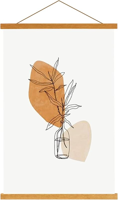
MCS Gallery Foundation 24×36 Poster Frame, Black Woodgrain
This frame is a strong pick for large posters because it balances a clean gallery look with practical, lightweight construction. The woodgrain finish gives it a more elevated feel than a basic poster frame, while the clear front helps protect artwork and keeps the poster looking crisp on the wall.
Frequently Asked Questions
The best frame depends on the poster’s style and the room. Minimal black, natural wood, or a slim metallic frame are all strong choices when you want the artwork to stay central.
A mat board is helpful when you want a more formal, gallery-like look or extra spacing around the image. It also adds a layer of protection by keeping the paper away from the glazing.
Yes, if the size is standard and the paper is easy to handle. For oversized, delicate, or valuable posters, custom framing is usually safer and more polished.
UV-protective glazing is the most useful choice for long-term care, especially in bright rooms. Anti-reflective options can also improve visibility if glare is a concern.
Choose a slim frame profile and avoid overly ornate finishes. Keeping the proportions balanced with the furniture and wall space also helps the piece feel lighter.
Living rooms, hallways, bedrooms, and creative workspaces are all strong options. The best spot is usually one where the poster can act as a clear focal point without competing with too many other objects.