Acrylic Paint for Picture Frames: How to Choose, Apply & Finish Like a Pro
Acrylic paint is a practical and stylish way to refresh picture frames, especially when you want a custom look that matches your room or artwork. It works best with good prep, the right finish, and careful attention to the frame material.
Acrylic paint can do more than refresh a picture frame. Used thoughtfully, it can turn a plain border into a quiet design statement that helps art, books, and interiors feel more connected.
- Best use: Refresh plain, thrifted, or mismatched frames.
- Finish matters: Matte and satin are the most versatile choices.
- Prep first: Clean, sand, and prime tricky surfaces for better adhesion.
- Think curatorial: Match the frame to the art, wall, and room palette.
- Care counts: Seal and protect frames in bright or high-touch spaces.
Acrylic Paint for Picture Frames: Why It Works in Artful Interiors
Acrylic paint for picture frames is popular because it dries quickly, offers strong color payoff, and works across many frame styles. For homes that lean into layered art, warm reading corners, or gallery walls, it creates a custom look without requiring a full frame replacement.
It is especially useful when a frame feels close to right but not quite finished. A thrifted wooden frame may need a calmer tone, a bright print may call for a darker border, or a room palette may need one more visual thread to feel intentional.
How acrylic paint transforms plain frames into gallery-style accents
A simple frame can become part of the composition rather than a neutral afterthought. Matte black can sharpen a print, soft ivory can brighten a moody wall, and a muted green or clay tone can echo the colors inside the artwork.
This is one reason acrylic paint pairs so well with modern interiors. It allows you to coordinate the frame with wall color, furniture wood tones, or the palette of nearby objects such as ceramics, books, and lamps.
Reader intent: when to paint, refresh, or coordinate a frame with a room
If a frame is structurally sound but visually off, painting is often the most elegant fix. It is also a practical choice for renters, collectors on a budget, or anyone who wants a cohesive display wall without buying everything new.
Think of it as a styling tool as much as a repair method. A fresh coat can revive an old frame, unify mismatched pieces, or help a favorite print feel more at home in a new room.
Choosing the Right Acrylic Paint Finish for Different Frame Styles
The finish matters almost as much as the color. Different sheens change how a frame reads in daylight, under lamps, and alongside the artwork it surrounds.
Matte, satin, gloss, and metallic finishes in modern and classic spaces
Matte finishes feel soft and contemporary. They are often the best choice for understated interiors, black-and-white photography, and rooms where you want the frame to support the art rather than compete with it.
Satin offers a gentle, versatile sheen that works in most homes. It can feel a little more polished than matte without becoming shiny, which makes it a strong middle ground for both modern and classic settings.
Gloss creates a bolder, more reflective effect. It suits playful or high-contrast interiors, though it can draw more attention to surface imperfections if the prep work is not careful.
Metallic finishes, including gold, bronze, and brushed silver tones, can be beautiful on ornate or traditional frames. They also work well when you want a decorative accent that feels a little more formal.
| Option | Best For | Note |
|---|---|---|
| Matte | Quiet galleries, photography, minimal rooms | Hides brush marks well and feels restrained |
| Satin | Most living spaces and mixed decor | Balanced sheen with broad appeal |
| Gloss | Bold accents, kids’ rooms, decorative contrasts | Needs smoother prep for a polished look |
| Metallic | Classic frames, vintage restorations | Best used with intention, not everywhere |
Style trade-offs: subtle restoration versus bold decorative contrast
The right choice depends on whether you want the frame to disappear or announce itself. A subtle restoration respects the original object and keeps attention on the artwork, while a bold contrast turns the frame into part of the visual story.
For more decorative displays, a painted frame can echo the feeling of a curated shelf or layered wall arrangement. For example, a dark frame near a pale mat can make a print feel more defined, while a warm neutral frame can soften a busy room.
Best Frame Materials for Acrylic Paint: Wood, MDF, Resin, and More
Not every frame accepts paint equally well. Surface texture, porosity, and finish all affect how acrylic adheres and how long the result will last.
What adheres best and where priming matters most
Wood is usually the easiest material to paint because it offers a stable surface with good grip. Unfinished wood is especially receptive, though a primer can still help create a smoother, more even finish.
MDF can also take acrylic paint well, but it benefits from careful priming because the edges may absorb more product. Resin and composite frames often need extra surface preparation so the paint bonds properly instead of peeling later.
Metal frames are possible to paint, but they generally need a primer designed for slick surfaces. If the frame has a glossy factory coating, sanding and priming become much more important.
When in doubt, test acrylic paint on a small hidden area first. Some pre-finished frames resist paint better than others, and a quick test can save time and frustration.
When acrylic paint is ideal for thrifted, vintage, or unfinished frames
Acrylic paint is especially useful for thrifted frames that have good shape but tired color. It is also a smart option for vintage finds that need gentle updating rather than full replacement.
Unfinished frames are the easiest canvas of all. They invite experimentation with muted whites, deep greens, soft browns, or even a single accent color that ties the frame to the room.
- Thrifted wood frames
- Unfinished MDF or wood
- Vintage frames needing a visual refresh
- The frame has delicate antique value
- The surface is highly glossy and unprepared
- You want a reversible finish only
Color Ideas Inspired by Art, Books, and Contemporary Interiors
Color is where frame painting becomes especially expressive. The best choices often come from the artwork itself, nearby bookshelves, or the atmosphere you want the room to hold.
Neutral tones for quiet curations and warm reading corners
Soft white, oatmeal, taupe, clay, and charcoal are timeless because they let the art breathe. These shades work beautifully in reading corners, hallways, and living rooms where you want the eye to move calmly from frame to frame.
Warm neutrals are especially effective near wood furniture, linen upholstery, and paper objects such as books and sketchpads. They create a gentle continuity that feels thoughtful rather than overly styled.
Statement colors for children’s rooms, creative studios, and display walls
For more energetic spaces, consider muted cobalt, terracotta, moss, mustard, or coral. These tones can make a frame feel playful and alive without becoming visually chaotic.
Children’s rooms often benefit from cheerful but slightly softened colors, while studios can handle richer, more saturated choices. On a display wall, a single statement frame can help anchor a cluster of simpler ones.
Pull your frame color from one small detail in the artwork rather than the dominant hue. That usually creates a more curated, less obvious result.
Curator recommendations for coordinating frames with artwork and wall color
When coordinating frames, look at the wall, the mat, and the artwork together. A frame that feels perfect in isolation may disappear or overpower once it is placed on the wall.
One useful approach is to repeat a tone already present in the room, then adjust the intensity. For example, a sage frame can soften a white wall, while a deep brown frame can warm up a cool-toned print.
A small set of paint samples in warm neutral, charcoal, and muted green is often enough to test most frame ideas. Those three directions cover quiet, dramatic, and nature-inspired looks without overwhelming the room.
How to Paint Picture Frames with a Clean, Professional Look
A polished finish depends on preparation more than speed. Even simple frames benefit from a careful, layered approach that respects edges, corners, and decorative details.
Surface prep, priming, brush selection, and layering techniques
Start by cleaning the frame so dust, oils, and residue do not interfere with adhesion. Light sanding can help create grip, especially on glossy or previously coated surfaces.
Primer is worth considering when the frame is slick, dark, stained, or made from composite material. It can improve coverage and help the final color look more even.
For brushes, a flat synthetic brush usually gives good control on straight edges, while a smaller detail brush helps with corners and carved ornament. Thin layers are better than one heavy coat, especially if you want to avoid drips or texture buildup.
Remove dust, wipe the frame, and lightly sand any glossy areas that may resist paint.
Use primer on resin, MDF edges, metal, or dark finishes that need better coverage.
Build color gradually with even strokes, allowing each layer to dry fully before the next.
Inspect edges, touch up missed spots, and seal only if the frame will see more handling or exposure.
Practical examples for ornate frames, slim gallery frames, and mixed-media pieces
Ornate frames often look best when the paint respects their sculptural detail. A dry-brushed metallic or softly brushed matte tone can preserve texture while updating the overall color.
Slim gallery frames usually benefit from a cleaner, more even finish. Matte black, white, or muted gray can keep the look contemporary and focused.
Mixed-media pieces may invite a more experimental approach. In those cases, the frame can echo a collage element, a paper edge, or a color field within the artwork itself.
Durability, Care, and Long-Term Display Considerations
Painted frames can last well, but they do need sensible care. Their longevity depends on handling, light exposure, humidity, and the quality of the surface preparation.
Protecting painted frames from scuffs, sunlight, humidity, and dust
Frames near doorways, desks, or shelves are more likely to pick up scuffs. In these areas, a tougher finish or a protective topcoat can be helpful.
Direct sunlight may gradually affect both paint and the artwork inside the frame. Humid rooms can also challenge painted surfaces, especially if the frame material is prone to swelling or movement.
Dusting with a soft, dry cloth is usually the gentlest routine. Avoid abrasive cleaners, which can dull the finish or leave marks on the painted surface.
If a frame holds valuable art, heirlooms, or delicate paper work, consider the preservation needs of the piece before painting. Some objects are better left in their original frame or handled by a conservation-minded framer.
Sealing options for frames used in high-touch or high-light interiors
A clear sealant can add protection when a frame will be handled often or displayed in a bright room. The right choice depends on whether you want to preserve a matte look or add a slight sheen.
For more decorative spaces, a light protective finish can help maintain the color while making cleaning easier. For subtle interiors, choose a sealer that does not shift the frame’s tone too dramatically.
Price Context: Budget-Friendly Styling Versus Custom Frame Finishes
Painting a frame is often one of the most budget-conscious ways to customize a display wall. It can deliver a custom-feeling result without the expense of commissioning a new decorative frame.
How acrylic paint compares with buying new decorative frames
Buying new frames can be convenient, especially if you need consistent sizing or a particular finish. But the cost rises quickly when you want multiple frames in matching styles or premium materials.
Acrylic paint offers flexibility. It lets you update what you already own, experiment with color, and adapt a frame to a specific room rather than settling for a store-bought compromise.
Where the value lies for collectors, renters, and design-minded gift-givers
Collectors may appreciate the ability to coordinate a frame with a series or display wall without altering the artwork itself. Renters often value the flexibility of changing a room’s tone without making permanent design commitments.
Gift-givers can also benefit from this approach. A painted frame feels personal when it is matched to the recipient’s style, favorite colors, or the mood of the art inside.
- Custom look without replacing the whole frame
- Easy way to coordinate with room color
- Useful for thrifted, vintage, or unfinished finds
- Works across many interior styles
Creative Recap: Turning Picture Frames into Part of the Artwork
When used well, acrylic paint for picture frames does more than update a surface. It helps the frame participate in the visual story of the room, the artwork, and the objects around it.
Final takeaways for styling, gifting, and building a cohesive visual story
Choose finishes with the room in mind, not just the frame. Matte and satin tend to feel the most versatile, while gloss and metallics are best when you want a stronger decorative statement.
Prioritize surface prep, especially for MDF, resin, and glossy frames. Then think about color as a curatorial decision: should the frame disappear, softly support, or confidently lead?
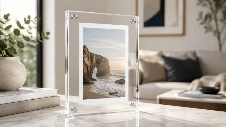
For more ideas on display-friendly framing and artful interiors, you may also enjoy our guides to acrylic floating picture frames, frames for canvas art, and picture ledge shelves versus hanging individual frames.
Recommended Products
SHOP THIS SETUP
DecoArt Americana Acrylic Paint Set, 24 Assorted Colors
DecoArt Americana is a dependable choice for painting picture frames because it offers strong coverage, smooth application, and a durable matte finish that works well on wood, MDF, and other frame materials. The color selection is versatile enough for both modern and decorative frame projects, making it a practical pick for DIYers looking for consistent results.
Frequently Asked Questions
Yes, acrylic paint works well on many picture frames, especially wood, unfinished MDF, and some resin frames. Good prep makes a big difference in how smooth and durable the result feels.
Primer is not always required, but it helps on glossy, dark, metal, resin, and MDF surfaces. It improves adhesion and can make the final color more even.
Matte and satin finishes are usually the easiest to live with in most interiors. Gloss and metallic finishes are better when you want the frame to read as a stronger decorative accent.
Clean the surface well, apply thin coats, and let each layer dry fully. A suitable sealant can help protect the finish in high-touch areas.
It can be, especially when the frame is thrifted, unfinished, or not highly valuable as an original antique. For heirloom pieces, it is worth considering preservation needs first.
They can, but humidity may affect some frame materials over time. Use primer and sealant carefully, and keep delicate pieces away from direct moisture when possible.