Can Art Portfolio Cover Art
Yes, can art portfolio cover art work as decor when the cover has strong design, good materials, and the right scale for the room. It fits best in studios, offices, and editorial-style interiors where it can read as a deliberate object, not just packaging.
can art portfolio cover art work as a real decor choice? Yes—when the cover is designed with the same care as a print, book jacket, or gallery object, it can add personality without needing a frame-full of explanation. For Hurrell Editions readers, the question is less about whether it belongs in a room and more about how well the cover design, materials, and scale support the space around it.
- Best use: Treat the cover like a graphic object, not disposable packaging.
- Room fit: Studios, reading corners, entryways, and creative offices are the easiest matches.
- What to check: Materials, finish, size, and whether archival details are actually specified.
- Main limitation: Small type, glare, and poor scale can make the cover feel underwhelming.
Can Art Portfolio Cover Art Work in a Home or Studio?
Short answer: yes, when the cover design is treated as a graphic focal point rather than just packaging
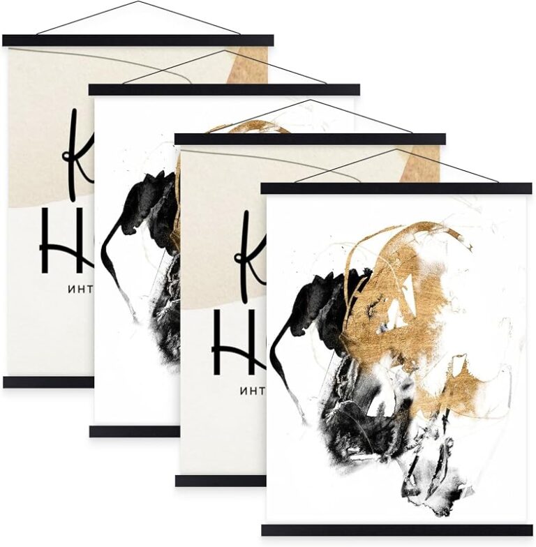
Portfolio cover art can work beautifully in a home or studio because it often already has the ingredients of good display art: strong composition, restrained typography, tactile materials, and a clear point of view. That said, it works best when the cover is visually intentional enough to stand on its own, whether you place it on a shelf, lean it on a console, or treat it like a framed object.
This is especially true for art portfolio cases and edition-style presentation pieces, where the cover may be part of the object’s identity rather than a disposable wrapper. If you are comparing formats, it can help to first understand how the case itself functions; our guide on how to use an art portfolio presentation case is a useful starting point for that broader context.
What “cover art” means in the context of art portfolio cases and editions
In this context, cover art refers to the front surface, title treatment, image, texture, or printed design that signals what the portfolio contains. It may be minimalist and typographic, image-led and expressive, or almost silent except for material cues like linen grain, debossing, or a matte wrap.
That distinction matters because portfolio cover art is not always meant to behave like a poster. Sometimes it functions more like an edition object: a cover that suggests authorship, craft, and archival intent. In practical terms, that means the design should hold up at arm’s length and still feel coherent when seen among books, frames, or studio tools.
What to Look for in Art Portfolio Cover Art
Visual hierarchy: title, image, and negative space
The strongest cover art usually gives the eye a clear path. A legible title, one primary image or motif, and enough negative space to prevent visual crowding are the basics to look for. If every inch is competing for attention, the cover may feel busy in a room even if it looks exciting online.
When you are deciding whether a cover will work as decor, ask what reads first from a few feet away. If the title disappears, the image is too small, or the layout feels cramped, the piece may be better suited to storage than display.
Material cues: linen, coated paper, embossed finishes, and print durability
Material is a major part of the appeal. Linen wraps can feel tailored and quiet, coated paper can look sharper and more graphic, and embossed or debossed details can add depth without relying on color. Those cues often matter as much as the artwork itself because they help the cover feel intentional and collectible.
Durability also matters if the piece will be handled often or displayed in changing light. A cover with a fragile surface, easily scuffed finish, or thin print layer may still be attractive, but it will need more careful placement and storage. If manufacturer details are available, confirm the exact surface finish and care guidance before buying.
Edition feel: minimalist, archival, collectible, or gallery-inspired
Some portfolio covers feel minimalist and architectural, while others lean archival, collectible, or gallery-inspired. The right choice depends on the room and the mood you want. A sparse, typography-led cover can look refined in a modern office, while a more expressive edition may suit a creative studio with layered objects and visible process materials.
Who It Suits and Which Rooms It Fits Best
Ideal for studios, creative offices, reading corners, and entryway displays
Portfolio cover art is especially effective in rooms where visual identity matters. Studios and creative offices benefit because the piece can reinforce a maker’s sensibility without feeling overly decorative. Reading corners and entryways are also strong candidates because they often need one polished object to establish tone.
A portfolio cover can also work as a quiet “welcome” piece on a console or shelf, especially when paired with books and one or two sculptural objects. For display ideas in that zone, see our guide to displaying framed art on a console table.
Best fit by interior style: contemporary, Scandinavian, modern classic, and editorial spaces
Contemporary interiors usually suit cover art with strong geometry, restrained color, and clean typography. Scandinavian rooms often favor lighter palettes, simple compositions, and natural textures that keep the cover from feeling too loud.
Modern classic and editorial spaces can handle a more refined, object-like presentation, especially if the cover has a structured layout or a material finish that echoes hardback books, museum catalogs, or archival boxes. In these settings, the cover becomes part of a broader visual language rather than a stand-alone statement.
When cover art feels out of place: overly busy, rustic, or highly traditional rooms
Cover art can feel out of step in rooms where the decor already leans highly ornate or heavily traditional. It may also struggle in rustic spaces if the finish looks too slick or editorial against rough wood, distressed textures, or antique-heavy arrangements.
That does not mean it cannot work at all. It simply means the cover needs a clearer bridge to the room, whether through color, texture, or a more subdued design. When that bridge is missing, the piece can look like packaging left on display instead of an intentional decor choice.
How to Style Art Portfolio Cover Art in 2026 Interiors
Using it as a framed print, shelf display, or leaner on a console
There are three especially practical ways to style portfolio cover art. Framing it can give the piece the most finished look, especially if the cover is flat, graphic, or paper-based. Shelf display works well when the cover belongs with books or edition objects. Leaning it on a console gives it an easy, editorial feel without requiring a permanent wall commitment.
If you are leaning toward a shelf-based approach, compare the piece with other display formats first. Our article on picture ledge shelves for framed art display can help you think through depth, layering, and visual balance.
Let the cover breathe. A single portfolio piece looks more polished when it has enough empty space around it to read as an object, not clutter.
Matching color temperature and tone with existing decor
Color temperature is easy to overlook, but it changes how a cover feels in the room. Warm neutrals can soften a cover with white space, while cooler grays and blacks can sharpen a minimalist design. If the room already has warm woods and brass accents, a stark high-contrast cover may need softer surroundings to avoid feeling abrupt.
Think in terms of tone as much as hue. A muted, low-saturation cover can blend into a calm room, while a saturated or glossy cover can become the focal point. Either approach can work; the key is making the cover feel deliberate in relation to the rest of the decor.
Pairing with books, sculpture, and other editorial objects for a layered look
Portfolio cover art often looks strongest when it is styled with other objects that share its editorial tone. Books, small sculpture, a ceramic vessel, or a neatly stacked set of art references can make the cover feel curated rather than isolated. This is especially effective in creative offices and reading corners where layered surfaces already feel natural.
Try pairing a linen-bound portfolio cover with one monochrome book stack and one matte object so the display feels calm, not crowded.
Materials, Specifications, and Build Quality to Check
Paper stock, binding, cover wrap, and print resolution
Before buying, check the material specification if it is available. Paper stock affects stiffness and perceived quality, binding affects how the piece opens or closes, and the cover wrap determines how the front surface will age with handling. Print resolution matters most on image-led covers, where soft or pixelated details can undermine the whole look.
When the listing is vague, use caution. A beautiful product photo does not always tell you how the cover will feel in person or how cleanly the title and image will reproduce. If the exact materials are not stated, confirm them with the retailer or manufacturer before ordering.
Archival considerations: fade resistance, acid-free materials, and surface protection
If the portfolio is meant to be kept, collected, or displayed for a long time, archival considerations matter. Acid-free materials are preferable for longevity, and fade resistance becomes more important if the cover will sit near daylight. Surface protection, such as a sleeve, case, or frame, can also help preserve the finish.
Keep delicate covers away from direct sun, damp walls, and high-traffic spots where hands, bags, or keys may scuff the surface.
Size, weight, and handling implications for display or gifting
Size affects everything from shelf fit to visual impact. A large cover can anchor a console or wall composition, but it may overwhelm a narrow shelf or small entry table. Heavier pieces also need more stable support, especially if they are going to be leaned rather than framed.
For gifting, size matters again because the object should feel substantial without becoming awkward to transport or store. If the listing does not specify exact dimensions or weight, treat that as a sign to verify before you buy.
- Confirm the exact size and finish before display planning
- Check whether the cover is intended for handling, storage, or open display
- Verify whether archival or acid-free materials are actually specified
- Make sure the scale suits the shelf, console, or wall space you have in mind
Benefits, Limitations, and Common Mistakes
Benefits: visual impact, collectability, and design-led identity
The biggest benefit of portfolio cover art is that it can communicate taste quickly. It adds visual impact without needing a full gallery wall, and it can make a room feel more collected and editorial. For artists, designers, and thoughtful gift buyers, that identity value is a major part of the appeal.
- Can act as a strong focal point in small or medium spaces
- Often feels more collectible than ordinary packaging
- Works well with books, shelves, and studio decor
- May read as too subtle if the typography is tiny
- Can look flat if the materials are low quality
- Does not suit every room style or scale
Limitations: legibility, glare, and mismatch with room scale
Not every cover is meant to be read from across the room. Small type, low-contrast layouts, and highly detailed imagery can lose clarity at a distance. Glossy surfaces may also create glare near windows or lamps, which can make a design harder to enjoy in everyday light.
Room scale is another limitation. A compact cover can disappear on a large wall, while an oversized portfolio can dominate a small shelf. Matching the piece to the room’s proportions is just as important as liking the design itself.
Common mistakes: poor placement, clashing frames, and overdecorating the wall
One common mistake is placing cover art where it competes with too many other focal points. Another is using a frame that clashes with the cover’s tone, such as a highly ornate frame around a minimalist edition. Overdecorating the wall can also dilute the effect, especially if the cover is supposed to feel special.
If you want a cleaner display strategy, think in terms of one hero object and a few supporting pieces. That approach usually preserves the editorial feel better than trying to make the cover compete with a crowded arrangement.
Care, Maintenance, and Long-Term Display Value
Cleaning methods by surface type and what to avoid
Care depends on the surface. Matte paper and uncoated wraps are generally more vulnerable to smudges, so they should be handled minimally and kept away from damp cloths unless the manufacturer specifically says otherwise. Coated or laminated surfaces may tolerate gentler dusting, but even then, abrasive cleaners and strong solvents are poor choices.
As a rule, dry dusting with a clean, soft cloth is the safest starting point for most display objects. If the cover has embossing, texture, or specialty finishes, avoid scrubbing the surface because that can flatten the detail or mark the print.
Light exposure, humidity, and storage recommendations
Light and humidity are the two biggest long-term concerns. Direct sunlight can fade inks and weaken paper-based surfaces, while high humidity can encourage warping or surface distortion. If you live in a bright or humid room, keep the piece in a protected spot or store it flat when not on display.
For storage, the safest approach is usually a clean, dry, flat environment away from pressure and dust. If the portfolio is part of a collection, consider whether it should be treated as an open display object or as a keepsake that comes out only occasionally.
When cover art becomes a keepsake, display object, or gift-worthy edition
The most successful portfolio cover art often crosses categories. It starts as packaging or presentation, then becomes a keepsake because the materials, image, and structure make it worth saving. In the right room, it can also become a gift-worthy edition object—something that feels considered, personal, and easy to live with.
That is why this category is more interesting than it first appears. It is not just about storage or transport. It is about whether the object can carry enough visual and material presence to earn a place in the room.
Final Verdict: Is Can Art Portfolio Cover Art Worth Choosing?
Best use cases and recommended buyer profile
Yes, can art portfolio cover art is worth choosing if you want a display object that feels graphic, collectible, and quietly personal. It is best for creative buyers, gift shoppers, and anyone styling a studio, office, entryway, or reading corner where a refined editorial object can do more than a conventional decorative print.
Transparent recommendation for Hurrell Editions readers
For Hurrell Editions readers, the clearest recommendation is to choose portfolio cover art when the cover itself has enough design integrity to stand alone: strong hierarchy, credible materials, and a finish that suits the room. If those elements are missing, the piece may still function as storage or presentation, but it will be less convincing as decor.
When in doubt, verify the materials, dimensions, and care guidance on the official listing before buying, then decide whether the cover belongs on a wall, a shelf, or in storage. That simple check usually tells you whether the piece is a true display object or just a nice package.
Frequently Asked Questions