How to Style a Picture Ledge
Style a picture ledge by choosing one clear direction, then layering framed art, books, and a few objects with balanced scale and breathing room. Warm lighting, careful spacing, and occasional refreshes will keep it looking curated and personal.
Picture ledges are one of the easiest ways to make art feel collected rather than fixed. When you know how to style a picture ledge well, the result can look editorial, personal, and quietly polished without feeling overworked.
- Pick a style lane: Minimal, layered, eclectic, or editorial keeps the ledge cohesive.
- Mix media: Art, books, and objects add depth and personality.
- Use scale well: Large pieces anchor the back; smaller pieces sit in front.
- Leave space: Negative space makes the display feel intentional.
- Refresh often: Seasonal swaps keep the ledge feeling current.
How to Style a Picture Ledge for a Gallery-Quality Display
A picture ledge does more than hold frames. It creates a flexible stage for art, books, and objects that can evolve with your taste, the season, or the room’s lighting.
Understanding the visual role of a picture ledge in modern interiors
In contemporary interiors, a picture ledge works like a soft alternative to a full gallery wall. It gives you visual movement, easy layering, and the freedom to change pieces without committing to new holes in the wall.
That flexibility is part of its appeal. A ledge can make a space feel thoughtful and lived-in, especially when you want art to feel curated rather than overly formal.
What readers want: a display that feels curated, flexible, and easy to refresh
Most people styling a ledge want three things at once: balance, personality, and ease. They want the arrangement to look intentional, but not so precious that it cannot be changed when new prints, books, or framed photos come home.
If that sounds familiar, the goal is not perfection. It is visual rhythm: a display that feels collected over time and simple enough to refresh when your mood changes.
Choose an Artistic Direction Before You Arrange Anything
The easiest way to avoid a cluttered ledge is to decide on a clear direction first. Before placing a single frame, choose the mood you want the ledge to express.
Minimal, layered, eclectic, or editorial: picking a style lane
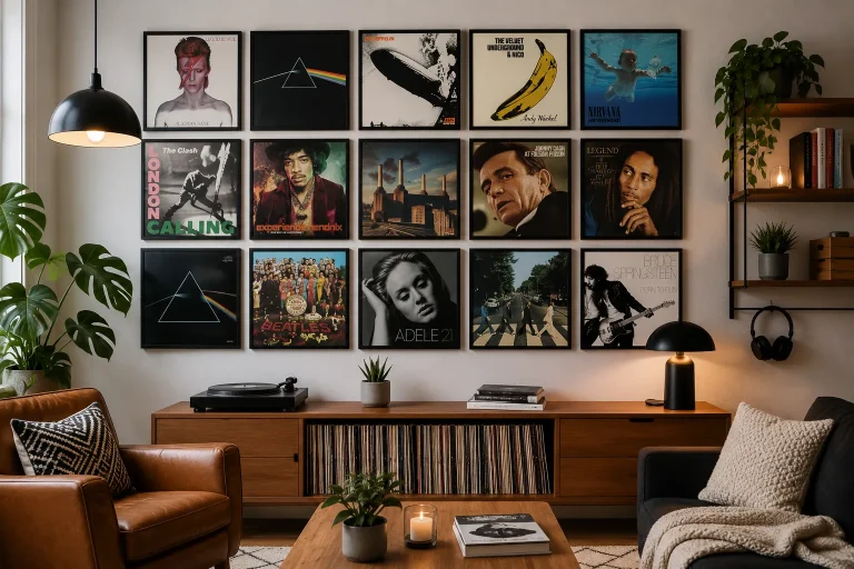
A minimal ledge usually relies on fewer pieces, more negative space, and a restrained palette. Layered styling adds depth with overlapping frames and a mix of heights, while eclectic displays combine different sizes, subjects, and textures for a more collected feel.
An editorial approach often sits between minimal and layered. It uses strong composition, a considered color story, and just enough variation to feel expressive without becoming busy.
Choose one dominant feeling for the ledge—calm, collected, bold, or soft—and let every frame, book, and object support that mood.
How to match the ledge to your room’s architecture, color palette, and mood
Let the room guide the styling. In a period home with moldings and tall ceilings, a ledge can echo the architecture with more formal framing and symmetrical spacing. In a modern apartment, it may work best with cleaner lines and a looser arrangement.
Color matters too. Warm neutrals, muted greens, and earthy tones create a grounded look, while black-and-white prints and pale woods feel crisp and contemporary. For a deeper dive into composition, see how to arrange frames on a picture ledge without clutter.
Build a Balanced Composition with Art, Books, and Objects
The most successful ledges usually mix media. Art gives the display focus, books add volume and warmth, and objects bring texture that keeps the arrangement from looking too flat.
Mixing framed prints, small canvases, and photography for depth
Framed prints are the easiest starting point because they create a clean visual anchor. Small canvases can add a softer, more tactile note, while photography introduces contrast through tone, subject, or finish.
If you are mixing all three, vary the frame profiles slightly but keep one unifying element, such as a shared color, mat style, or material finish. That subtle repetition helps the display feel coherent.
- Layering framed prints behind smaller works
- Combining art with books and sculptural accents
- You want a very formal, grid-like presentation
- Your ledge is narrow and needs very few pieces
Using books, ceramics, and sculptural pieces to add texture and personality
Books are especially useful on a picture ledge because they create height and a sense of personal taste. Art books, monographs, and slim volumes can be stacked horizontally to support smaller frames or objects.
Ceramics, small stone pieces, and sculptural finds add texture and keep the ledge from feeling too two-dimensional. If you are styling a ledge in a living room or hallway, one or two objects are usually enough.
A small art monograph or exhibition catalog works beautifully on a ledge because it adds color, weight, and a sense of cultural layering without overwhelming the display.
Styling trade-offs: symmetry vs. relaxed asymmetry
Symmetry feels calm and refined, especially in formal rooms or spaces with strong architectural balance. It is also helpful when you want the ledge to read as orderly from across the room.
Relaxed asymmetry feels more natural and collected. It is often the better choice if you want the ledge to feel lived-in, creative, and less rigid. The key is to keep the visual weight distributed evenly, even if the arrangement is not mirrored.
Work with Scale, Height, and Negative Space
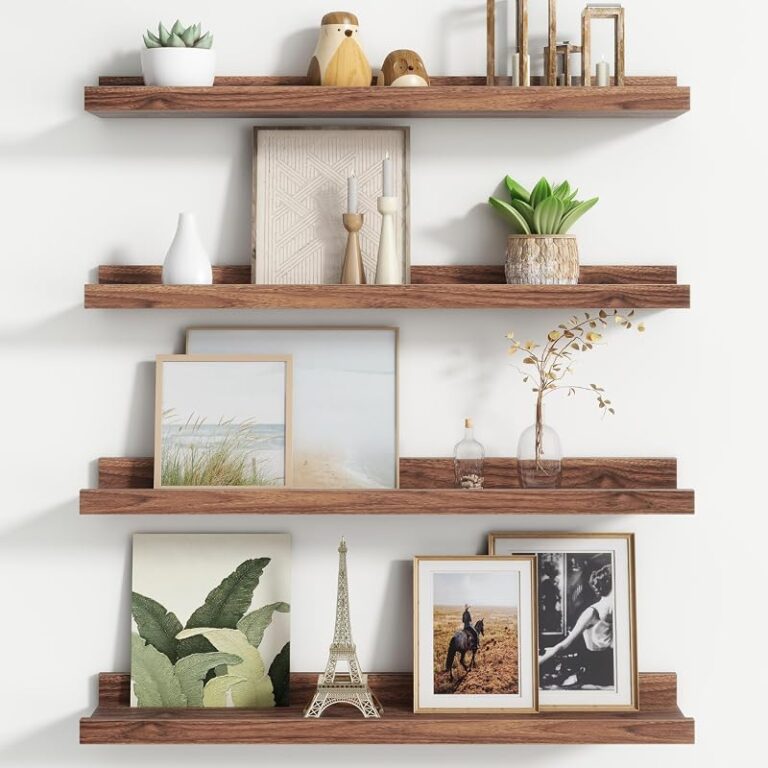
Scale is what makes a picture ledge look designed rather than accidental. A well-styled ledge usually has a clear hierarchy: larger pieces anchor the back, while smaller accents create movement in front.
How to layer larger pieces at the back and smaller accents at the front
Start with your tallest or largest frame at the back of the ledge, slightly off-center if you want a softer look. Then layer medium pieces in front or beside it, and finish with the smallest accents where they can break up the edges.
This back-to-front layering creates depth and helps the eye move naturally across the display. If your ledge is deep enough, you can also overlap frames by a few inches for a more collected effect. For sizing guidance, how deep a picture ledge should be for framed art is a useful reference.
Why leaving breathing room makes the display feel intentional
Negative space is not empty space; it is part of the composition. A ledge that is packed edge to edge often feels visually noisy, while a display with a little breathing room feels edited and calm.
Leave gaps between clusters so individual pieces can be appreciated. This is especially important if you are using bold artwork, textured ceramics, or books with vivid spines.
Practical examples for narrow ledges, long ledges, and small rooms
On a narrow ledge, keep the arrangement lean: one larger frame, one smaller frame, and a single object or book stack may be enough. Long ledges can support repeating patterns, such as alternating frames and objects, but they still benefit from visual pauses.
In small rooms, choose fewer pieces with lighter visual weight. Pale mats, slim frames, and a restrained palette can make the ledge feel airy rather than crowded.
- How deep the ledge is
- Whether the room needs calm or energy
- How many pieces can sit comfortably without crowding
- Whether the display will be viewed close up or from across the room
Use Light to Elevate Art and Create Evening Atmosphere
Lighting changes everything. A picture ledge can feel quiet and daytime-fresh in natural light, then warm and atmospheric at night with the right nearby illumination.
Natural light placement and avoiding glare on glass
If possible, place the ledge where it receives soft side light rather than direct sun. Strong sunlight can create glare on glass and may also fade paper-based art over time.
Glare is especially noticeable on glossy frames and photographs. If you cannot avoid bright light, consider matte finishes or move more delicate works away from the most exposed spot.
Paper art, vintage prints, and photographs can be light-sensitive. Avoid prolonged direct sun, and be mindful of humidity near kitchens, bathrooms, and unventilated walls.
Accent lighting ideas: picture lights, sconces, and warm lamps nearby
Accent lighting can make a ledge feel intentional after dark. A picture light above the arrangement, a wall sconce nearby, or a warm table lamp in the same zone can all create a softer, more inviting atmosphere.
If you want to choose the right fixture, how to choose a picture light for artwork offers a helpful starting point. Warm bulbs often flatter prints and books better than cool white light.
How lighting changes the mood of prints, books, and decorative objects
Lighting does more than illuminate; it changes tone. Warm light makes paper feel richer, ceramics feel softer, and frames feel more integrated into the room. Cooler light can sharpen contrast, but it may also make the display feel less intimate.
For evening rooms, especially living spaces and bedrooms, a gentle glow usually suits a picture ledge better than bright overhead light.
Designers often treat picture ledges as “changeable galleries” because they let a room evolve without requiring a full rehang. That flexibility is one reason they remain so popular in modern homes.
Curator-Approved Styling Ideas for Different Rooms
The best picture ledge styling always responds to the room it lives in. A ledge in the living room should feel more social, while one in a bedroom can lean softer and more personal.
Living room picture ledge ideas for statement art and conversation pieces
In a living room, let the ledge carry one or two stronger pieces. This is the place for a striking print, a black-and-white photograph, or a work with a bold shape that can anchor the arrangement.
Add a conversation piece, such as a small ceramic or a book on design, to give guests something to notice up close. If you are deciding between a ledge and a wall of frames, picture ledge shelves vs hanging individual frames breaks down the trade-offs clearly.
Bedroom styling with softer palettes, personal prints, and calming books
Bedrooms usually benefit from quieter styling. Soft neutrals, gentle landscapes, personal photography, or abstract prints in muted tones can make the ledge feel restful rather than performative.
Books here can be more intimate: poetry, essays, or art books you genuinely return to. Keep the arrangement looser and lower in contrast so it supports the room’s calm mood.
Hallway or dining room displays that feel collected and refined
Hallways are ideal for a more curated, passing-view arrangement. Use a few strong pieces with enough spacing that the eye can take them in as you walk by.
Dining rooms can support a more polished and slightly formal look. A balanced arrangement of framed art, a small stack of books, and one elegant object can feel refined without becoming stiff.
- Easy to refresh without rehanging the whole wall
- Works for art, books, and decorative objects
- Lets you layer pieces for depth and personality
- Adapts well to changing seasons and collections
Protect, Refresh, and Care for Your Display Over Time
A beautiful ledge should also be practical. The best displays are easy to dust, simple to adjust, and built from materials that suit the room’s conditions.
Dusting, repositioning, and preserving framed work and paper pieces
Dust frames and ledges regularly with a soft, dry cloth. If you are using paper art or photographs, avoid touching the surface directly and keep hands clean when repositioning pieces.
Rearrange the display occasionally so one side does not become visually dominant. Small changes can make the ledge feel fresh without requiring new purchases.
Choosing materials and finishes that suit long-term use
For long-term styling, frames with durable finishes and simple profiles tend to age best. Wood, painted finishes, and quality metal frames all work well, but the right choice depends on the room and the mood you want.
Entry-level frames and accessories are often suitable for prints you like to rotate frequently. Mid-range options can be a smart balance for everyday display, while investment pieces make sense for art you expect to keep long term or for special framing.
Budget and price context: where to invest in frames, art, and accessories
If your budget is limited, invest first in the pieces that affect the overall look most: the main frame, the most visible artwork, and any lighting that will shape the mood of the display. Accessories can often be added gradually.
Original art, archival framing, and well-made lights usually justify a higher spend, especially if the pieces will be exposed to light or handled often. Decorative objects and books can be sourced more flexibly, depending on taste and availability.
Availability, finish, and price can vary widely by maker and region. Choose materials based on the room’s light, humidity, and how often you expect to refresh the arrangement.
Finish with a Creative Reset: Styling a Picture Ledge as an Evolving Art Story
A picture ledge works best when you treat it as a living composition. It does not need to stay fixed forever; in fact, its charm often comes from change.
Seasonal swaps, giftable pieces, and keeping the arrangement fresh in 2026
Seasonal updates can be subtle. A winter ledge might lean into darker frames and richer tones, while spring might call for lighter prints, fresh flowers nearby, or a more open composition.
Picture ledges are also excellent for giftable pieces: a small print, a ceramic object, a special book, or a framed photograph can all become part of the story. In 2026, the most appealing displays are likely to remain the ones that feel personal, adaptable, and quietly collected.
Final recap: the easiest way to make a picture ledge feel personal, polished, and collectible
The simplest formula is this: choose a clear style direction, balance art with books and objects, layer by scale, and leave enough space for each piece to breathe. Then let light and thoughtful maintenance do the rest.
When styled well, a picture ledge becomes more than storage for frames. It becomes a small, evolving gallery that reflects your taste, your home, and the way you love to live with art.
Recommended Products
SHOP THIS SETUP
Umbra Exhibit Gallery Picture Frame Shelf, Black
Umbra’s Exhibit shelf is a smart choice for styling a picture ledge because it combines a slim, modern profile with a strong display rail that helps keep frames in place. It’s especially useful for creating a layered gallery look with art prints, small objects, and family photos without making the shelf feel crowded.
Frequently Asked Questions
Mix framed art, books, and one or two decorative objects for a balanced look. Keep the arrangement edited so the ledge feels intentional rather than crowded.
Choose one style direction, repeat a few colors or materials, and vary the heights of your pieces. Leaving some negative space is one of the easiest ways to make the display feel curated.
Yes, slight overlap can add depth and a collected feel. Just avoid stacking so many pieces that the display looks heavy or hard to read.
That depends on the ledge length and depth, but fewer pieces usually look better than too many. Start with a few anchors and add only if the composition still feels open.
Soft natural light, picture lights, sconces, or warm lamps nearby can all work well. Avoid harsh direct sun and bright glare on glass if possible.
Limit the number of objects, vary scale carefully, and use a consistent palette. If the ledge starts to feel busy, remove one item and add more breathing room.