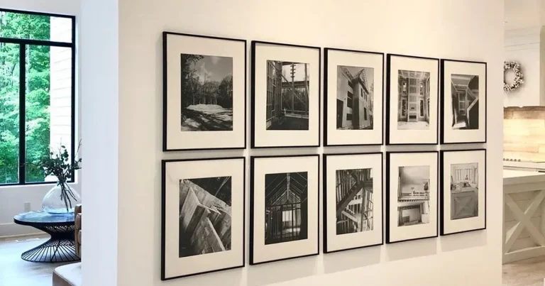
Gallery Wall Frame Spacing Guide for Perfect Results

Keep gaps between frames at 2–3 inches for most walls, and adjust for frame size, wall scale, and furniture below. Plan the layout with paper templates, keep the arrangement center near eye level, and use hardware matched to your wall type.
This gallery wall frame spacing guide walks through the numbers, the layout methods, and the hardware decisions that turn a random set of frames into a cohesive display. The goal is simple: consistent gaps, balanced visual weight, and a wall that looks intentional from every seat in the room.
- Golden rule: 2–3 inches between frames works for most gallery walls; adjust for oversized or very.
- Plan first: Use paper templates or a floor layout to test spacing before drilling holes.
- Eye level: Center the whole arrangement near 60 inches, or 6–8 inches above furniture.
- Hardware matters: Match hanging hardware to wall type and frame weight to keep spacing exact.
- Maintain: Re-level frames and clean gently so gaps stay consistent over time.
The Golden Rule: How Far Apart Should Frames Be?
The most common starting point is 2 to 3 inches between frames. That range reads as “connected” without feeling crowded, and it gives each piece enough breathing room to register as its own artwork.
Why 2–3 Inches Works for Most Gallery Walls
Two to three inches is roughly the width of two or three fingers, which makes it easy to measure by hand as you work across the wall. At this distance, the eye travels smoothly from one frame to the next, and the gaps read as deliberate rather than accidental. The spacing also keeps the group tight enough that the collection feels like a single composition instead of separate objects scattered across the wall.
When to Break the Rule: Oversized Frames and Tight Clusters
Large frames — anything much beyond 24 inches on the long side — can handle 4 to 5 inches of spacing because their mass carries the composition. Tiny frames, by contrast, look better closer together; 1.5 to 2 inches keeps a cluster from feeling scattered. The rule flexes in both directions, but the principle stays the same: the gap should be small enough that the eye connects the frames and large enough that each one keeps its identity.
When in doubt, err on the tighter side. It is far easier to spread frames apart later than to close gaps after the holes are already in the wall.
Factors That Change the Ideal Spacing
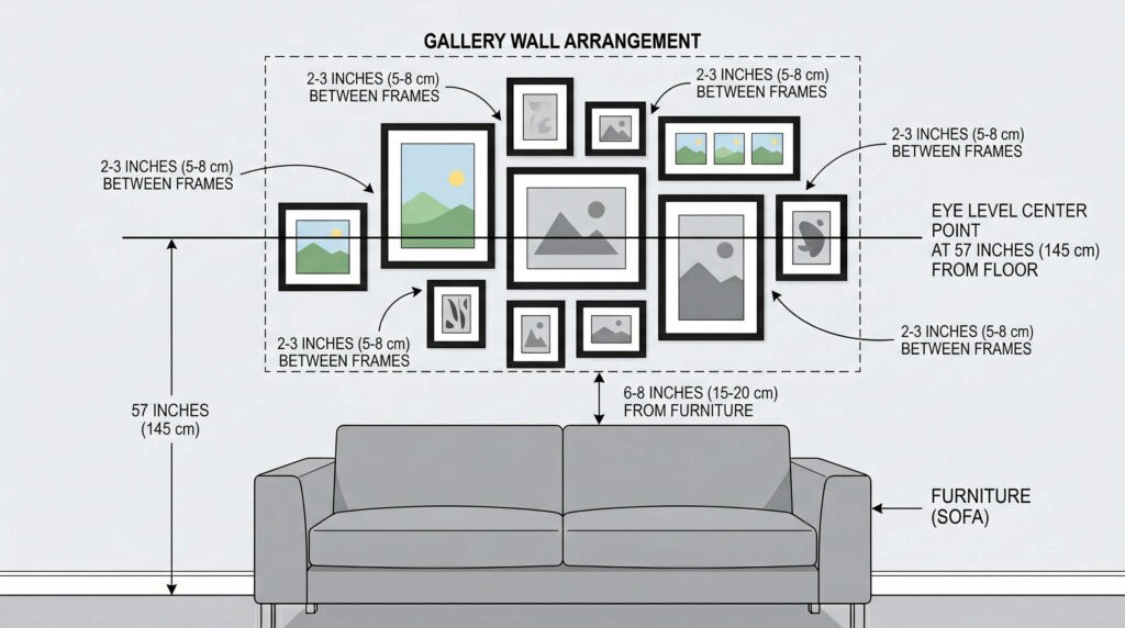
Comparison of frame spacing options showing how wall size affects optimal distance.
The 2–3 inch rule is a starting point, not a law. Three factors should adjust your numbers before you commit to a layout.
Frame Size and Visual Weight
A wall of identical 8×10 frames behaves differently than a mix of small and oversized pieces. When sizes vary, use spacing to balance visual weight: place larger frames slightly closer to the center of the arrangement and let smaller frames sit at the edges with slightly wider gaps. If you are assembling a set from scratch, a guide on how to mix frame sizes for a gallery wall can help you choose proportions that will cooperate with consistent spacing.
Wall Size and Room Proportions
A small wall with a tight cluster looks intentional; the same cluster on a large, empty wall looks lost. Scale the spacing to the wall: generous walls can support 3 to 4 inch gaps, while narrow walls above a desk or console often look best at 2 inches or less. As a general target, the overall footprint of the arrangement should fill roughly two-thirds to three-quarters of the available wall area.
Furniture and Architectural Features Below the Wall
What sits beneath the wall changes how spacing reads. Above a sofa, the bottom edge of the arrangement should sit about 6 to 8 inches above the backrest, and tighter spacing keeps the group from visually colliding with the furniture. Above a console or sideboard, leave 4 to 6 inches between the lowest frame and the piece below. Doorways, windows, and light switches also act as visual boundaries — the frames should feel related to them without crowding them.
Planning Your Layout: Measure, Arrange, Adjust
Planning on the floor before you put a single nail in the wall is the difference between a polished gallery wall and a frustrating afternoon of re-drilling.
Paper Templates and the Floor-Layout Method
Cut kraft paper or newspaper to the exact dimensions of each frame, tape the templates to the wall, and step back. This lets you test spacing, arrangement, and height without committing to holes. The floor-layout method works the same way: arrange the actual frames on the floor in front of the wall, measure the gaps between them, and transfer those measurements to the wall.
Record the exact width and height of each piece, including the frame itself.
Trace each frame onto kraft paper or newspaper and write which frame it represents.
Arrange the templates on the wall and move them until every gap looks even at a glance.
Mark the hanging points through the templates, remove the paper, and install the hardware.
The 60-Inch Eye-Level Rule for Gallery Centres
The center of the entire arrangement — not the center of each frame — should sit at roughly 60 inches from the floor. That places the middle of the collection at average eye level. For arrangements that hang above furniture, the eye-level rule yields to the furniture rule: the bottom of the group sits 6 to 8 inches above the backrest, and the center lands wherever it lands.
Mapping Out Grids, Salons, and Asymmetrical Arrangements
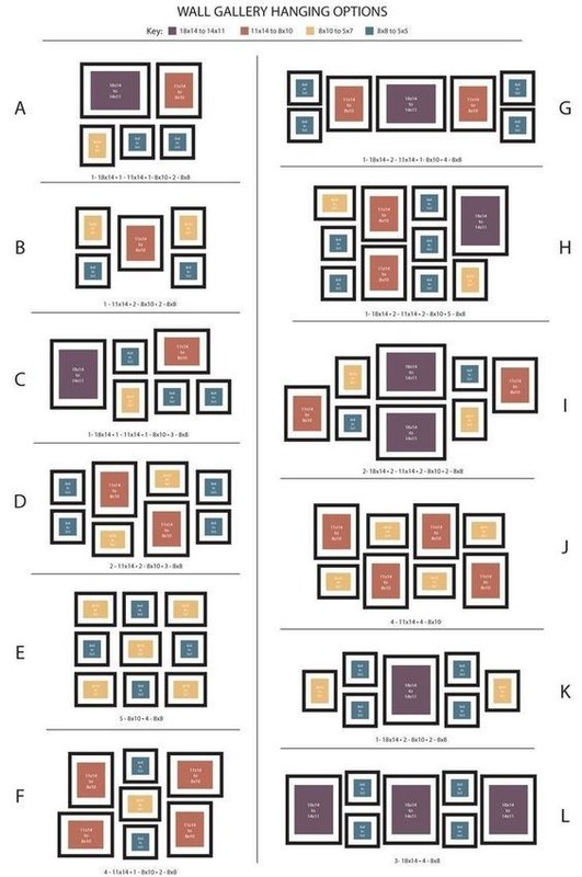
Grids need mathematical consistency: identical gaps in every direction, usually 2 inches, with all frames aligned on a shared center line. Salon-style walls are looser — gaps can vary between 1.5 and 3 inches, but the overall shape should stay balanced. Asymmetrical arrangements work best when you establish one anchor frame and build outward, keeping the spacing consistent even as the sizes vary. If you want to see the options laid out visually, these gallery wall layout templates for frames are a useful reference before you commit to paper.
Frame Materials, Hanging Hardware, and Wall Types<
Frame materials and hanging hardware on different wall types with spacing tools.
Frame materials and hanging hardware on different wall types with spacing tools.
/h2>
Spacing is only half the job. The hardware has to hold the frames exactly where you put them, and the wall type determines which hardware that is.
Matching Hardware to Plaster, Drywall, Brick, and Panelling
Drywall accepts standard picture-hanging hooks or wall anchors, depending on weight. Plaster is harder and more brittle — use masonry bits and anchors designed for plaster, and avoid hammering nails directly into it. Brick and concrete require masonry anchors or a hammer drill; adhesive strips are rarely a reliable option. Wood panelling and wainscoting can take small nails or screws, but the frames will be positioned relative to the panel seams, which may force you to adjust your spacing.
Wall construction varies widely even within the same room. If you are unsure what your wall is made of, check by tapping, looking inside a switch plate opening, or asking a professional before drilling.
Weight Limits, Frame Construction, and Hanging Methods
The weight of the frame determines the hardware. Small, lightweight frames can hang from a single nail or hook; heavier framed pieces need two hanging points or a rated wall anchor. The frame’s own construction matters too — a D-ring or wire rated for the frame’s weight is only as strong as the screw holding it into the frame’s rail. If the frame feels heavy or the wall feels soft, err on the side of stronger hardware. For frames that tend to tilt forward, wall-mounted bumpers or a second anchor point can keep them flush against the wall.
Matching Your Gallery Wall to Existing Decor
Spacing creates structure; the frames themselves create the style. The two need to agree for the wall to feel finished.
Colour, Metal Finishes, and Matting Consistency
Consistent spacing does more work when the frames share a visual language. Matching metal finishes — all black, all gold, all natural wood — makes varied sizes feel unified. Matting consistency does the same: if every frame uses a white mat, the eye skips over the mats and reads the art. If you are starting fresh, a coordinated set removes the guesswork. For living-room installations, a gallery wall frame set for a living room can simplify the whole process of choosing pieces that will sit well together.
Room-Specific Styling: Hallways, Staircases, Living Rooms, and Bedrooms
Hallways and staircases favor tighter spacing because the wall is narrow and the viewer is usually moving. Living rooms allow more breathing room above sofas and consoles, and the arrangement should relate to the furniture below. Bedrooms work well with softer, lower-contrast frames and slightly wider gaps for a calmer feel. In every room, the spacing should feel consistent even if the layout is not symmetrical — that consistency is what makes the wall read as curated rather than accidental.
Common Spacing Mistakes and How to Avoid Them
Most gallery wall problems are spacing problems in disguise.
Uneven Gaps and the “Crawling” Frame Problem
The “crawling” effect happens when frames drift progressively upward or sideways across the wall, often because each frame was hung relative to the previous one instead of relative to a plan. The fix is to measure every gap from the same reference point and use a level on every frame. Uneven gaps — 1 inch on one side, 3 on the other — read immediately as sloppy, even when the frames themselves are beautiful.
- Measure every gap with a ruler or tape measure.
- Use a bubble level or laser level on every frame.
- Step back and check the arrangement from across the room.
- Hanging frames one at a time without a written plan.
- Guessing gaps by eye when the arrangement has more than four frames.
- Ignoring how the wall looks from doorways and seating areas.
Ignoring Sightlines, Corners, and Light Switches
A frame that looks fine from directly in front can look wrong from the sofa or the doorway. Before committing, check the arrangement from every seat and entry point in the room. Corners need special attention: frames placed too close to a corner can feel squeezed, and light switches or thermostats can visually “steal” a frame if the spacing does not account for them. The arrangement should work with the room’s architecture, not compete with it.
Caring for Your Gallery Wall: Maintenance and Adjustments
A gallery wall is not a set-and-forget project. Frames shift, hardware loosens, and dust accumulates.
Keeping Frames Level and Hardware Secure Over Time
Check the level of every frame every few months, especially in rooms with heavy foot traffic or slamming doors. If a frame keeps drifting, the hardware is probably undersized for the weight — upgrade the hook or anchor rather than re-leveling it every week. For frames that tilt forward at the top, adding bumpers or adjusting the wire tension usually solves the problem. If you are dealing with persistent tilting, a guide on how to stop picture frames from tilting on the wall covers the common fixes in detail.
Cleaning and Protecting Frames Without Disturbing Spacing
Dust frames with a soft, dry cloth; avoid spray cleaners near the glass or mat, since moisture can seep into the frame and stain the mat. When you clean, hold the frame steady with one hand so you don’t nudge it off its hanging point. If you remove a frame for deeper cleaning, mark the wall with a pencil dot at the hanging point before you lift it — that way you can return it to the exact same position without re-measuring the spacing.
Direct sunlight and humidity are the slow enemies of framed art. Keep frames out of prolonged direct sun to prevent fading, and avoid hanging them in steamy bathrooms or directly above radiators.
Value, Limitations, and Final Recommendation
Spacing is the cheapest upgrade you can make to a gallery wall — it costs nothing but attention, and it changes everything about how the collection reads.
When Hiring a Professional Is Worth It
If the wall is brick, concrete, or lath-and-plaster, or if the frames are heavy or valuable, a professional installer is a reasonable investment. The same applies to stairwells, where ladders and angled ceilings make measuring difficult, and to very large arrangements where one mistake means re-drilling several holes. For a standard drywall wall with lightweight frames, careful DIY planning is usually enough.
The Last Word on Achieving Perfect Spacing
There is no single perfect number, but there is a perfect process: measure the wall, plan the layout on paper, test with templates, hang with consistent gaps, and check from across the room before you call it done. The 2–3 inch rule is the best starting point for most walls. Adjust it for frame size, wall scale, and the furniture below, and you will land on spacing that looks deliberate from every angle.
- Start with 2–3 inches between frames and adjust for frame size and wall scale.
- Plan with paper templates or a floor layout before committing to holes.
- Keep the arrangement center near 60 inches, or 6–8 inches above furniture.
- Match hanging hardware to wall type and frame weight.
- Re-level frames and clean gently so gaps stay consistent over time.
Frequently Asked Questions