How to Use a Color Wheel When Mixing Paint: Harmony, Contrast & Mixing Tips
A color wheel helps you choose harmonious or contrasting paint colors before you mix, which makes it easier to avoid muddy results. Use it to plan complements, analogous colors, tints, shades, and muted tones for art and interiors.
Using a color wheel well can save you from guesswork, muddy mixtures, and endless repainting. Whether you are working on a canvas, a mural, or a room accent wall, it gives you a simple way to choose colors that feel intentional and balanced.
For the Hurrell Editions Editorial Team, the color wheel is less about rules and more about clarity. It helps you see how pigments relate, how light changes a mixture, and how to build a palette that feels polished rather than accidental.
- Start with relationships: Use complements, analogues, and split complements to guide your mix.
- Mix in small steps: Build color gradually to protect clarity and brightness.
- Test in real light: Swatches reveal how a color actually behaves on your surface.
- Keep notes: Record pigments, ratios, and surfaces for repeatable results.
- Choose by medium: Pick a wheel that suits acrylic, watercolor, gouache, oil, or mixed media.
What the Color Wheel Actually Does for Painters and Decorators
A color wheel is a visual map of color relationships. It helps you understand which hues sit beside each other, which ones intensify one another, and which combinations naturally calm or energize a space.
Primary, secondary, and tertiary colors in plain terms
The basic wheel starts with primary colors: red, yellow, and blue. These are the foundation colors you combine to create other hues, though the exact results depend on the paint medium and pigment quality.
Secondary colors are made by mixing two primaries: orange, green, and violet. Tertiary colors sit between them, such as blue-green or red-orange, and they are often the most useful shades for nuanced interiors and painterly effects.
Many artists rely on the color wheel not to “find the perfect color” instantly, but to narrow the field of good choices before mixing begins.
Why the color wheel matters for studio work, murals, and interior accents
In studio work, the wheel helps you plan harmony across a series so each piece feels related. For murals and decorative painting, it can keep large areas from looking flat or overly busy.
In interiors, the same logic applies on a quieter scale. A cushion, painted shelf, or feature wall often looks more refined when its color family is chosen with a wheel in mind rather than by instinct alone.
Color wheels are guides, not absolute truth. Real paint behavior changes with pigment load, binder, surface texture, and lighting, so always test before committing.
Choosing the Right Color Wheel for Your Medium and Workflow
Not every wheel works equally well for every painter. Some are designed for classroom basics, while others are more useful for artists who mix from pigment, decorators who match finishes, or creatives who work across multiple mediums.
Traditional pigment wheels vs. digital and designer-friendly versions
Traditional pigment wheels are best when you want to understand how actual paint behaves. Digital wheels can be convenient for planning, but they do not always reflect the subtle shifts you get from opaque, transparent, warm, or cool pigments.
Designer-friendly versions often include tints, shades, and neutral ranges, which can be helpful if you are selecting wall colors, textiles, or decorative accents. If your work crosses over between art and interiors, that extra information is worth having.
Best fit for acrylic, watercolor, gouache, oil, and mixed media
Acrylic painters often benefit from a wheel that shows both bright mixes and muted results, since acrylics can move quickly from vivid to chalky if overmixed. Watercolor and gouache artists may want a wheel that emphasizes transparency and layering, especially for delicate blends.
Oil painters usually appreciate a more pigment-focused guide because oils can produce rich, slow-building transitions. Mixed media creators may want a flexible wheel that helps them compare paint, ink, and drawing materials without assuming one system fits all.
If you are assembling a home studio, it also helps to keep your mixing tools organized. Our guide on how to set up a home art studio space can help you create a cleaner workflow around color mixing, storage, and drying space.
Price context: what to expect from basic classroom tools to premium artist guides
Entry-level color wheels are usually inexpensive and practical, especially for beginners or students. Mid-range options may include more detailed pigment guidance, while premium artist guides often focus on nuanced mixing relationships and more refined color theory.
For most home artists, the right choice is the one you will actually use beside your palette. A beautiful wheel is nice, but a clear, durable one with useful labels is better.
How to Use a Color Wheel When Mixing Paint Step by Step
The color wheel becomes most useful when you use it before the paint hits the palette. Start by deciding whether you want contrast, harmony, neutrality, or a softened transition between colors.
Finding complements, analogous colors, and split complements
Complementary colors sit opposite each other on the wheel, such as blue and orange or red and green. They create strong contrast and can make each color look more vivid, which is useful for focal points and energetic compositions.
Analogous colors sit next to each other, like blue, blue-green, and green. These combinations feel more fluid and restful, making them ideal for serene interiors, botanical studies, and paintings where continuity matters.
Split complements use one base color plus the two colors beside its direct complement. This gives you contrast with a little more softness, which is often easier to live with in decorative work than a full opposite-color clash.
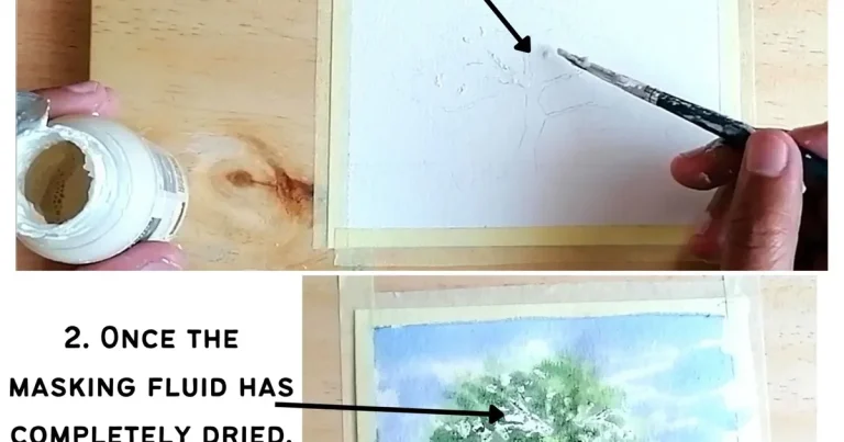
Mixing tints, shades, and muted tones without muddy results
Tints are made by adding white, shades by adding black or a darkening color, and muted tones by adding a complement or neutralizing pigment. The key is to add slowly and mix thoroughly between each adjustment.
If a mixture starts to flatten, stop before it loses its character. Many muddy results come from overmixing too many pigments together, especially when each one already contains a small amount of its opposite color.
When you want a muted color, try neutralizing in tiny steps. A little complementary pigment often gives a richer result than a large amount of black or white.
If you prefer a more textured approach, a palette knife can help keep mixtures cleaner and more distinct. Our article on when to use a palette knife in painting explains why some artists reach for a knife instead of a brush during mixing.
Practical studio examples: skin tones, neutrals, foliage, and shadow colors
Skin tones usually work best when you build from a warm base and then adjust with tiny amounts of complementary or earth pigments. The goal is not to match one fixed formula, but to observe undertone, light source, and surrounding color.
Neutrals are often more interesting when they are mixed rather than bought premade. A soft gray, taupe, or mushroom tone can be created by blending complements, then adjusting warmth or coolness to suit the subject or room.
Foliage benefits from variation. Instead of using one green, try a range of yellow-greens, blue-greens, and muted olive tones so the result feels natural rather than decorative in a stiff way.
Shadow colors should usually avoid pure black unless you want a very graphic effect. A shadow built from a deeper version of the local color often looks more believable and more elegant, especially in portrait work or interior studies.
Reading Temperature, Contrast, and Mood for Creative Living Spaces
Color mixing is not only about accuracy. In homes and studio spaces, the emotional temperature of a color matters just as much as its hue.
Warm vs. cool palettes for calm rooms, bold feature walls, and gallery-style interiors
Warm colors tend to feel more intimate and inviting, which is why they often suit dining rooms, reading corners, and statement walls. Cool colors can feel airy and composed, making them a strong fit for bedrooms, workspaces, and gallery-like settings.
A room does not need to be all warm or all cool. The most attractive interiors often use one temperature as the lead and the other as a balancing note, like a blue-gray wall softened by oak, linen, or clay accents.
How lighting changes the look of mixed paint in morning, evening, and artificial light
Morning light can make colors feel clearer and cooler, while evening light often warms them up. Artificial lighting can shift mixtures even more, especially if bulbs lean yellow, blue, or very bright white.
This is why a paint that looks perfect on the palette may feel different on a wall or canvas after a few hours. Test your mix in the actual light where it will live, and check it again at different times of day.
Paint samples, paper swatches, and test boards can fade, warp, or change under strong sun and humidity. Keep them in a stable place if you want them to remain useful for comparison.
Style trade-offs: vivid statement color versus soft, timeless restraint
Vivid color gives personality and immediate energy. It works well when you want a room or artwork to feel expressive, modern, or memorable.
Soft restraint is quieter, but it often ages beautifully. Muted palettes and carefully balanced neutrals tend to be easier to live with over time, especially in rooms that already hold a lot of visual activity.
There is no wrong choice here, only a design trade-off. The color wheel helps you decide whether a palette should sing, whisper, or do a little of both.
Curator Recommendations for Better Palette Building
Good palette building often comes down to discipline. The most compelling color stories usually use fewer hues than you expect, but use them more thoughtfully.
Limiting your palette for cohesion in art series, books, and home projects
A limited palette creates visual unity. If you are painting a series, styling a shelf, or planning a room refresh, choosing a small number of related colors can make the result feel curated rather than scattered.
This approach is especially helpful for people who love books, art prints, and layered interiors. Repeating one or two tones across different objects can quietly tie the whole room together.
If you enjoy displaying your creative references as part of your decor, our guide to how to store coffee table books offers practical ideas for keeping visual inspiration organized and beautiful.
Using neutral anchors, earth tones, and accent hues to elevate results
Neutral anchors give the eye somewhere to rest. Think of warm gray, ivory, charcoal, stone, or soft brown as the background that lets other colors breathe.
Earth tones are especially useful because they bridge art and interior design so well. Terracotta, ochre, olive, and umber can make a palette feel grounded, even when brighter accents are present.
Accent hues should be used with intention. A small amount of cobalt, coral, or emerald can bring a composition to life, but too many accents at once can weaken the overall effect.
Suggested approaches for beginners, hobby painters, and design-minded creators
Beginners do best with a simple wheel and a narrow set of paints. Focus on learning complements, tints, and muted mixes before trying to build highly complex palettes.
Hobby painters often benefit from swatch books and written notes. Recording what you mixed, and in what order, makes it easier to repeat a successful color later.
Design-minded creators may want to think in terms of atmosphere first: calm, dramatic, airy, grounded, or romantic. Once the mood is clear, the wheel becomes a tool for translating that feeling into a usable palette.
A well-made artist color wheel with pigment labels and a durable finish is one of the most useful small purchases for a home studio. It is not glamorous, but it earns its place quickly because it supports better decisions across paint, paper, and decor projects.
Common Mixing Mistakes and How to Avoid Them
Even experienced makers can lose clarity in a mix if they move too quickly. The good news is that most color problems are easy to prevent once you know what to watch for.
Overmixing, over-darkening, and losing color clarity
Overmixing can make a color look flat because the pigments blend so thoroughly that the mixture loses its visible life. This is especially common when trying to chase a perfect match by adding one more pigment, then one more again.
Over-darkening is another common issue. A small amount of dark pigment can go a long way, so it is usually safer to deepen a color gradually than to correct a mix that has become too heavy.
Preventing chalky, dull, or muddy mixtures
Chalky mixtures often happen when too much white is added to a color that already lacks strength. Dull mixtures usually come from combining too many unrelated pigments, while muddy mixtures often appear when complements are overused without a clear goal.
To avoid this, mix in stages and keep a clean area of the palette for testing. If a color starts to lose its freshness, stop and compare it against a fresh sample rather than continuing to adjust blindly.
Testing swatches before committing to walls, canvases, or decorative objects
Swatches are the most reliable way to judge a color. Apply your mix to the same surface type you plan to use, whether that is primed canvas, watercolor paper, wood, or a painted wall sample board.
For home projects, test at least two sizes if you can: a small swatch for quick comparison and a larger one for seeing how the color behaves in context. If you are choosing paint for a decorative object or accent wall, this step is rarely wasted time.
If you work with acrylics regularly, keeping your materials in good shape also helps consistency. Our guide on how to store acrylic paint tubes correctly is useful for preventing dried paint, split tubes, and color surprises later on.
Tools, Surfaces, and Care Tips That Make Color Matching Easier
Color matching improves when your tools are clean, your surface is consistent, and your notes are easy to find. A thoughtful setup removes friction from the process.
Palette knives, brushes, sample cards, and mixing trays
Palette knives are excellent for mixing because they keep colors separate until you choose to combine them. Brushes are useful for application, but they can pick up stray pigment and make a test mix harder to read.
Sample cards and mixing trays are especially helpful if you are comparing multiple versions of the same color. Cards let you label and save results, while trays make it easier to see how a color shifts beside others.
- Cleaner mixes with less contamination
- Faster comparison between color variations
- Better record-keeping for repeatable results
Storing your color wheel, swatches, and paint notes for repeatable results
A color wheel is most helpful when it is easy to reach. Keep it near your mixing area, along with swatches, notes, and any reference cards you use often.
Label your mixtures clearly with the paint names or pigment codes if available, plus the medium and surface. That small habit saves time when you want to recreate a successful color weeks or months later.
Care tips for keeping tools clean and colors consistent over time
Clean tools help preserve color accuracy. Residual paint in a brush, tray, or knife can alter the next mix in subtle ways that are hard to spot until the result looks off.
Brush care matters especially for oil and acrylic work, where buildup can affect both handling and color. If that is part of your routine, you may also find our guide on how to clean oil paint brushes useful for maintaining clean, reliable tools.
Store your swatches away from direct sun and excessive humidity when possible. Even beautiful sample boards can become misleading if they warp or fade over time.
Creative Recap: Turning Color Wheel Knowledge into Confident Paint Choices
The color wheel is most valuable when it becomes part of your process, not just a reference you glance at once. It helps you move from vague preference to deliberate choice, which is where painting and decorating start to feel more confident.
How to apply the wheel to future artworks, interiors, and handmade gifts
For future artworks, use the wheel to plan harmony, contrast, and focal points before mixing begins. For interiors, let it guide the relationship between walls, furniture, textiles, and accent pieces so the room feels cohesive.
It is also useful for handmade gifts. A painted tray, framed study, or small decorative object feels more thoughtful when its colors are chosen with the same care you would give to a full artwork.
A final reminder on experimentation, observation, and personal style
There is no substitute for testing and looking closely. The more you observe how a color behaves in different light, on different surfaces, and beside different hues, the better your eye becomes.
Most importantly, let the color wheel support your style rather than replace it. The best palettes are not the most technically correct ones — they are the ones that feel alive, balanced, and true to the mood you want to create.
Recommended Products
SHOP THIS SETUP
Prang Watercolor Mixing Wheel
This is a practical, beginner-friendly tool for understanding complementary, analogous, and triadic color relationships before you start mixing paint. It’s especially useful for artists who want a simple visual reference while working with watercolor, gouache, or acrylics, making it a strong fit for learning how to use a color wheel effectively.
Frequently Asked Questions
Start by choosing whether you want harmony or contrast. Then use the wheel to find complementary, analogous, or split-complement colors before mixing on the palette.
Muddy mixes usually happen when too many pigments are combined or when complements are overmixed. Add colors in small steps and stop as soon as the mixture feels balanced.
Yes, it helps to choose a wheel that reflects the medium you use most often. Acrylic, watercolor, gouache, and oil paints can behave differently, especially in transparency and mixing strength.
Make tints by adding white slowly and shades by deepening gradually with a dark pigment. For muted tones, use a small amount of a complement instead of over-darkening the mix.
Yes, it can help you build rooms that feel cohesive and intentional. Use it to balance warm and cool tones, especially when choosing walls, accents, and decorative objects.
Paint a swatch on the same type of surface you plan to use, then view it in different lighting conditions. This makes it easier to catch shifts in tone, brightness, or warmth before committing.