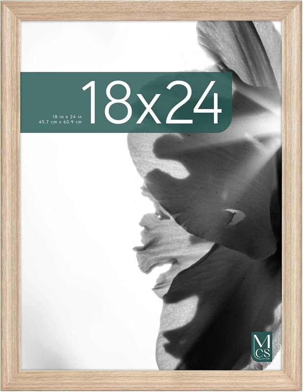
Rustic Wood Poster Frame

A rustic wood poster frame hangs on a neutral wall.
A rustic wood poster frame is best when you want posters to feel warmer, more grounded, and more finished. It works especially well in rooms with natural textures, but you should verify size, hanging hardware, and finish before buying.
A rustic wood poster frame adds warmth, texture, and a more relaxed finish to posters that might otherwise feel flat or overly modern. For anyone choosing wall art for a living room, office, bedroom, or entryway, the right rustic frame can make a print feel more grounded and intentional without overpowering it.
- Best fit: Warm, textured rooms and posters that need more visual presence.
- Key checks: Confirm wood finish, glazing, backing, and hanging orientation.
- Room match: Living rooms, bedrooms, offices, hallways, and entryways are the easiest wins.
- Main trade-off: Rustic frames can be heavier and less uniform than simpler styles.
What a Rustic Wood Poster Frame Is and Why It Works
A rustic wood poster frame is a frame made to look natural, weathered, or lightly distressed rather than sleek and polished. It may feature visible grain, knotting, rough-sawn texture, matte stain, whitewash, reclaimed wood character, or subtle imperfections that give the piece a lived-in feel.
What makes it effective is contrast. Posters are often smooth, graphic, and mass-produced; rustic wood adds softness and depth so the overall display feels warmer and less temporary. That is especially useful when the poster is large, colorful, or visually busy, because the frame helps it read as wall art instead of just a sheet on the wall.
Quick answer: the best use cases for a rustic wood poster frame
This frame style is a strong fit for nature prints, vintage posters, travel art, black-and-white photography, typography, and oversized wall pieces that need warmth. It also works well in rooms that already include wood, linen, leather, woven textures, or matte finishes.
If your space leans very glossy, ultra-minimal, or highly formal, rustic wood may feel too casual unless you use a cleaner profile or a lighter finish. In those rooms, a thin wood frame or a smoother solid-wood option may be the better bridge between warmth and restraint; for a broader overview of styles, see Rustic Wood Picture Frames.
How rustic framing changes the look of posters, prints, and wall art
Rustic framing changes both the visual weight and the emotional tone of the artwork. A bright poster in a rustic frame often feels more curated and less commercial, while a muted print can become richer and more tactile.
It also affects how the eye reads the piece from a distance. Darker rustic finishes can anchor a large poster and make it feel substantial, while weathered oak, beige wash, or reclaimed tones can keep the wall from becoming too heavy. The frame becomes part of the composition rather than just a border.
Frame finish matters as much as frame material: a matte, slightly uneven surface usually reads more rustic than a glossy stain, even when both are made from similar wood.
What to Look For Before You Buy
Before buying, focus on the parts of the frame that affect appearance, protection, and ease of use. The most important variables are wood type, finish, glazing, backing, and hanging hardware, because those details determine whether the frame suits your poster and your wall.
Wood type, finish, grain, and distressing level
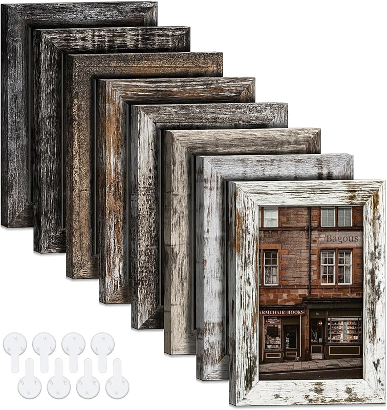
Not all rustic wood looks the same. Some frames use reclaimed wood or visibly weathered lumber, while others use new wood with a rustic stain or brushed finish. The difference matters because reclaimed wood tends to look more irregular, while new wood with a rustic treatment usually looks more consistent.
Grain visibility is one of the biggest style cues. A strong grain pattern creates a natural, organic look, while a smoother grain with light distressing feels more refined. If you want a frame that works in more than one room, a moderate rustic finish is often safer than an aggressively distressed one.
Also check whether the finish is sealed or raw-looking. Sealed finishes are easier to dust and may resist minor handling marks better, while raw or heavily textured finishes can be more characterful but may show wear faster.
Frame profile, glazing options, and backing quality
The frame profile is the depth and shape of the visible edge. A thicker profile usually feels more substantial and traditional, while a thin profile keeps the look lighter and more contemporary. For poster art, profile choice can change whether the frame feels like a statement piece or a supporting element.
Glazing options vary by model. Glass often offers a more traditional presentation, while acrylic can be lighter and less prone to shattering, though it may scratch more easily if handled carelessly. If the poster is especially valuable or irreplaceable, confirm the glazing type and UV protection claims directly with the manufacturer or retailer before buying.
Backing quality matters more than many shoppers expect. A sturdy backing helps the poster stay flat, reduces shifting, and supports a cleaner presentation. If the listing does not clearly describe the backing, hinge method, or closure type, it is worth checking the product page or care instructions before purchase.
- Confirm the wood finish matches the room’s level of warmth and texture
- Check glazing type, backing quality, and how the poster is secured
- Verify hanging orientation, hardware, and wall compatibility
- Review whether the frame is meant for a poster, print, or matted artwork
Mounting hardware, hanging orientation, and wall compatibility
A good frame should be easy to hang in the orientation you actually need. Many poster frames can be hung vertically or horizontally, but not all include hardware for both directions, so check that detail before buying.
Wall compatibility is equally important. Drywall is common, but plaster, brick, and wood paneling may require different anchors or fasteners. If the frame is large or heavy, confirm the wall’s support method and weight limit rather than assuming standard picture hooks will be enough.
If the frame will be placed in a rental, look for hardware options that minimize wall damage or allow easier repositioning. For people comparing rustic frames with simpler suspension styles, this guide on using reclaimed wood for a poster frame is useful for understanding the visual and practical trade-offs.
Best Room and Style Matches
Rustic wood frames are versatile, but they are not equally strong in every room. The best match depends on how much warmth, texture, and visual weight the space already has.
Living rooms, bedrooms, hallways, offices, and entryways
Living rooms are one of the easiest places to use rustic wood because the frame can echo furniture finishes, woven rugs, or natural textiles. In bedrooms, rustic wood tends to feel softer and more restful, especially with muted prints or calm photography.
Hallways and entryways benefit from rustic framing because these spaces often need one strong visual anchor. A well-sized poster in a rustic frame can make a narrow wall feel more finished without requiring a large gallery arrangement. In home offices, rustic wood can warm up screens, bookshelves, and desk surfaces that otherwise feel too hard or technical.
Which interiors suit rustic wood best: farmhouse, vintage, cabin, modern organic, and transitional
Farmhouse interiors are an obvious fit, but rustic wood also works in vintage, cabin, and lodge-inspired rooms where natural character feels expected. In modern organic spaces, rustic framing helps balance clean lines with softer texture, especially when paired with linen, stone, clay, or matte black accents.
Transitional interiors can also benefit from rustic wood if the finish is restrained. A frame that leans toward weathered oak or lightly distressed brown often bridges traditional and modern furniture better than a highly decorative frame would.
Note
Rustic does not have to mean rough or overly distressed. A subtle grain, low-sheen finish, and clean edges can still read rustic while fitting more polished interiors.
When rustic wood may feel too heavy or too casual
Rustic wood can feel too heavy in rooms with very dark furniture, low light, and many textured surfaces already competing for attention. In those settings, the frame may add more visual density than the wall needs.
It can also feel too casual in formal dining rooms, sleek minimalist apartments, or gallery-style interiors where crisp edges and uniform finishes are the priority. In those cases, a cleaner solid wood frame or a thinner profile may preserve warmth without adding too much visual noise.
Sizing, Placement, and Gallery Wall Planning
Size and placement matter just as much as style. A rustic frame that is too small can look accidental, while one that is too large can overpower the artwork or crowd nearby furniture.
How to choose the right frame size for common poster dimensions
Start with the actual poster size, then decide whether you want a tight fit or a matted presentation. A tight fit usually feels more casual and poster-like, while a mat gives the piece more visual breathing room and a slightly more formal finish.
For common poster sizes, matching the frame exactly is often simplest, but only if the opening and backing are designed for that size. If the poster is a standard commercial print, check whether the frame is true-to-size or intended for a slightly smaller image area. When you need a broader size strategy for larger pieces, large poster frame sizes is a helpful reference.
If you are framing an unusually large print, keep proportions in mind. A rustic frame with enough width can support a big poster well, but an oversized frame around a small image can make the art feel lost unless a mat or wide border is part of the design.
Spacing rules for single frames and gallery wall sets
For a single frame, the most important spacing rule is to let the art breathe. Leave enough wall space around the frame so the rustic texture reads clearly, especially if the room already has a lot of pattern or furniture nearby.
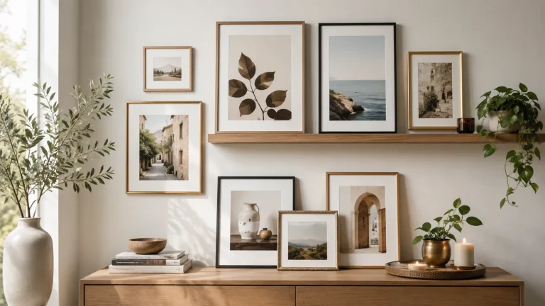
For gallery walls, keep the spacing consistent from piece to piece. Rustic frames can vary slightly in tone and texture, but the gaps between pieces should still feel intentional. If the spacing becomes uneven, the wall can start to look improvised instead of styled.
When mixing rustic frames with other finishes, keep one element consistent—such as frame color, mat color, or spacing—so the wall feels edited rather than random.
Wall type considerations: drywall, plaster, brick, and wood paneling
Different walls need different hanging approaches. Drywall is the most common and usually the easiest to work with, but plaster can be more fragile and may require more careful anchor selection. Brick and masonry typically need appropriate masonry hardware, while wood paneling may allow simpler fasteners depending on thickness and condition.
If the frame is heavy, do not rely on guesswork. Check the product’s weight information if available, confirm the wall type, and use hardware rated for the load. For uncertain or older walls, professional installation may be the safer choice.
Hanging hardware and layout tips for balanced placement
Balanced placement begins with the centerline of the wall or furniture below it. A rustic poster frame above a sofa, console, or bed usually looks best when it sits visually connected to the furniture rather than floating too high.
If you are planning a set of multiple frames, lay the arrangement out on the floor first or use paper templates on the wall. That helps you decide whether the rustic finish should be the dominant element or just one texture among several. For readers comparing frame systems, gallery wall frame sets can help with planning consistent spacing and layout.
Styling Ideas for a More Cohesive Look
The most successful rustic framing usually looks connected to the rest of the room. You do not need every finish to match exactly, but the frame should feel like it belongs to the same visual family as the furniture and textiles.
Matching rustic frames to existing furniture, textiles, and finishes
Look for repeated tones in the room. If you already have oak, walnut, cane, leather, or woven fabric, choose a frame that echoes one of those materials rather than introducing a completely new wood tone.
Rustic wood also pairs well with natural textiles such as linen curtains, cotton bedding, wool throws, and jute rugs. Those materials soften the frame’s texture and help the wall art feel integrated into the room instead of isolated on it.
Using rustic wood frames with black-and-white art, travel prints, photography, and typography
Black-and-white art and rustic wood are a classic pairing because the contrast is clean but not cold. The frame adds warmth while the artwork keeps the display crisp.
Travel prints and landscape photography also work well because rustic wood reinforces an outdoorsy, collected feeling. Typography can be trickier: bold graphic text may benefit from a cleaner rustic finish, while distressed or vintage-style lettering can handle a more weathered frame. If you are deciding between a rustic frame and a slimmer profile, the article on thin wood poster frames is a useful contrast point.
Creating contrast with modern decor without losing warmth
Rustic frames can soften modern rooms, especially ones with metal, glass, lacquer, or concrete surfaces. The trick is to use the rustic element as a balancing accent rather than the dominant theme of the room.
In a modern space, a lightly distressed or low-sheen frame usually works better than a heavily weathered one. That keeps the room feeling intentional and contemporary while still adding warmth. A single rustic frame can be enough to make a minimalist wall feel more human.
Try pairing one rustic wood frame with one matte black object nearby, such as a lamp or shelf bracket, to keep the room from leaning too country.
Benefits, Limitations, and Common Mistakes
Like any frame style, rustic wood has strengths and trade-offs. Knowing both helps you avoid buying a frame that looks good online but feels wrong in the room.
Why buyers choose rustic wood poster frames
People choose rustic wood because it adds warmth quickly and makes wall art feel more finished. It is especially appealing when the room already uses natural materials or when the poster itself needs a stronger visual border.
It also tends to be forgiving stylistically. A rustic frame can work with older furniture, casual interiors, and mixed decor more easily than a very polished frame that demands a matching environment.
Trade-offs to consider: weight, finish variation, and visual consistency
Rustic frames can be heavier than simpler alternatives, especially when the wood is thick or the glazing is glass. That matters for hanging, wall anchors, and renter-friendly placement.
Finish variation is another trade-off. Because rustic wood often celebrates natural differences, two frames from the same listing may not look identical. That can be a strength in one room and a problem in another, particularly if you want a highly uniform gallery wall.
- Adds warmth and texture to posters and prints
- Works across farmhouse, vintage, and modern organic interiors
- Can make simple wall art feel more intentional
- May be heavier than thinner or simpler frame styles
- Natural variation can reduce visual uniformity
- Heavily distressed finishes are not ideal for every room
Common mistakes with sizing, matting, and overmatching decor
One common mistake is choosing a frame that is too rustic for the artwork. If the print is already aged, textured, or visually dense, adding a heavily distressed frame can make the whole display feel cluttered.
Another mistake is ignoring matting or border proportions. A mat can improve the presentation of a poster, but too much matting can make the art feel disconnected from the frame. Finally, avoid overmatching every wood tone in the room. A frame does not need to match your table, shelf, and flooring exactly; it only needs to harmonize with them.
Care, Maintenance, and Long-Term Value
Rustic wood frames can last well when cared for properly, but the finish and glazing type determine how much maintenance they need. Long-term value depends on both durability and whether the frame still suits your space after the novelty wears off.
Cleaning methods for wood, glass, acrylic, and backing
Dust the wood with a soft, dry cloth or a gentle microfiber cloth. Avoid harsh cleaners unless the manufacturer specifically says they are safe for the finish. For glass, use a cleaner appropriate for framed glass and apply it carefully so moisture does not seep into the frame edges.
Acrylic should be cleaned with products made for acrylic or with methods recommended by the manufacturer, since the wrong cleaner can cloud the surface. The backing should generally be kept dry and undisturbed unless you need to change the print. If the frame opens in a specific way, follow the product’s instructions rather than forcing it; if needed, a guide like how to open a wood poster frame can help you understand common frame mechanisms.
Keep rustic wood frames away from prolonged direct sunlight, high humidity, and damp walls. Those conditions can fade prints, stress wood, and warp backing materials over time.
How to protect prints from sunlight, humidity, and warping
Sunlight is one of the biggest threats to posters and prints. Even attractive rustic framing cannot protect artwork if the print is exposed to strong direct light for long periods, so placement matters as much as glazing claims.
Humidity is another concern, especially in bathrooms, kitchens, basements, or poorly ventilated rooms. If you want to display a poster in one of those spaces, confirm that the frame materials and backing are suitable for the environment. Warping is more likely when wood, paper, and moisture are all under stress at the same time.
What makes a rustic wood poster frame a good value in 2026
In 2026, a good value frame is one that balances appearance, protection, and versatility rather than just looking rustic in photos. The best value often comes from a frame that feels sturdy, includes clear hanging hardware, and has a finish that will still work if you rearrange the room later.
Value also depends on how specific your needs are. If you want a one-of-a-kind reclaimed look, you may accept more variation and a less uniform finish. If you want a dependable everyday frame, a cleaner rustic profile with consistent construction may be the smarter choice. For shoppers who enjoy making their own displays, how to make a poster frame from wood can help clarify what construction details are worth paying for versus building yourself.
Final Verdict: Who Should Choose a Rustic Wood Poster Frame
A rustic wood poster frame is best for someone who wants wall art to feel warmer, more grounded, and less generic. It is a strong choice for living rooms, bedrooms, entryways, and offices where natural texture helps the room feel finished.
Best-fit buyer profile and room recommendation
The best fit is a buyer who values character more than perfect uniformity. If you like natural grain, soft distressing, and a frame that can bridge casual and refined decor, rustic wood is a smart choice for medium to large posters, especially in rooms with other organic materials.
Choose a rustic wood poster frame when you want one frame style that can warm up a print without making the room feel formal. It is especially effective in living rooms, home offices, and bedrooms, though very polished or highly minimalist spaces may need a cleaner finish.
When to choose an alternative frame style instead
Choose another style if you need strict visual uniformity, a very lightweight frame, or a highly modern presentation. A thinner wood frame, a smoother solid-wood frame, or even a more minimal hanger-style solution may be better when the poster itself should stay front and center.
If you are still narrowing the look, comparing rustic, vintage, and solid wood options can help. The right decision usually comes down to how much texture your room already has, how formal you want the wall to feel, and whether the frame should blend in or become part of the decor story.
Frequently Asked Questions
Living rooms, bedrooms, entryways, hallways, and home offices are usually the easiest fits. The frame adds warmth and texture without needing a very formal setting.
Start with the poster’s actual dimensions and decide whether you want a tight fit or a matted look. Check whether the frame is true-to-size and whether the opening is designed for your print size.
Confirm the wood type, finish, glazing, backing quality, and hanging hardware. If the poster is valuable or the frame is large, review the manufacturer’s specifications carefully before buying.
Dust the wood gently and clean glass or acrylic according to the manufacturer’s instructions. Keep the frame away from strong sunlight, high humidity, and damp walls to reduce fading and warping.
They can be heavier, and finish variation may make matching multiple frames more difficult. Heavily distressed styles can also feel too casual in sleek or formal rooms.
Check the wall type first, since drywall, plaster, brick, and wood paneling often need different hardware. For larger or heavier frames, confirm the load rating and use anchors appropriate for the wall surface.