How to Display Art at Home Like a Designer

Display art like a designer by sizing it to the furniture, hanging it at a natural eye level, and keeping spacing consistent. The best arrangements feel connected to the room, not just centered on an empty wall.
Knowing how to display art at home well has less to do with expensive pieces and more to do with proportion, placement, and restraint. When art feels polished in a room, it usually comes down to a few designer habits: choosing the right scale, hanging with the furniture in mind, and giving each piece enough space to breathe.
- Scale first: Aim for art that spans about two-thirds to three-quarters of the furniture below it.
- Hang lower: Most art looks better slightly lower than people first expect, especially above seating.
- Mind visual weight: Dark colors, bold contrast, and thick frames make pieces feel larger and stronger.
- Use structure: Gallery walls need consistent spacing and an overall shape to avoid chaos.
- Protect the piece: Check wall type, hardware, glare, sunlight, and humidity before final placement.
How to Display Art at Home Like a Designer: Start With Scale, Sightlines, and Balance
Why placement matters more than price or size alone
A modest print can look sophisticated when it is hung at the right height, framed thoughtfully, and placed where the eye expects it to be. A large, valuable work can still feel awkward if it floats too high above a sofa or sits on a wall that is visually crowded.
Designers usually think about art as part of the room composition, not as a separate object. That means considering what sits below it, what is happening on nearby walls, where natural light falls, and how people move through the space. The goal is not to fill every blank surface. It is to create visual balance so the art feels intentional.
The designer rule of thumb: hang for the room, not just the wall
One of the most useful mindset shifts is this: art should relate to the furniture, architecture, and sightlines of the room, not just the dimensions of the empty wall. A piece above a console should feel connected to the console. A grouping in a hallway should read clearly while walking past. A bedroom arrangement should support a calmer atmosphere than a high-contrast salon wall in a dining room.
If you are styling layered surfaces rather than drilling immediately, this is also where ledges and consoles become useful. Hurrell Editions has a more focused guide on how to display framed art on a console table if you want a relaxed, non-permanent approach.
What to Look For Before You Hang Anything

A person measures wall placement while framed art rests against the wall.
Artwork size, orientation, and visual weight
Start with the physical size of the piece, but do not stop there. Orientation matters too. Vertical works emphasize ceiling height and suit narrow wall sections, while horizontal works usually sit more comfortably above sofas, beds, and sideboards.
Visual weight is just as important as measurements. A dark abstract in a thick black frame often feels heavier than a pale drawing of the same size in a slim oak frame. Dense compositions, high contrast, and bold colors all make a piece feel more dominant. That can be useful when a room needs a focal point, but it can overwhelm a quiet space if the scale is already generous.
Frame style, glazing, and matting choices
The frame can either support the artwork or compete with it. Thin metal and simple wood frames tend to feel cleaner and more contemporary. Traditional profiles, ornate gilding, and wider mouldings can add presence, especially in classic interiors.
Glazing affects both appearance and practicality. Standard glass is common, but reflections can be distracting opposite windows or lamps. Acrylic glazing is lighter and often easier to manage in larger sizes, though exact performance varies by product. Mats add breathing room around paper-based works and can make smaller art feel more substantial on the wall.
If you are buying framed work online, confirm what glazing is included, whether hanging hardware is attached, and whether dimensions refer to the image size or the outer frame size.
Colour palette, subject matter, and how the piece relates to existing decor
Art does not need to match the room exactly, but it should feel related to it. That relationship can come from repeated tones, shared materials, or a similar mood. A room with warm woods, linen, and muted upholstery often suits earthy palettes, soft photography, or tonal abstracts. A sharper interior with lacquer, chrome, or graphic textiles can handle stronger contrast.
Subject matter matters emotionally as much as visually. Bedrooms usually benefit from pieces that feel restful rather than overly busy. Entryways can take bolder work because the viewing time is shorter. Kitchens and breakfast areas often suit playful, graphic, or food-adjacent imagery because the mood is lighter.
- Measure the full framed size, not just the artwork opening.
- Use painter’s tape or paper templates before committing to placement.
- Check glare during both daylight and evening lamp light.
- Let one piece lead the room instead of making every wall a focal point.
Choosing the Right Art for Each Room in the Home
Living rooms: anchoring art above sofas, consoles, and fireplaces
Living rooms usually need art that can hold its own against larger furniture. Above a sofa, the artwork should feel wide enough to anchor the seating area. Over a console, you can go slightly narrower, especially if lamps, vases, or stacked books help build out the composition.
Fireplaces are trickier because the mantel and surround already create a strong architectural frame. A single statement piece often works better than a busy grouping. If the fireplace is tall and formal, a vertical piece may echo the proportions. If it is long and low, a horizontal work or pair can feel more balanced.
For more layered, shelf-based styling, see Hurrell Editions’ guide on how to style picture ledges for layered art display.
Bedrooms: softer compositions, calmer palettes, and lower-contrast styling
Bedrooms usually look best with art that supports rest rather than constant stimulation. Landscapes, tonal abstracts, line drawings, and soft photography are common choices because they add interest without making the room feel visually loud.
Placement above the bed should feel centered to the bed itself, not to the entire wall if nightstands or windows shift the layout. In many bedrooms, slightly lower contrast framing and gentler mat colors help the arrangement feel more integrated with bedding and textiles.
Dining rooms, hallways, kitchens, and home offices: where statement pieces work best
Dining rooms can handle drama. Rich color, larger scale, and more conversational subject matter often work well because people spend time seated and facing the walls. Hallways are ideal for series, pairs, or compact gallery walls because repetition creates rhythm in a transitional space.
Kitchens benefit from practicality. Avoid placing valuable or delicate works too close to heavy steam, grease, or direct heat. Home offices can support more energetic or inspiring pieces, but scale still matters. If your workspace is part of a broader creative zone, a related article on how to set up a home art studio space may help you think through layout and visual flow.
Art Sizing, Placement, and Spacing Rules That Actually Work
How wide art should be above furniture
A reliable rule is for the artwork, or the full grouping, to span roughly two-thirds to three-quarters of the width of the furniture beneath it. This usually creates enough presence to feel anchored without looking oversized.
So if a sofa, bed, or sideboard is visually substantial, a tiny centered frame will often look accidental. If your art is smaller than ideal, you can sometimes solve the problem with a larger mat, a wider frame, or a grouped arrangement rather than replacing the piece.
Ideal hanging height and eye-level placement in 2026 interiors
The old problem remains the same in 2026: most people hang art too high. In many homes, the center of the artwork or grouping should land around average eye level, then adjust slightly for the room and the furniture below it. Seated spaces, such as dining rooms or living rooms with low sofas, often benefit from art being a touch lower than people first expect.
Above furniture, leave enough breathing room so the piece does not feel cramped, but not so much that it floats away. A moderate gap usually looks more connected than a large one. Exact distances vary by frame size, ceiling height, and furniture scale.
Spacing for pairs, grids, and salon-style gallery walls
Consistency matters more than rigid perfection. Pairs usually look best when the gap between frames is deliberate and relatively tight. Grids rely on even spacing to feel calm and architectural. Salon-style walls can be more varied, but they still need an invisible structure, such as aligning a central axis or maintaining similar distances between neighboring frames.
If you are mixing sizes, start on the floor first and build around the largest piece. For a deeper dive into proportion and arrangement, Hurrell Editions also covers how to mix frame sizes for gallery wall.
When a gallery wall feels chaotic, the issue is usually not variety itself. It is inconsistent spacing, weak alignment, or too many pieces with equal visual weight competing at once.
Wall Type, Hanging Hardware, and Safety Basics
Drywall, plaster, brick, and panelled walls: what changes
Different walls require different approaches. Drywall is common and often straightforward for lighter framed pieces, while older plaster can be less forgiving and more prone to cracking. Brick and masonry usually require wall-appropriate fixings, and panelled walls may affect where hardware can be placed cleanly.
Because hardware performance varies by wall type, frame construction, and weight, always check the manufacturer’s instructions for both the frame and the hanging system. For especially heavy works, oversized glazing, or valuable pieces, professional installation is often the safer choice.
Hooks, anchors, D-rings, picture wire, and cleat systems
D-rings are common on framed art and can offer a stable hanging point. Picture wire allows flexibility, though it can sometimes make leveling more finicky. Cleat systems are often preferred for larger or heavier works because they distribute weight more evenly and can keep the frame closer to the wall.
Anchors and hooks are not universal. Their suitability depends on the wall material and the weight they are rated to support. If a frame arrives with minimal hardware, verify whether it is appropriate for your wall before hanging.
How to protect walls, keep frames level, and hang heavy works securely
Small rubber bumpers on the lower back corners of a frame can help protect the wall surface and reduce shifting. A level, measuring tape, and paper template make cleaner results more likely than estimating by eye.
Heavy art deserves extra caution. Confirm the total weight of the framed piece, use hardware suited to that weight and wall type, and avoid improvising with unknown fixings. If electrical lines, masonry drilling, or substantial loads are involved, consult a qualified installer.
Keep framed art away from persistent moisture, strong direct sun, and heat sources when possible. Paper works, certain pigments, adhesives, and wood frames can all be affected over time by light, humidity, and temperature swings.
How to Match Art to Your Interior Style Without Making It Feel Too Perfect
Modern, classic, minimalist, eclectic, and layered British interiors
Modern rooms often suit cleaner lines, larger pieces, and more negative space around each work. Classic interiors can handle richer framing, portrait formats, and more formal symmetry. Minimalist rooms benefit from restraint, where one well-scaled piece often says more than a crowded arrangement.
Eclectic and layered British-style interiors tend to welcome contrast: antique frames with contemporary prints, oil paintings beside photography, or a traditional chest under a bold abstract. The trick is to repeat something subtle, such as a color, wood tone, or frame finish, so the mix still feels connected.
Mixing framed prints, photography, paintings, and sculptural wall pieces
Mixing media adds depth, especially when everything is not trapped in the same frame profile. Photography can bring crispness, paintings add texture, and sculptural wall pieces introduce shadow and relief. The room usually looks more collected when at least one element breaks the pattern.
This is also helpful if you want a home to feel personal rather than showroom-perfect. Family art, student work, or children’s pieces can sit beautifully alongside more formal framing when edited thoughtfully. If that is your goal, you may also like how to display childrens artwork in a stylish home.
When to coordinate tones and when to use contrast for impact
Coordinate tones when the room already has a lot happening. Similar woods, repeated blacks, or related neutrals create calm. Use contrast when the room feels flat and needs a focal point. A dark frame on a pale wall, or a vivid artwork in a quiet room, can shift the entire mood.
What usually looks best is not perfect matching but controlled tension. A room becomes more memorable when one element surprises you slightly.
Styling Ideas Designers Use to Make Art Feel Intentional
Creating a gallery wall with rhythm, negative space, and variety
A strong gallery wall has repetition and variation at the same time. Repetition might come from a shared frame finish, a color family, or a common mat style. Variation might come from different image sizes, orientations, or subject matter.
Negative space is what stops the arrangement from feeling cluttered. Leave enough room between pieces that each one can still be read. If the wall is large, resist the urge to cram the center and abandon the edges. Let the overall shape of the grouping feel deliberate.
Leaning art on shelves, mantels, and consoles for a more relaxed look
Leaning art can soften a room because it feels less formal than a fully mounted arrangement. It works especially well with layered frames, overlapping heights, and objects placed slightly in front, such as candlesticks, bowls, or books.
This approach is practical for renters or for anyone who likes rotating pieces seasonally. It also suits rooms where you want depth instead of a flat wall presentation. Just make sure the surface is stable and the frame is not at risk of sliding.
Using picture lights: placement, brightness, colour temperature, power source, and safety
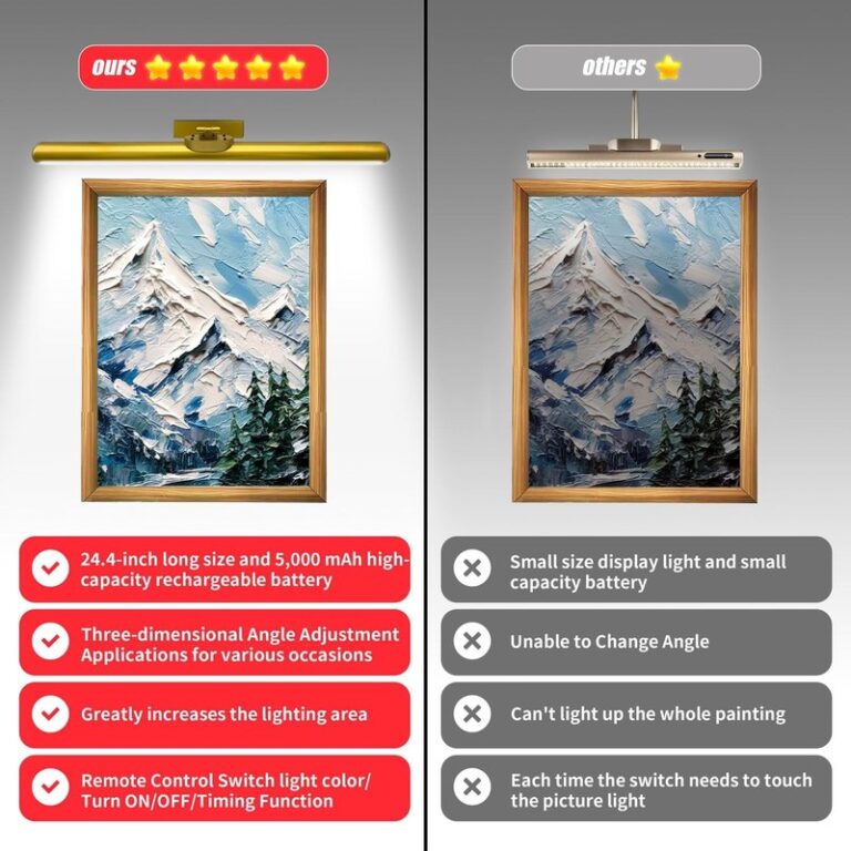
Picture lights can make art feel more architectural, but they need careful sizing and placement. The fixture should suit the width of the artwork or frame, and the beam should illuminate the piece evenly without harsh hotspots or glare on glazing.
Warm to neutral color temperatures usually feel more natural in residential interiors than very cool light. Brightness should highlight the art, not overpower the room. Battery, plug-in, and hardwired options all exist, but the right choice depends on placement, access to power, and how permanent you want the installation to be.
If you are exploring accent lighting more broadly, Hurrell Editions also has a related guide on how to put led lights behind a picture. For any hardwired fixture or uncertain load-bearing situation, use a qualified professional.
Common Mistakes, Care Tips, and When a Display Choice Is Worth the Investment
Mistakes that make art feel undersized, crowded, or disconnected
The most common mistake is hanging art too high. Close behind that are choosing pieces that are too small for the furniture, using a gallery wall with no visual structure, and matching every frame so closely that the room loses personality.
Another frequent issue is ignoring glare, sunlight, and room function. A beautiful glazed piece opposite a bright window may never look its best during the day. Art near steam, grease, or strong sun may need a different placement or better protective framing.
Caring for framed art, paper works, and glazed pieces over time
Dust frames gently with a soft, dry cloth and avoid spraying cleaner directly onto glazing or frame joints. Moisture can creep into corners, mats, or backing materials. Paper-based works are especially vulnerable to humidity and prolonged sun exposure.
If the piece is valuable, delicate, or unusually large, refer to the framer’s or seller’s care guidance and confirm whether special materials were used. UV-filtering glazing, archival matting, and conservation framing can be worth considering for works on paper or sentimental pieces you want to keep long term.
Final recommendation: a timeless approach to displaying art beautifully at home
The most timeless way to display art is to treat it as part of the architecture of the room: scale it to the furniture, hang it lower than instinct first suggests, keep spacing consistent, and let a few pieces lead instead of asking every wall to perform equally. That approach works across modern, classic, eclectic, and minimalist homes because it prioritizes proportion and atmosphere over trends.
If you are unsure where to begin, start with one important wall, measure carefully, and build from there. A room rarely needs more art than you think it does. It usually needs better placement.
Frequently Asked Questions