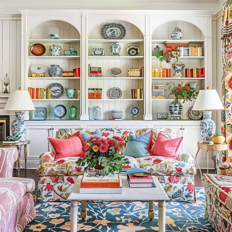
How to Arrange Coffee Table Books on Shelves Easily

Arrange coffee table books on shelves by mixing upright books with low horizontal stacks and leaving open space between groupings. Start with the largest books, balance visual weight across the shelf, and add only a few decor accents.
Knowing how to arrange coffee table books on shelves comes down to three things: scale, spacing, and contrast. When you combine a few horizontal stacks with some upright volumes, leave breathing room, and repeat colors or themes across the shelf, the display looks intentional instead of accidental.
Coffee table books can do more than fill an empty shelf. They add height, color, personality, and a collected feel that works in living rooms, bedrooms, home offices, and entryways. The key is to style them like decor without making them hard to reach or visually heavy.
- Start with scale: Place the largest books first to anchor each shelf.
- Mix orientations: Combine vertical rows and horizontal stacks for a more relaxed look.
- Use breathing room: Negative space keeps shelves from feeling crowded.
- Style with restraint: Add one or two objects, not lots of filler decor.
- Protect the books: Limit sun, humidity, and overloaded shelves.
How to Arrange Coffee Table Books on Shelves Easily: The Core Styling Formula
The easiest formula is simple: start with one or two anchor books, build a few varied groupings, and stop before every shelf is full. A good shelf display usually mixes practical storage with visual rhythm, so the books still feel usable.
Start with stacks, spacing, and visual balance
Begin by dividing your books into small groups rather than trying to place every title one by one. Most shelves look better with two to four zones of interest instead of a continuous wall of spines. Think in clusters: a short horizontal stack, a row of upright books, and an open patch of shelf can be enough.
Visual balance matters more than perfect symmetry. If one side of a shelf has a large stack of oversized art books, offset that weight with a taller vertical row or a medium decorative object on the other side. The goal is not to make both sides identical, but to keep one side from feeling too heavy.
Leave at least some empty shelf visible around each grouping. That negative space is what makes coffee table books look styled rather than simply stored.
Mix horizontal and vertical placement for a relaxed editorial look
If every book stands upright, the shelf can read like a library. If every book is stacked flat, it can look static and bulky. Mixing both orientations creates movement and gives the arrangement a more editorial, collected look.
Use horizontal stacks for oversized or visually striking books with beautiful covers. Use vertical placement for books with strong spines, especially when the title typography or color adds to the display. A horizontal stack can also act as a pedestal for a small bowl, candle, or sculptural object, which helps break up the rectangular repetition of books.
If you want a more artful display overall, the same principles used in styling shelves with art apply here too: vary heights, repeat tones, and avoid filling every inch.
What to Look for Before Styling Coffee Table Books on Shelves
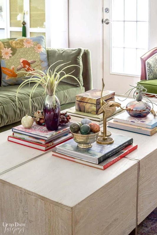
Shelf styling with coffee table books, decor accents, and balanced spacing.
Before arranging anything, take stock of both the books and the shelf itself. A beautiful stack can still look awkward if the proportions are wrong or the shelf depth is too shallow.
Book size, spine design, color palette, and subject matter
Not all coffee table books behave the same way on a shelf. Some are tall and slim, some are square and heavy, and some have dust jackets that slide easily. Grouping similar sizes together usually creates a cleaner result than mixing very large and very small books in one tight section.
Spine design matters if the books will stand upright. Minimal linen spines, bold black-and-white titles, and richly colored jackets all create different effects. If your shelves are visible from across the room, the spine becomes part of the room’s palette. If the covers are more beautiful than the spines, use a face-out display for one or two books rather than turning every book forward.
Subject matter can guide the arrangement too. Fashion, architecture, photography, interiors, and art books often pair well when they share a mood or visual language. If you are still building your collection, this guide on how to choose coffee table books for any style can help narrow the look you want.
Shelf depth, height, weight capacity, and overall room proportions
Shelf dimensions shape what is possible. Deep shelves can hold horizontal stacks and layered objects more comfortably, while shallow shelves are usually better for upright books and a lighter touch. Height also matters: tall shelf openings can swallow small books, while low shelf openings may force you into flat stacks only.
Weight is another practical issue. Large coffee table books can be surprisingly heavy, especially in groups. Manufacturer specifications for the bookcase or shelving system are the best place to confirm weight limits, since capacity varies by material, span, mounting method, and shelf thickness.
If your shelves are wall-mounted or adjustable, confirm the official weight guidance before loading them with oversized books. Capacity varies widely by model and installation method.
Finally, step back and look at the room. A dramatic wall of books may suit a large living room, but it can overwhelm a compact bedroom. In smaller spaces, fewer books with stronger spacing often look more refined.
How to Arrange Coffee Table Books on Shelves Step by Step
A structured approach makes shelf styling much easier. Instead of decorating as you go, build the arrangement in layers.
Sort by size and theme before placing anything
Start by removing the books you plan to use and sorting them on the floor or a table. Make piles by size first: oversized, medium, and small. Then notice themes, colors, or moods that naturally work together.
This extra step helps you avoid awkward combinations, like putting a tiny book on top of an extra-wide stack or placing several visually loud covers side by side. It also helps you decide which books should stand upright and which should be stacked flat.
Build a foundation with larger books and layer smaller accents
Place the largest books first. These act as anchors and determine the visual structure of the shelf. On a wide shelf, that may mean one horizontal stack at one end and one vertical grouping at the other. On a narrower shelf, it may mean a single stack with one accent object beside it.
Once the anchors are in place, layer in smaller books or objects. A small framed piece, a ceramic bowl, or a candle can soften the edges of a stack and keep the shelf from looking too boxy. If you use framed art nearby, keep the scale modest so the books remain part of the composition rather than background filler. Readers combining books and tabletop art may also find ideas in this guide on how to display framed art on a console table.
Use oversized volumes to anchor the shelf and establish the main layout.
Mix orientations so the shelf feels relaxed and visually varied.
Use decor sparingly to add shape, texture, and contrast without hiding the books.
Remove anything that feels crowded, repetitive, or too small for the shelf.
Use negative space so shelves feel curated rather than crowded
One of the most common styling mistakes is trying to use every book at once. Empty space is not wasted space. It gives the eye a place to rest and makes the books you do display feel more important.
If a shelf feels crowded, take away one full stack before making smaller adjustments. That single edit often solves the problem faster than shifting everything around. If you own more books than you can display comfortably, rotate them seasonally and store the rest properly. For overflow collections, see this guide on how to store coffee table books.
Best Shelf Arrangements by Room and Interior Style<
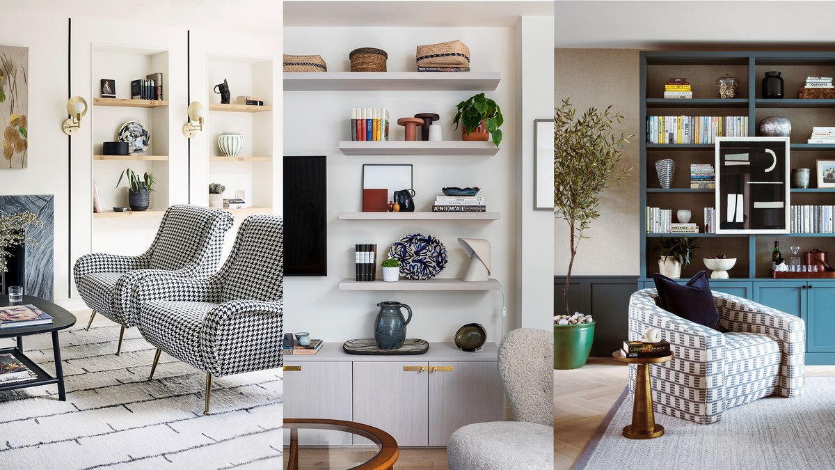
Shelves display stacked and upright coffee table books in a modern living room.
Shelves display stacked and upright coffee table books in a modern living room.
/h2>
The best arrangement depends on where the shelf sits and what mood the room already has. The same books can look crisp and modern in one space or warm and collected in another.
Living rooms, home offices, bedrooms, and entryways
Living rooms: This is the easiest place to use bolder stacks and larger books. Open shelving in a living room can handle a more decorative approach, especially when books are mixed with art objects, ceramics, and framed pieces.
Home offices: Here, books should feel inspiring but not distracting. Architecture, photography, design, and art books work especially well. Keep the arrangement slightly tighter and more functional than in a living room.
Bedrooms: Softer, simpler arrangements usually work best. A few calming tones, lower stacks, and less visual clutter can make bedroom shelving feel restful.
Entryways: Because these shelves are often seen quickly, use fewer books with stronger covers or spines. One stack, one upright group, and one object is often enough.
Modern, classic, minimalist, eclectic, and gallery-inspired interiors
Modern interiors: Choose cleaner lines, fewer books per shelf, and a restrained palette. Black, white, beige, gray, and muted art-book covers tend to work well.
Classic interiors: Richer tones, more substantial stacks, and elegant subjects like art history, gardens, travel, or architecture can feel appropriate.
Minimalist interiors: Edit hard. Fewer books, stronger spacing, and consistent tones matter more than quantity.
Eclectic interiors: Mix subjects, colors, and object shapes, but repeat at least one element such as a color family or material so the shelf still feels cohesive.
Gallery-inspired interiors: Use books almost like exhibition catalogs on display. Face one or two covers outward and pair them with small art objects or framed works for a more curated feel.
| Arrangement Style | Best For | Key Consideration |
|---|---|---|
| Mostly vertical | Shallow shelves and practical access | Needs strong spines to look intentional |
| Mostly horizontal | Oversized books and decorative styling | Can feel heavy if stacks are too tall |
| Mixed layout | Editorial, collected interiors | Works best with visible negative space |
Styling Ideas That Make Coffee Table Books Look More Elevated
Once the basic arrangement works, small styling choices can make the shelf feel more finished and personal.
Pairing books with objects, framed art, candles, and sculptural decor
Books look best when paired with objects that add contrast in shape and material. Since books are rectangular and often glossy, they benefit from organic forms like stone, ceramic, wood, or glass. A rounded vase, a small tray, or a sculptural object can break up the lines and add texture.
Framed art can work beautifully too, especially if it echoes a color from one of the book covers. Keep the layering light rather than crowded. If you want a more cohesive art-and-book composition, one or two overlapping elements usually look more polished than many small accessories.
Using color stories, seasonal rotation, and asymmetrical composition
A color story is one of the easiest ways to make shelves look intentional. You do not need every book to match, but it helps when the covers or spines repeat a few tones already present in the room. Neutrals can create a calm effect, while one bold accent color can energize the shelf.
Seasonal rotation also keeps shelves from feeling stale. In warmer months, lighter, brighter covers may feel fresh; in colder months, deeper tones and heavier subjects can make a room feel richer. This does not mean buying new books every season, only changing what is on display.
Asymmetry is often more interesting than mirror-image styling. Instead of matching stacks on both sides, try balancing a tall vertical group with a lower stack and a small object. That kind of uneven balance tends to feel more natural and less staged.
- Limit most horizontal stacks to two to four books so they stay stable and easy to browse.
- Use one face-out cover per shelf at most unless the shelf is very large.
- Repeat one color or material across shelves to tie the full bookcase together.
- Remove small filler decor that serves no visual purpose.
Benefits, Limitations, and Common Mistakes to Avoid
Displaying coffee table books on shelves has clear visual benefits, but it is not the right approach for every collection or every room.
Why shelf-styled books add personality, height, and visual texture
Coffee table books bring personality into a room because they reflect interests as much as style. Art, fashion, interiors, travel, and photography titles can all tell a subtle story about the people who live there. They also add height variation, color, and surface texture that plain shelving often lacks.
Another advantage is flexibility. Unlike large furniture or built-ins, books are easy to rotate, restyle, or move to a different room. That makes them useful for renters, frequent redecorators, and anyone who likes to refresh a space without major changes.
Overstacking, forcing symmetry, hiding spines, and ignoring scale
The biggest mistake is overstacking. Tall piles may look dramatic for a moment, but they can feel bulky, unstable, and hard to use. Another common issue is forcing symmetry where the shelf does not need it. Perfectly matched arrangements can feel stiff unless the room itself is very formal.
Hiding every spine is another missed opportunity. Some covers deserve to face outward, but if all the books are turned or stacked without logic, the shelf can stop feeling like a collection and start feeling like set dressing. Scale problems matter too: tiny accents can disappear next to oversized books, while large objects can swallow the books entirely.
- Group books by size and visual weight.
- Mix upright rows with low horizontal stacks.
- Leave open space on each shelf.
- Use decor to complement books, not cover them.
- Building stacks so tall they wobble or bow the shelf.
- Trying to make every shelf identical.
- Using too many tiny filler objects.
- Ignoring shelf depth and weight limits.
Care, Maintenance, and Preservation for Coffee Table Books on Shelves
Good styling should not come at the expense of the books themselves. Displayed books need occasional care, especially if they are oversized, jacketed, or printed on coated paper.
Dust control, sunlight exposure, humidity, and shelf stability
Dust shelves regularly with a soft, dry cloth and handle jackets gently. If a room gets strong direct sun, rotate sensitive books or move the most valuable ones away from the brightest spot. Prolonged sunlight can fade covers and jackets over time.
Humidity matters too. Damp rooms can encourage warping, rippling, or mildew, while very unstable conditions can stress bindings. Shelves should also stay level and stable, especially when holding large-format books.
Keep coffee table books away from direct sunlight, radiators, and noticeably damp areas. Heat and moisture can damage jackets, boards, bindings, and page edges over time.
How to keep covers, jackets, and page edges in good condition
Store very heavy books flat if they seem to pull at their own binding when upright. Keep stacks neat so corners do not snag. If a dust jacket slides easily, consider placing that book lower on the shelf or within a shorter stack where it is less likely to shift.
Page edges can show dust quickly, especially on light-colored books. Regular gentle cleaning helps, as does avoiding overcrowded shelves where friction can scuff jackets and corners. For collectible or expensive volumes, the publisher or retailer may also provide care guidance worth checking before long-term display.
Are Coffee Table Books Worth Displaying on Shelves? Final Styling Recommendation
For most homes, yes. Shelf-styled coffee table books are worth displaying because they combine storage with personality and can make a room feel more layered without adding much visual clutter when arranged well.
Who this approach suits, gifting occasions, and presentation ideas
This approach suits art lovers, design enthusiasts, renters, homeowners, and anyone who wants decor that feels personal rather than generic. It also works well for gift giving, especially for housewarmings, birthdays, holidays, or host gifts, because a well-chosen book can function as both reading material and decor.
If you are giving books as a gift, think about the recipient’s shelf space as well as their taste. One oversized title may be perfect for a spacious living room, while a slimmer volume may be easier to display in a small apartment or home office.
How to create a polished display that still feels personal in 2026
The most polished shelves in 2026 still do not look overdesigned. They feel edited, layered, and personal, with enough open space to let each book stand out. Start with books you genuinely want to keep visible, group them by size and mood, mix vertical and horizontal placement, and add only a few supporting objects.
When in doubt, use fewer books, stronger spacing, and better proportion. That combination almost always looks more sophisticated than a shelf packed to the edges.
- Anchor shelves with larger books, then mix upright rows and low stacks.
- Use negative space to keep the display curated and easy to read.
- Match scale, color, and subject matter to the shelf and the room.
- Protect books from excess sun, humidity, and overloaded shelves.
Frequently Asked Questions