How to Mix Wood and Metal Picture Frames Right

Mix wood and metal picture frames by choosing one dominant finish and repeating one unifying detail like mat color, frame width, or artwork palette. Keep undertones compatible and spacing consistent so the display looks collected rather than cluttered.
Learning how to mix wood and metal picture frames comes down to restraint, repetition, and a clear visual hierarchy. The best mixed-frame displays do not rely on matching every frame exactly; instead, they feel cohesive because one finish leads, one element ties everything together, and the artwork still remains the focus.
Wood brings warmth, texture, and softness. Metal adds crisp edges, contrast, and a more tailored feel. Used together, they can make a gallery wall look layered and collected rather than flat or overly coordinated. The challenge is avoiding a display that feels random, busy, or split between two unrelated styles.
- Lead with one material: Use a roughly 70/30 mix instead of splitting wood and metal evenly.
- Match undertones: Warm woods pair best with warm metals, while cooler woods suit silver or black.
- Unify with mats: Consistent mat color and glazing can tie different frame materials together.
- Control the layout: Keep spacing even and let one larger anchor piece organize the wall.
- Check practical details: Verify frame depth, weight, and hardware before hanging on drywall, plaster, or masonry.
How to Mix Wood and Metal Picture Frames Right: Start With One Dominant Finish and One Unifying Element
The easiest way to build a mixed-frame arrangement is to decide which material will lead the composition. In most rooms, that means choosing either mostly wood frames with a few metal accents, or mostly metal frames with a smaller group of wood pieces. Once that dominant finish is set, add one repeated feature that appears across the display.
Why mixed-frame displays work when color, scale, or matting stays consistent
Mixed materials work best when the eye can quickly understand the pattern. That pattern might be consistent white mats, a limited color palette in the artwork, similar frame widths, or repeated black accents throughout the arrangement. Without that repetition, the display can look like unrelated frames gathered by accident.
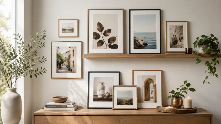
Matting is often the simplest bridge. A warm oak frame and a slim brass frame can sit comfortably together if both hold artwork with the same off-white mat and similar spacing around the image. Scale matters too. If every frame is a different thickness, size, and finish, the wall starts to feel noisy. But when profiles are visually comparable, the contrast between wood and metal feels deliberate.
A simple 70/30 rule for balancing wood warmth with metal crispness
A practical guideline is the 70/30 rule: let roughly 70 percent of the display lean toward one material and 30 percent act as contrast. For example, a gallery wall above a sofa might use seven oak or walnut frames and three black or brass metal frames. The ratio does not need to be exact, but it helps prevent a 50/50 split that can feel indecisive.
This balance also helps when your room already has a strong material story. If your furniture is mostly wood, metal frames can sharpen the look without making the room feel cold. If the room has black hardware, chrome lamps, or industrial shelving, wood frames can soften the edges.
If you are unsure where to start, let the largest frame in the arrangement set the dominant finish. Smaller accent frames can introduce the second material without overpowering the wall.
What to Look for Before You Combine Wood and Metal Frames
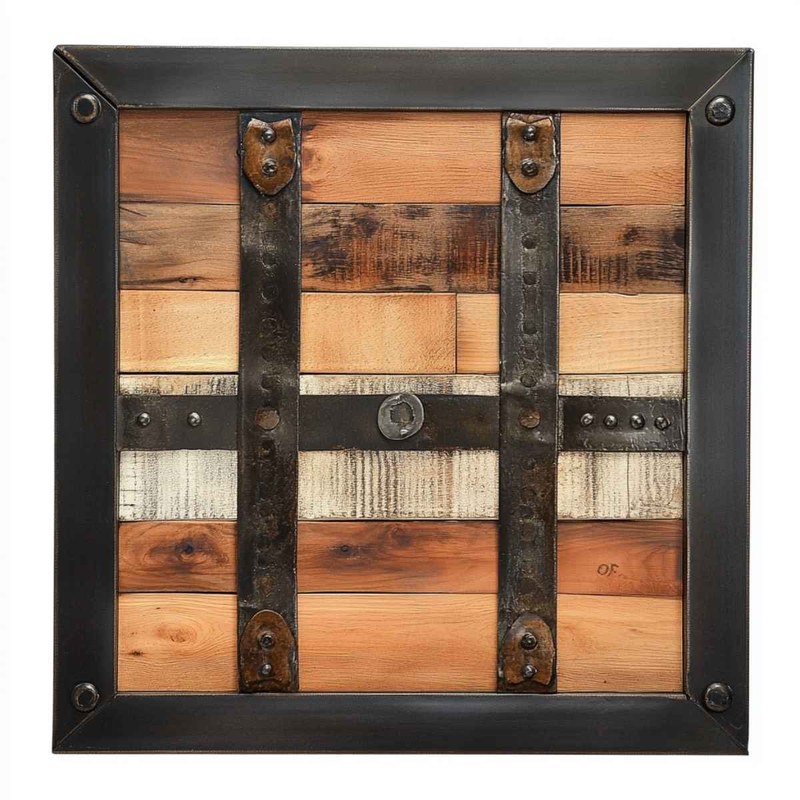
Mixed wood and metal frames are grouped to compare finish, color, and proportion.
Before buying or rehanging anything, compare more than just color. The success of a mixed display depends on proportion, undertone, glazing, and how the artwork itself interacts with the frames.
Frame profile width, depth, and visual weight
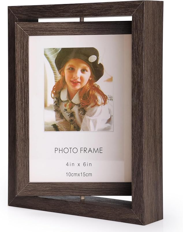
Two frames can have the same outer dimensions and still feel completely different on the wall. A deep shadow-box-style wood frame carries more visual weight than a slim aluminum frame. A wide flat metal profile can feel bolder than a narrow walnut molding. When mixing materials, compare not just inches but presence.
Try to pair frames that are either intentionally similar in profile or intentionally contrasted in a controlled way. For example, several thin metal frames can work with a few medium-width wood frames, but combining extra-thick rustic wood, ultra-thin metal, ornate gilded edges, and deep box frames in one small area usually creates tension rather than harmony.
Wood tones, metal finishes, and undertones that complement rather than clash
Undertone is where many mixed-frame displays go wrong. Wood can read yellow, red, gray, or neutral. Metal can read warm, cool, or stark black. A honey oak frame with strong yellow undertones may not sit well beside a pinkish brass or a bright blue-toned chrome unless another element connects them.
Generally, warm woods pair more easily with warm metals like aged brass, antique bronze, or softer black finishes. Cooler woods such as ash, pale walnut, or gray-washed oak tend to work better with brushed nickel, stainless, or matte black. That does not mean warm and cool can never mix, but it usually requires a very controlled palette in the art and surrounding decor.
Glazing, mat board color, and print style as the bridge between materials
Glass or acrylic fronts, mat board tone, and the art style itself often do more to unify a wall than the frame materials. If every piece has bright white mats and clean glazing, the display feels more curated. If one frame has no mat, one has cream matting, one has a glossy photo finish, and one has textured deckled paper floating inside, the arrangement may need more breathing room to work.
Print style matters too. Black-and-white photography, line drawings, typography, and limited-palette abstracts tend to tolerate mixed frames very well. Highly saturated art, ornate illustrations, and varied paper tones can still work, but they often need a tighter edit in frame finishes.
- Compare frame width and depth, not just overall size.
- Check whether the wood and metal share warm, cool, or neutral undertones.
- Look at mat color and glazing style across the whole group.
- Confirm dimensions, included hardware, and care details on the official product listing before ordering.
Which Rooms Suit Mixed Wood and Metal Frames Best
Mixed frame materials are versatile, but they look strongest in rooms that already balance softness and structure. The display should relate to the room rather than compete with it.
Living rooms, hallways, bedrooms, and home offices
Living rooms are often the easiest place to use mixed frames because they already contain a range of materials: wood furniture, metal lighting, textiles, and layered decor. Hallways also suit the look well because a collected arrangement can make a transitional space feel more personal.
Bedrooms benefit from a softer version of the mix, such as pale wood with muted brass or black metal with walnut. In a home office, mixed frames can feel polished without becoming too formal, especially when paired with shelves, books, and a desk area. If you are styling ledges instead of hanging directly on the wall, Hurrell Editions also has a guide on how to arrange frames on a picture ledge without clutter.
When the look suits modern, transitional, industrial, classic, and eclectic interiors
This approach works especially well in transitional interiors because the whole point of that style is balance: old and new, warm and crisp, tailored and lived-in. Modern rooms often benefit from a few wood frames to soften clean lines. Industrial spaces usually welcome black metal, bronze, and weathered wood. Classic interiors can use mixed materials too, but the frame profiles should remain refined rather than overly stark.
Eclectic homes may seem like they can handle any combination, but even eclectic rooms need editing. The difference between curated and chaotic is usually repetition. If the room already has many finishes, keep the frame palette narrower.
How to match mixed frames to existing furniture, hardware, and flooring
Use the room as your reference point. Pull one wood tone from the floor, table, or shelving, and one metal finish from hardware, lamps, or curtain rods. The frames do not need to match exactly, but they should feel related. If the room has medium walnut furniture and matte black accents, that pairing often translates naturally to the wall.
For a broader decorating strategy, see how to display art at home like a designer, which helps connect artwork placement to the rest of a room rather than treating frames as a separate decision.
Rooms with strong orange flooring, cool gray walls, or highly reflective chrome accents may need extra finish testing by eye. Frame undertones can shift noticeably depending on daylight, lamp warmth, and wall color.
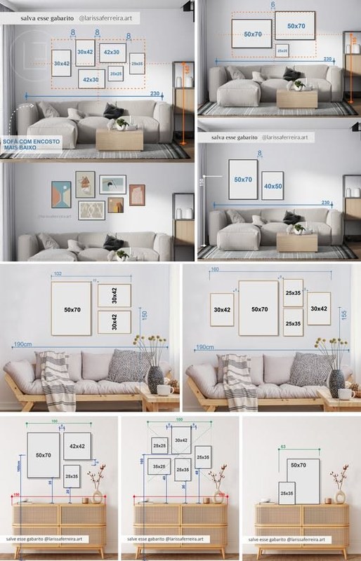
Sizing, Spacing, and Layout Rules for a Balanced Gallery Wall<

Mixed wood and metal frames arranged with even spacing on a gallery wall.
Mixed wood and metal frames arranged with even spacing on a gallery wall.
/h2>
Even a beautiful mix of wood and metal can fail if the layout is off. Proportion and spacing often matter more than the exact frame finish.
How to mix small, medium, and oversized frames without visual clutter
Start with one anchor piece, usually the largest frame, then build outward with medium sizes and finish with smaller accents. Oversized pieces should not be scattered randomly; they work best near the center or at the visual base of the arrangement. Smaller frames can fill edges and corners, but too many tiny pieces will make the wall feel fragmented.
A common fix is to limit the number of size categories. Instead of using every frame you own, choose perhaps two or three size families. If you need more guidance on proportion, Hurrell Editions has a useful article on how to mix frame sizes for gallery wall.
Ideal spacing between frames and when to keep sizes symmetrical
Consistent spacing is one of the fastest ways to make mixed materials feel organized. Many gallery walls look best when the gaps are visually even throughout the arrangement. Exact spacing can vary depending on frame scale and wall size, but the principle remains the same: tighter spacing feels more unified, while wider spacing makes each piece read more independently.
Symmetry is especially helpful when the artwork is formal, the furniture below is centered, or the room leans classic. In looser, more eclectic displays, asymmetry can work beautifully, but the overall outline of the arrangement should still feel balanced.
Layout ideas for stairways, sofas, consoles, and narrow walls
Above a sofa, use a layout that roughly follows the furniture width and keeps the visual center aligned with the seating area. Above a console, a more compact arrangement usually looks cleaner. On stairways, follow the rise of the stairs with a gentle diagonal or stepped composition rather than forcing a rigid rectangle.
Narrow walls benefit from vertical stacks or slim columns of frames with repeated matting and limited finish variation. If the area is too tight for a full gallery wall, a picture ledge may be more flexible than multiple nail points. For that approach, you might also find how to style picture ledges for layered art display helpful.
Wall type, hanging hardware, and weight considerations for plaster, drywall, and masonry
Always check the wall type before hanging a mixed-frame display, especially if solid wood frames or glazed oversized pieces are involved. Drywall, plaster, and masonry can require different hardware. Weight capacity varies by wall condition, anchor type, frame construction, and hanging method, so it is worth confirming the manufacturer guidance for both the frame and the hardware.
For heavy or valuable pieces, especially on plaster or masonry, cautious planning matters more than speed. If the wall condition is uncertain or the frame weight is significant, consult a qualified installer rather than guessing.
Do not assume the included hanging hardware is suitable for every wall. Heavier solid wood frames, large glazed frames, and masonry walls may require hardware selected specifically for the wall type and load.
Best Styling Combinations for Wood and Metal Picture Frames
Some pairings naturally feel easier than others because their undertones and visual weight are already compatible. These combinations are not rules, but they are reliable starting points.
Light oak with brass, walnut with black metal, and ash with brushed silver
Light oak and brass create a warm, softly elevated look that suits contemporary, Scandinavian, and transitional rooms. Walnut with black metal feels grounded and architectural, making it a strong choice for modern, industrial, or moody interiors. Ash with brushed silver reads cooler and cleaner, often fitting minimalist spaces, home offices, or rooms with pale walls.
If you prefer a rustic or reclaimed look, the wood side of the pairing becomes more dominant, and the metal should usually stay simple. Highly textured barn wood plus polished metal can feel disconnected unless the art is extremely restrained.
Using black-and-white art, photography, and limited palettes to unify the mix
Black-and-white imagery is one of the most forgiving choices for mixed frames because it already supplies contrast and consistency. Photography, charcoal sketches, architectural prints, and monochrome abstracts help wood and metal coexist without fighting for attention.
Limited-palette art works similarly. If the artwork repeats just a few colors, the eye reads the group as one collection, even when the frame materials differ.
How mats, mounts, and picture lights can refine the overall display
Mats create breathing room and can make mixed frames feel more formal and cohesive. Wider mats often add calm to a busy arrangement, while float mounting can make a single special piece feel more gallery-like. If you want to elevate the display further, a picture light can visually pull the grouping together by adding one more repeated design element.
Picture light placement, brightness, color temperature, power source, and safety basics
For a mixed-frame arrangement, picture lights usually look best when centered over a key piece or over a compact grouping rather than scattered above every frame. Brightness should be strong enough to reveal the art without creating harsh glare on glazing. Color temperature affects the whole mood: warmer light tends to flatter wood tones, while neutral light can keep metal finishes looking crisp.
Plug-in, battery, and rechargeable options each have tradeoffs in convenience and visual neatness, and specifications vary by model. Before buying, check the official listing for dimensions, runtime claims, mounting method, and care instructions. If you are comparing options, Hurrell Editions has guides on how to choose a picture light for artwork and how to light a gallery wall without hardwiring.
- Repeat one finish at least three times so it looks intentional rather than accidental.
- Use matching mats when the frame materials differ noticeably.
- Let the artwork palette stay tighter if the frames are more varied.
- Choose one statement frame, not five competing ones.
The Benefits and Limitations of Mixing Wood and Metal Frames
Mixed materials can make a wall feel richer and more personal, but they are not automatically the right choice for every room or every art collection.
Why the combination adds depth, contrast, and a collected feel
Wood and metal bring different visual temperatures to a room. Together, they can add depth that a single-material display sometimes lacks. The result often feels collected over time, which is especially appealing in homes that mix vintage, contemporary, and personal pieces.
Where mixed materials can look disjointed or overly busy
The look can fail when too many finishes compete at once, when the artwork styles are unrelated, or when the room already has a lot of visual noise. Small walls are less forgiving than large ones. So are rooms with bold wallpaper, heavy pattern, or many contrasting furniture finishes.
Evidence limits: when style advice depends on room lighting, wall color, and artwork variety
Styling advice has limits because the same frame pairing can look excellent in one room and awkward in another. Natural light, bulb warmth, wall paint, glazing reflectivity, and the variety of the artwork all affect the outcome. That is why mood boards, floor layouts, or frame mockups can be useful before committing to a full arrangement.
- Adds contrast and visual depth.
- Feels more layered than a perfectly matched set.
- Works across modern, transitional, and eclectic interiors.
- Makes it easier to combine old and new artwork.
- Can look random without a unifying element.
- Undertones may clash under certain lighting.
- Busy art plus busy frames can overwhelm small rooms.
- Weight and hardware needs may vary more across the display.
Common Mistakes to Avoid When Mixing Frame Materials
Most problems come from overcomplicating the display. A mixed wall usually needs fewer variables, not more.
Too many finishes, mismatched undertones, and inconsistent proportions
Wood, black metal, brass, silver, white lacquer, and acrylic all on one wall is rarely the easiest path to cohesion. Even if each frame is attractive on its own, the group can lose its center. Keep the finish story edited, and make sure the frame proportions relate to one another.
Ignoring artwork scale, wall size, and the surrounding decor
A mixed gallery wall should fit the room. Tiny frames on a large wall can feel scattered, while oversized heavy frames can crowd a small bedroom or narrow hall. Consider the furniture, ceiling height, and sightlines around the display before deciding on the final arrangement.
Overcrowding layouts or choosing hanging hardware unsuited to the wall
When frames are too close, the eye cannot separate the individual pieces. When they are too far apart, the grouping falls apart. And even a beautifully planned layout can become a problem if the mounting method is wrong for the wall or the frame weight.
Care, Maintenance, and Long-Term Value of Wood and Metal Frames
A mixed-frame arrangement lasts longer and looks better when the materials are maintained according to their finish type and environment.
Cleaning finishes safely and preventing tarnish, scratches, or warping
Wood frames generally benefit from gentle dusting and a dry or lightly damp soft cloth, depending on the finish and manufacturer guidance. Metal frames should also be cleaned carefully to avoid scratching coated surfaces or encouraging tarnish on certain finishes. Avoid harsh cleaners unless the official care instructions specifically allow them.
Placement matters too. Strong direct sun can affect artwork and some finishes over time, while humidity can be harder on wood components, backing materials, and mat boards.
When solid wood, quality metal, and archival components are worth the investment
If you are framing original art, sentimental photographs, or pieces you plan to keep for years, better materials are often worth considering. Solid wood, well-finished metal, UV-protective glazing, acid-free mats, and archival backing can all matter, though exact claims vary by brand and model. Confirm those details on the seller or manufacturer page rather than assuming every frame includes them.
Final recommendation: how to build a mixed-frame arrangement that still feels intentional
The most reliable approach is to choose one dominant material, repeat one unifying detail, and edit the layout until the art feels more prominent than the frames themselves. If you keep the undertones compatible, the spacing consistent, and the size mix controlled, wood and metal frames can share a wall beautifully without looking forced.
Frequently Asked Questions