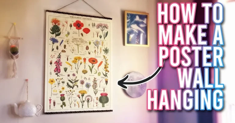
How High to Hang Picture Ledge
For most rooms, hang a picture ledge at a height that feels connected to the furniture below and comfortable to view from across the room. The best placement depends on wall size, ceiling height, and whether you want the display to feel intimate, balanced, or dramatic.
When people ask how high to hang picture ledge, the most useful answer is this: high enough to feel intentional, but low enough to stay connected to the furniture and art around it. A picture ledge is part display, part architectural line, so its placement changes the mood of the whole room.
At Hurrell Editions, we think of ledge height as a curatorial decision rather than a single measuring rule. The best placement depends on the room, the ceiling, the furniture below, and whether you want the display to feel relaxed, formal, dramatic, or quietly collected.
- Room matters: Living rooms, bedrooms, and hallways often need different ledge heights.
- Balance counts: Keep the ledge visually related to the furniture below it.
- Eye level helps: Use it as a guide, not a strict rule.
- Style changes height: Low, mid, and high placement each create a different mood.
- Light and safety matter: Avoid glare, heat, and overload when choosing placement.
How High to Hang a Picture Ledge: The Curator’s Starting Point
A picture ledge works best when it feels like it belongs to the wall, not as if it was added as an afterthought. The right height helps framed art read clearly, keeps the arrangement visually balanced, and gives the room a more finished, thoughtful character.
If a ledge sits too low, it can feel crowded against furniture. Too high, and it may drift away from the rest of the room, making the display feel disconnected. The sweet spot is usually guided by eye level, furniture height, and how much breathing room you want around the arrangement.
Why height matters for art, shelves, and room balance
Height changes how we read scale. A ledge placed thoughtfully can make small prints feel deliberate, give books a graceful resting place, and soften a blank wall without overwhelming it.
It also affects balance. A ledge above a sofa, console, or bed should relate to the object below it, creating a visual conversation rather than competing with it. That relationship is what makes the wall feel composed.
How the “right” height changes by wall size, ceiling height, and viewing distance
On a large wall, a picture ledge can sit slightly higher and still feel grounded, especially if the room has tall ceilings or long sight lines. In a smaller room, the same ledge may need to sit lower so the display feels intimate and approachable.
Viewing distance matters too. In a narrow hallway, people pass close to the wall, so a lower or mid-height ledge is often easier to enjoy. In a living room, where you may view the wall from across the room, a slightly higher ledge can read beautifully without feeling intrusive.
There is no single universal measurement that works in every home. The best height is the one that suits the room’s proportions, the furniture below, and the visual weight of the pieces you plan to display.
Choosing the Best Height by Room: Living Room, Bedroom, Hallway, and Studio
Different rooms ask for different rhythms. A picture ledge in a family living room should feel easy to live with, while one in a bedroom or reading nook may benefit from a softer, lower line. In transition spaces, the ledge often needs to be more flexible and less formal.
Living room placement above sofas and sideboards
Above a sofa, a picture ledge usually looks best when it sits close enough to feel anchored to the furniture. That creates a layered look that feels intentional rather than floating.
Above a sideboard or console, the ledge can sit a little higher if the furniture is lower and the wall has room to breathe. If you are styling with framed prints, consider pairing the placement with a guide on how to style picture ledges for layered art display so the height and composition work together.
Bedroom and reading nook placement for a softer, lower line
Bedrooms usually benefit from a calmer, lower visual line. A picture ledge over a headboard or reading chair should feel restful, not dominant, and should leave enough open wall space to preserve the room’s softness.
In a reading nook, a lower ledge can create a lovely intimate corner for books, small prints, and a lamp nearby. The effect is more personal than formal, which suits spaces meant for slowing down.
Hallways, stair landings, and compact spaces where eye level shifts
Hallways and stair landings are trickier because your eye level changes as you move. A ledge that feels perfect while standing still may feel too high or too low when you are walking past it.
In these spaces, it often helps to hang the ledge so the arrangement is visible at a comfortable glance, not just straight-on. A slightly higher placement can work well on stair walls, while narrow hallways often suit a mid-level line that feels elegant but unobtrusive.
Before drilling, tape a strip of paper or painter’s tape to the wall at the proposed height and live with it for a day. Seeing the line in context is often more helpful than measuring alone.
Picture Ledge Height Rules of Thumb for Artful Styling
Rules of thumb are useful because they give you a starting point, especially when you are choosing between several plausible heights. They are not laws, but they can save you from placing a ledge in a way that feels awkward or disconnected.
The relationship between ledge height and standard eye level
Standard eye level is often a useful reference, but it should not be followed mechanically. A picture ledge does not need to sit exactly at eye height to work well; it needs to support the composition and the room.
For most interiors, the visual center of the display should land somewhere comfortable to see without strain. If the ledge is serving as a changing gallery for art and objects, a slightly lower placement can make the pieces easier to swap and enjoy up close.
Spacing between ledges, frames, and surrounding furniture
Spacing matters as much as height. Leave enough wall space between the top of furniture and the ledge so the composition can breathe, but not so much that the two elements feel unrelated.
If you are using multiple ledges, keep the intervals consistent unless you want a deliberately asymmetrical effect. For framed pieces, the spacing should allow the eye to travel comfortably from one object to the next without visual clutter. For practical sizing guidance, see how deep a picture ledge should be for framed art.
When to break the rules for a gallery-style or minimalist look
Some rooms are improved by breaking the expected formula. A gallery-style wall may look more dynamic with a higher ledge that creates a sense of display and movement. A minimalist room may benefit from a single low ledge with just one or two objects.
The best reason to break the rules is clarity of intent. If a higher placement makes the room feel taller and more sculptural, that is a good design choice. If a lower placement creates a cocooning effect, that can be just as elegant.
Style Trade-Offs: Low, Mid, or High Placement
Each height zone creates a different emotional effect. Low placement feels intimate, mid-height feels adaptable, and high placement can feel striking or architectural. Choosing between them is often less about correctness and more about the atmosphere you want.
Low placement for intimate, collected interiors
Low placement suits homes that feel layered, lived-in, and personal. It can make art feel close and conversational, almost as if the objects were gathered rather than staged.
This approach works especially well in bedrooms, cozy sitting rooms, and spaces with vintage furniture or warm textures. It is also forgiving if you like to rotate prints, books, and small ceramics often.
Mid-height placement for flexible, family-friendly display
Mid-height is the most versatile choice for many homes. It usually balances well with everyday furniture and gives enough room for children, pets, and practical movement around the wall.
This is a strong option if your ledge needs to change over time. Families, renters, and frequent redecorators often appreciate a height that feels polished but not precious.
Higher placement for dramatic walls, tall ceilings, and sculptural impact
Higher placement can be beautiful in rooms with tall ceilings or a lot of vertical volume. It draws the eye upward and can make a wall feel more architectural.
Use this approach carefully, though. If the ledge is too high for the room, the display may feel remote. The goal is drama with connection, not drama at the expense of comfort.
- Tall walls
- Formal living rooms
- Statement arrangements
- The room already feels visually busy
- You want an easy, touchable display
- The furniture below is very low
Curator Recommendations for Styling Books, Prints, and Small Objects
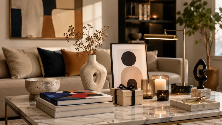
A picture ledge becomes especially charming when it does more than hold frames. Books, ceramics, postcards, and found objects can add personality and make the display feel collected over time rather than assembled in one afternoon.
Mixing framed art with books, ceramics, and found objects
Mixing categories creates depth. A framed print can sit behind a small vessel, or a stack of books can act as a base for a smaller object. The contrast between flat and dimensional pieces keeps the ledge from feeling static.
If you love a cleaner look, limit the palette and vary only the textures. If you prefer a more abundant mood, let the mix be looser, but keep one or two repeated tones so the arrangement still feels curated.
Layering sizes and leaning compositions for depth
Layering works best when the largest piece anchors the back row and smaller pieces step forward. Leaning frames is part of the charm of a picture ledge, but each layer should still be legible.
For a balanced display, try one taller piece, one medium piece, and one smaller object, then repeat that rhythm across the ledge. If you want more guidance on avoiding visual overload, how to arrange frames on a picture ledge without clutter is a helpful companion read.
Seasonal swaps for creative living spaces and gift-worthy displays
One of the pleasures of a picture ledge is how easily it can change with the season. A summer arrangement might feature lighter prints and a few airy objects, while winter could lean into darker frames, books, and richer tones.
That flexibility also makes ledges thoughtful gift spaces. A beautifully wrapped book, a small framed drawing, or a ceramic object can become part of a display that evolves with the home.
A small stack of art books with strong spines can anchor a ledge beautifully. Choose titles you genuinely love, then layer a framed print or object on top for a look that feels both personal and polished.
Lighting Considerations That Affect Where a Picture Ledge Should Go
Lighting can change not only how art looks, but how high the ledge seems to sit. A ledge under a bright window, near a lamp, or beside a wall light will read differently from one in a dim corner.
Avoiding glare, shadows, and heat near artwork
Direct sunlight can fade prints and stress paper over time, so avoid placing a ledge where fragile pieces will sit in strong light for long periods. Heat from radiators, fireplaces, and some lamps can also affect artwork and finishes.
Glare is another issue. Glass-fronted frames may reflect light and obscure the image, so angle and placement matter. If you are choosing focused lighting, it may help to read how to choose a picture light for artwork before deciding on the ledge position.
Paper art, vintage prints, and handmade works may be sensitive to sunlight, humidity, and heat. If your ledge is near a window or bathroom, choose pieces with care and rotate them occasionally.
Using wall lights, lamps, and natural light to enhance the display
Good lighting can make a modest ledge feel elevated. A nearby table lamp, soft wall sconce, or indirect daylight can bring out texture, paper grain, and frame finishes without overpowering the display.
For a layered room, it is often better to think about the ledge as part of the lighting plan rather than an isolated feature. The display should look appealing in the morning, afternoon, and evening, not just under one perfect condition.
How lighting changes the perceived height of the ledge
Bright light above the ledge can make it feel higher and more prominent. Softer, lower light can make it feel calmer and visually closer to the furniture below.
That means a ledge placed at the same measured height may feel quite different from room to room. Before committing, look at the wall at different times of day and notice whether the ledge seems to float, anchor, or disappear.
Installation, Care, and Price Context for 2026 Buyers
Once you have chosen the right height, installation becomes the part that turns good planning into a finished result. Careful measuring, suitable hardware, and realistic expectations about weight all matter, especially if you are displaying treasured pieces.
Measuring, marking, and leveling before drilling
Start by measuring from the floor, the top of the sofa, the edge of the bed, or the furniture below, depending on the room. Mark the line lightly, step back, and check it from several angles before drilling.
A level is essential. Even a slight tilt can make a ledge feel off, especially once frames and books are added. If you are new to wall styling, take your time here; the visual payoff is worth it.
Work from the furniture below and the wall height above, not from a guess.
Use painter’s tape to test the visual height before making holes.
Step back and view the wall from the doorway or seating area.
Weight limits, hardware, and safe spacing for treasured pieces
Picture ledges are practical, but they are not limitless. Hardware, wall type, and ledge construction all affect how much weight they can safely hold, so follow the manufacturer’s guidance and avoid overloading them.
If you plan to display heavier frames, books, or ceramics, leave extra spacing and use a more secure fixing method suited to your wall. For especially valuable or fragile items, it is wise to keep the arrangement lighter and more stable.
Care tips for dusting ledges, protecting frames, and refreshing the arrangement
Dust gathers quickly on horizontal surfaces, so a soft cloth or microfiber duster is useful for regular upkeep. Frames should be checked occasionally for scuffs, slipping, or marks where they lean against the wall.
Refreshing the arrangement every few months can also keep the display looking intentional. This is a good moment to rotate books, introduce a new print, or remove anything that no longer feels right for the room.
What to expect at different price points for picture ledges and materials
Price varies by material, finish, length, and construction quality. Entry-level ledges are often simple and practical, mid-range options tend to offer better finishes or sturdier builds, and investment pieces may use more refined materials or custom sizing.
For 2026 buyers, it is sensible to think in terms of value rather than just cost. A well-made ledge that suits your wall and supports your display safely is usually worth more than a cheaper option that feels flimsy or visually out of place.
If you are comparing display formats, it can also help to read picture ledge shelves vs hanging individual frames to decide whether a ledge is the right long-term solution for your space.
Creative Recap: The Most Elegant Height Choices for a Finished Interior
The most elegant picture ledge height is rarely the most obvious one. It is the height that respects the room’s proportions, supports the objects you love, and lets the wall feel calm, layered, and complete.
Quick decision guide for choosing a height with confidence
If the ledge is above a sofa or bed, keep it visually connected to the furniture. If it is in a hallway or stairwell, think about movement and sight lines. If the wall is tall, you can usually go a little higher without losing balance.
When in doubt, choose the placement that leaves enough room for the display to breathe while still feeling part of the room. That simple test solves more layout problems than any rigid measurement.
Final styling takeaways for artful, lived-in rooms
A picture ledge should feel like a living composition. It is at its best when it holds art, books, and objects in a way that feels personal rather than overworked.
For Hurrell Editions, the ideal answer to how high to hang picture ledge is this: high enough to create presence, low enough to feel human, and balanced enough to let the pieces on it quietly shine.
Recommended Products
SHOP THIS SETUP
Wallniture Bora Floating Shelf 24 Inch, White
This clean, versatile floating shelf is a strong pick for creating a picture ledge display because it has the right shallow profile for framing art without overwhelming the wall. Its simple white finish works in nearly any room, and the 24-inch size makes it easy to space correctly when you’re planning how high to hang a picture ledge.
Frequently Asked Questions
It should usually feel visually connected to the sofa rather than floating far above it. Leave enough wall space for breathing room, but keep the ledge close enough to anchor the seating area.
Eye level is a useful reference, but it is not a strict rule. The best height depends on the room, furniture, and the mood you want the wall to create.
It should be high enough to avoid crowding the furniture, but low enough to feel related to it. The exact spacing depends on the height of the sofa, bed, console, or sideboard below.
Yes, hallways can be excellent places for picture ledges. Just consider sight lines and movement so the display is easy to see without feeling cramped.
Framed prints, books, small ceramics, postcards, and found objects all work well. Keep the arrangement balanced so the ledge feels curated rather than cluttered.
They should be dusted regularly and checked for slipping frames or overloaded sections. Keep fragile artwork away from direct sunlight, heat, and excess humidity.