Hanging a Picture Wall: Layout Planning, Frame Choices & Styling Guide
A strong picture wall starts with a clear layout, a cohesive art mix, and frames that suit the room’s style. Protect the display with good lighting, careful spacing, and materials that match your budget and the artwork’s needs.
Hanging a picture wall is one of the most effective ways to turn a plain room into a space with personality, rhythm, and memory. Done well, it feels collected rather than decorated, with each frame contributing to a larger visual story.
- Plan first: Use templates and spacing tests before hanging anything.
- Edit the mix: Repeat a palette, frame finish, or theme for cohesion.
- Choose the right frames: Oak, black, white, and brass each change the mood.
- Think about light: Avoid direct sun and reduce glare on glazed pieces.
- Invest wisely: Archival materials and framing matter most over time.
Why Hanging a Picture Wall Matters in 2026 Interiors
In 2026, interiors continue to move toward spaces that feel layered, lived-in, and emotionally specific. A picture wall does that beautifully: it softens blank architecture, brings warmth to minimal rooms, and gives creative homes a sense of intention without requiring a full redesign.
For gallery wall sets and curated art collections, the appeal is not just visual. A thoughtful wall can make a hallway feel welcoming, a reading corner feel settled, or a living room feel more personal. It is one of the few styling choices that can change both the mood and the movement of a room.
From blank walls to curated storytelling
A blank wall is neutral, but it is rarely expressive. Once you begin hanging framed art, photographs, or prints together, the wall becomes a kind of visual narrative. It might tell the story of your travels, your taste in color, your love of books, or your preference for calm, abstract forms.
This storytelling quality is why picture walls remain so appealing in homes that value character. They let you build a display over time, rather than forcing everything to match at once. For many people, that slower, more collected approach feels more authentic than buying a single oversized piece and calling the room finished.
How gallery walls shape mood, movement, and personal style
A well-hung picture wall changes how the eye travels through a room. Tight grids feel orderly and architectural. More relaxed salon-style layouts feel creative and layered. Linear compositions can elongate a wall and guide the eye across a sofa, staircase, or console.
Just as importantly, the wall sets the emotional tone. Soft palettes and generous spacing create calm. Bold contrast, mixed media, and denser arrangements create energy. The best picture walls do not only decorate a room; they help define how the room feels to live in.
Choosing the Right Art Mix for a Cohesive Picture Wall
The most successful picture walls usually balance variety with restraint. You want enough contrast to keep the display interesting, but enough common ground that the wall feels unified rather than random.
If you are building a set from scratch, start by choosing a visual thread: color, subject matter, frame finish, or overall mood. That thread will help you mix different art types without losing coherence.
Balancing prints, photography, illustration, and typography
Prints often provide the structure of a gallery wall because they are easy to scale and frame consistently. Photography adds realism and texture. Illustration brings line work and personality. Typography can introduce wit, literary references, or a graphic pause between more image-driven pieces.
The trick is not to use everything equally. A wall with too many competing voices can feel busy. Consider one or two dominant formats, then use the others as accents. For example, a mostly art-print wall might include one photograph and one typographic piece to keep the arrangement fresh.
If your room already has strong patterns in rugs, upholstery, or curtains, keep the art mix calmer. If the room is visually quiet, a more eclectic set can add welcome energy.
Color harmony versus contrast-led composition
Color harmony is the safest route for a cohesive picture wall. Similar tones, repeated neutrals, or a shared palette of muted greens, rusts, blues, or charcoals can make mixed artwork feel deliberate. This approach works especially well in bedrooms, studies, and open-plan spaces where calm matters.
Contrast-led composition is more dynamic. Black-and-white photography beside a warm abstract print, or a vivid color study next to a restrained drawing, can create tension in a good way. If you choose contrast, repeat at least one element elsewhere on the wall so the composition still feels anchored.
Theme ideas for creative homes, reading corners, and giftable spaces
Creative homes often benefit from themes that are broad enough to evolve. Think botanical studies, travel memories, architectural sketches, literary quotations, or abstract forms with a shared palette. These themes feel thoughtful without becoming overly literal.
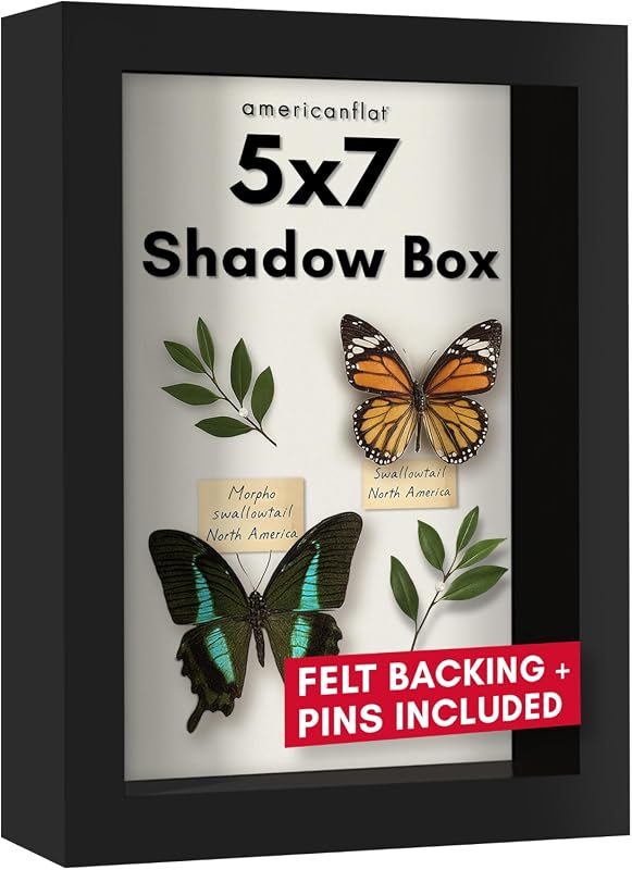
Reading corners and giftable spaces work especially well with smaller framed works that feel intimate. A pair of prints above a chair, a trio near a bookshelf, or a compact wall beside a desk can feel more personal than a large, highly formal arrangement. For gift-givers, a ready-made gallery wall frame set can be a practical starting point when you want the result to feel curated rather than improvised.
Planning Layouts Before You Hang Anything
Good planning saves both time and holes in the wall. Before picking up a hammer, decide on the overall shape of the arrangement, the spacing between pieces, and the visual center point of the wall.
It helps to think of the layout as design, not just installation. The wall should relate to the furniture below it, the height of the ceiling, and how people move through the room.
Grid, salon, linear, and asymmetrical arrangements
Grid layouts are ideal when you want order and symmetry. They suit matching frames, repeated image sizes, and contemporary interiors that benefit from clean structure. Salon layouts are looser and more expressive, with varied frame sizes and a collected feel.
Linear arrangements work well above sofas, sideboards, and beds because they create a long visual horizon. Asymmetrical layouts are more playful and can make a wall feel dynamic, especially in creative studios or eclectic living rooms. If you are deciding between a ledge and a more fixed arrangement, our guide on picture ledge shelves vs hanging individual frames can help clarify the trade-offs.
| Option | Best For | Note |
|---|---|---|
| Grid | Minimal, modern rooms | Most cohesive with matching frames |
| Salon | Collected, eclectic interiors | Needs careful balance to avoid clutter |
| Linear | Above furniture | Strong if spacing stays consistent |
| Asymmetrical | Creative, relaxed spaces | Works best when one anchor piece leads |
Paper templates, spacing rules, and visual balance
Paper templates are still one of the simplest ways to plan a wall. Cut paper to each frame size, tape the shapes to the wall, and adjust until the composition feels right. This is especially useful when you are working with different frame sizes or trying to center the arrangement around furniture.
As a general rule, keep spacing consistent within the same cluster. Small frames can sit closer together, while larger pieces need more breathing room. If the wall feels crowded from across the room, increase the gaps slightly before committing to nails or hooks.
Measure the available space and mark the furniture line, ceiling height, and central axis.
Test several layouts on the floor or wall until the proportions feel balanced.
Keep gaps visually even, then hang from the center outward for easier alignment.
Common layout mistakes that make walls feel crowded or flat
One common mistake is hanging everything too high. Another is spacing pieces so far apart that the wall loses energy and looks accidental rather than composed. A third is mixing too many frame styles without a unifying element.
Flatness can also happen when all the artwork is the same size and placed in a rigid row with no variation in tone or subject. If you want the wall to feel alive, make sure there is at least one point of emphasis — a larger work, a darker frame, or a stronger visual anchor.
Materials, Frames, and Lighting That Elevate the Display
The materials around your artwork matter almost as much as the artwork itself. Frame finish, glazing, mount width, and lighting all affect how polished or casual the final wall feels.
For a gallery wall set, these choices should support the mood of the room while also protecting the pieces you love. A beautiful wall should also be a durable one.
Frame finishes: oak, black, white, brass, and mixed materials
Oak frames bring warmth and suit interiors with natural textures, linen upholstery, and soft neutral palettes. Black frames create crisp contrast and are especially effective for photography, line drawings, and modern layouts. White frames feel airy and understated, which can be useful in bright rooms or smaller spaces.
Brass finishes add a slightly more formal, reflective note. Mixed materials can look sophisticated when repeated thoughtfully, but they need discipline; otherwise, they can make the wall feel fragmented. If you are drawn to a softer, float-mounted look, our article on what is a floating picture frame is a useful place to start.
- Warm oak in relaxed, natural interiors
- Black frames for graphic contrast
- White frames in light, minimal rooms
- Your room already has dominant wood tones you do not want to repeat
- You want a softer, less architectural feel
- You need the wall to disappear visually
Choosing glass, mount widths, and paper textures for artwork longevity
For paper art, glazing helps protect against dust and handling, though the right choice depends on light exposure and budget. Mount widths also affect the final impression: wider mounts feel more formal and spacious, while narrow mounts keep the display compact and contemporary.
Paper texture matters too. Smooth prints feel clean and modern. Textured papers can add a more tactile, art-book quality, especially for illustrations and limited-edition prints. If the wall is in a humid room, avoid assuming every paper or frame is equally suitable; preservation needs vary by material.
Paper art can fade in direct sun and may warp in humid spaces. If your wall faces strong daylight or sits near a kitchen or bathroom, choose archival materials and more protective framing.
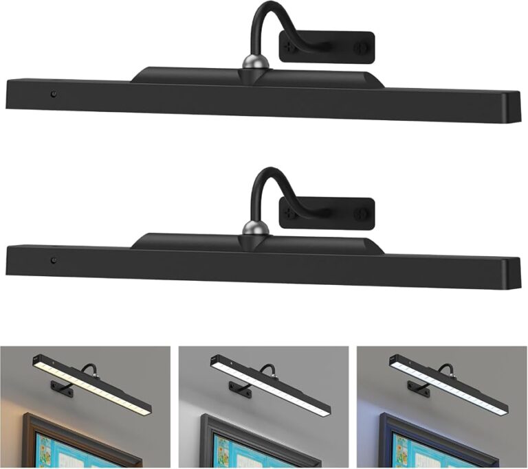
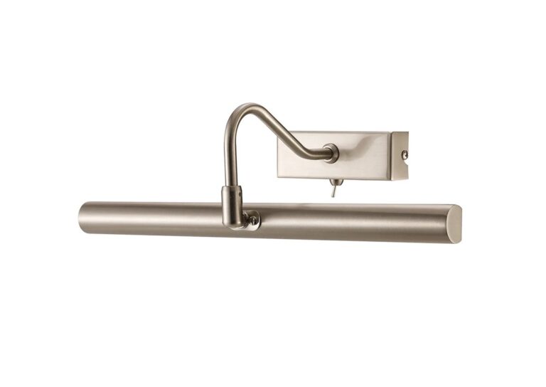
Lighting considerations: daylight, picture lights, and shadow control
Natural daylight can make a picture wall feel fresh, but too much direct sun is risky for prints and paper. Picture lights, wall sconces, and well-placed lamps can bring out texture and color after dark while keeping the room feeling intimate.
If you are choosing a dedicated light for art, the beam angle and glare control matter more than decorative flair. Our guide on how to choose a picture light for artwork offers a helpful overview of what to consider. Good lighting should flatter the work without washing it out or creating harsh reflections.
Many designers treat wall lighting as part of the composition itself. A picture wall often looks more intentional when the light source is planned alongside the frame layout, not added afterward.
Style Trade-Offs: Minimal, Eclectic, or Curated Maximalism
There is no single right style for hanging a picture wall. The best choice depends on how you want the room to feel and how much visual activity the rest of the interior already contains.
Think of the wall as a style decision with trade-offs. Minimalism, eclectic layering, and curated maximalism each create a different kind of presence.
When to keep spacing disciplined for a gallery feel
Disciplined spacing is ideal when you want the wall to feel refined and architectural. This approach works well in contemporary homes, formal living rooms, and spaces with clean furniture lines. It also helps smaller collections look deliberate rather than sparse.
A disciplined wall usually uses repeated frame sizes, a restrained palette, and aligned edges. The result is calm and elegant. If your home already has strong texture elsewhere, this may be the most balanced approach.
When to layer personality for a lived-in, collected look
If you love the feeling of art gathered over time, a more layered wall may suit you better. This is where travel photographs, vintage-inspired prints, drawings, and book-related imagery can sit comfortably together. The key is to repeat certain details — perhaps a frame color, a paper tone, or a subject matter — so the wall still feels connected.
Layered walls are especially appealing in homes with open shelving, books, ceramics, and mixed materials. They can make a room feel generous and human, though they do require editing. Too many small pieces without hierarchy can quickly lose charm and become visual noise.
Think of a picture wall the way you would think of a well-edited bookshelf: a few strong pieces, some breathing room, and enough variation to invite a second look.
How to match the wall to contemporary, classic, or creative interiors
Contemporary interiors usually benefit from cleaner lines, fewer frame finishes, and tighter spacing. Classic rooms often suit symmetrical layouts, traditional framing, and more formal proportions. Creative interiors can handle bolder contrast, mixed media, and asymmetry more easily.
For a more maximalist approach, edit carefully so the wall still has rhythm. For a more minimal room, let the artwork do the expressive work and keep the surrounding styling quiet. The wall should belong to the room, not compete with it.
Curator Recommendations for a More Refined Picture Wall
The most polished picture walls often look simple because the editing behind them was careful. Refinement comes from selection, not from quantity.
When in doubt, choose the stronger piece, the cleaner line, or the better proportion. A wall with fewer, better-chosen works usually feels more confident than one crowded with fillers.
Editing down to stronger pieces instead of filling every gap
Not every gap needs to be occupied. In fact, negative space often gives the eye somewhere to rest and helps the best pieces stand out. If you are building from a mix of existing art, try removing one piece and seeing whether the wall becomes clearer.
This is especially important in smaller rooms. A tight wall can feel elegant, but only if the composition is disciplined. If every inch is filled, the result can look busy even when the artwork itself is beautiful.
- Stronger visual hierarchy
- More timeless, less cluttered look
- Better focus on standout artwork
Using scale, rhythm, and repeated details like a professional display
Professional-looking displays usually rely on rhythm. That might mean repeating a frame finish every few pieces, echoing a color in different artworks, or alternating large and small pieces in a pattern that feels intentional.
Scale matters as much as style. One large anchor piece can ground a wall of smaller works. Repeated details, such as similar mat widths or a shared paper tone, help the eye move smoothly across the display.
A small set of monochrome prints with one warm-toned abstract piece can be a quietly elegant combination for living rooms and studies. It gives the wall structure while still allowing one work to introduce softness and color.
Recommended art pairings for entryways, living rooms, and bedrooms
Entryways suit concise pairings: two framed prints, a photograph and a drawing, or a small trio that greets guests without overwhelming them. Living rooms can handle larger, more layered arrangements, especially above sofas or sideboards where the wall needs to hold attention from across the room.
Bedrooms usually benefit from gentler palettes and calmer subject matter. Botanical studies, abstract washes, and quiet photography tend to work well. If you are styling a console or shelf instead of a wall, our guide to displaying framed art on a console table can help you extend the same visual language into the room.
Care, Maintenance, and Price Context for Gallery Wall Sets
A picture wall is not only a styling project; it is a collection that needs care. Good maintenance preserves both the look of the wall and the condition of the artwork.
Price also matters, but not in a one-size-fits-all way. Costs vary widely depending on size, framing, materials, and whether you are buying individual pieces or a ready-to-hang set.
Dusting frames, protecting paper art, and avoiding sun damage
Dust frames with a soft, dry cloth and avoid harsh cleaners near glazing or paper edges. Check hanging hardware periodically, especially for heavier frames or walls that experience vibration from doors, stairs, or daily traffic.
Protect paper art from prolonged direct sunlight when possible. If you live in a bright space, consider UV-protective glazing or positioning the wall where the light is softer. Humidity can also affect paper, so bathrooms and very damp kitchens need extra caution.
Budget ranges for prints, frames, and ready-to-hang sets in 2026
Entry-level gallery wall sets in 2026 may include simple prints and basic frames, often making them accessible for renters, first homes, or seasonal refreshes. Mid-range options usually add better paper, more refined frame finishes, and stronger overall cohesion.
Investment pieces may involve archival materials, premium framing, limited-edition prints, or custom dimensions. Because pricing varies by size and finish, it is wise to compare the full cost of the artwork plus framing rather than the print alone.
Where to invest more: archival materials, framing, and lighting
If you are deciding where to spend more, start with the parts that protect and define the display. Archival paper, durable framing, and good lighting tend to make the biggest difference over time. They help the wall age well, even if the artwork changes later.
For a gift, a ready-made wall set can be a thoughtful choice, but only if the style suits the recipient’s home. If you are unsure, choose a more versatile palette and let the wall evolve. A good picture wall should be able to grow with the space.
A Creative Recap: Building a Picture Wall That Feels Personal and Collected
Hanging a picture wall is ultimately about more than decoration. It is a way to bring memory, taste, and atmosphere into the architecture of a home.
The most memorable walls usually feel edited, not excessive. They leave room for the eye to move, for the pieces to breathe, and for the room to keep its own identity.
Turning one wall into a visual narrative
When you choose art with intention, plan the layout carefully, and pay attention to materials and light, one wall can become a visual narrative that feels deeply personal. It may include family photographs, art prints, literary references, or abstract works that simply make the room feel more alive.
That narrative does not need to be finished in one day. In fact, some of the best walls evolve slowly, as new pieces are added and old ones are moved. That sense of change is part of the charm.
Final styling notes for artful homes, thoughtful gifts, and evolving spaces
For artful homes, a picture wall can be the most expressive element in the room. For thoughtful gifts, it offers something meaningful and lasting, especially when chosen with the recipient’s style in mind. And for evolving spaces, it provides a flexible framework that can change without losing its core identity.
If you want the result to feel polished, focus on proportion, spacing, and restraint. If you want it to feel warm and lived-in, allow a little imperfection and a few personal details. The best picture walls do both.
Recommended Products
SHOP THIS SETUP
FIXSMITH Picture Hanging Kit with Level, Hooks, Nails, and Hanging Accessories
This is a practical all-in-one kit for anyone building a picture wall, especially if you want to plan and hang multiple frames with less guesswork. It includes the essentials for measuring, leveling, and installing frames securely, making it a smart companion to a gallery wall project in any home.
Frequently Asked Questions
Start with paper templates, measure the wall, and decide on a layout style such as grid, salon, or linear. Check spacing from across the room before making any holes.
Consistent spacing usually looks best, with smaller gaps for compact clusters and slightly wider gaps for larger frames. The goal is to keep the wall balanced and easy to read visually.
No, but matching frames can make the wall feel more cohesive. Mixed frames work well too if you repeat one or two details, such as color, finish, or mat width.
A picture wall should relate to the furniture and the room’s sightlines, not sit too close to the ceiling. In most rooms, the composition should feel centered around eye level and the furniture below it.
Prints, photography, illustration, and typography can all work well together if they share a palette or theme. The best mix depends on the room’s mood and how much contrast you want.
Use proper glazing, keep paper art out of direct sunlight, and avoid humid areas when possible. Dust frames gently and check hanging hardware regularly.